The Admin application allows you to set up and manage your Content Accelerator environment.
Setup
This section describes the general configuration that are used across the Content Accelerator application.
Application
Application Config is the first configuration page in the Admin application. Fill out the sections as directed.
Configure hpi_administrators as an allowed group for the Content Accelerator Admin. Other groups can be added
depending on security requirements.
Main Settings
In this section you have the ability to set up the general configuration for your application. This includes an Application wide time zone (if none is selected, then time will display in the user’s local time zone) as well as the date and time format that is displayed throughout the application:

Available settings include:
- Header Notifications - show notifications in the application header
- Show/Hide file extensions - show file extensions
- Sterilize document names - regex to sterilize document names upon upload
- Default Application Path - module a user is taken to upon login
- Enable Logo to Navigate to Default Path - when enabled, clicking on the logo in the header will navigate to the default application path
- Default Session Timeout - minutes until a user is automatically logged out
- Timezone - application wide time zone. If none is selected times will display in the user’s local time zone
- Date Format - application wide date display format
- Time Format - application wide time display format
- Default number of search results per page - default number of search results
Header Links
You can specify what Application modules that are available to the users and whether to display them in the application’s header. Icons for header links are defaulted, can be turned off, or can be customized to any glyphicon.
Custom Links
This section provides the ability to add custom links to the application’s header (e.g. a link to your company’s IT Help Page).
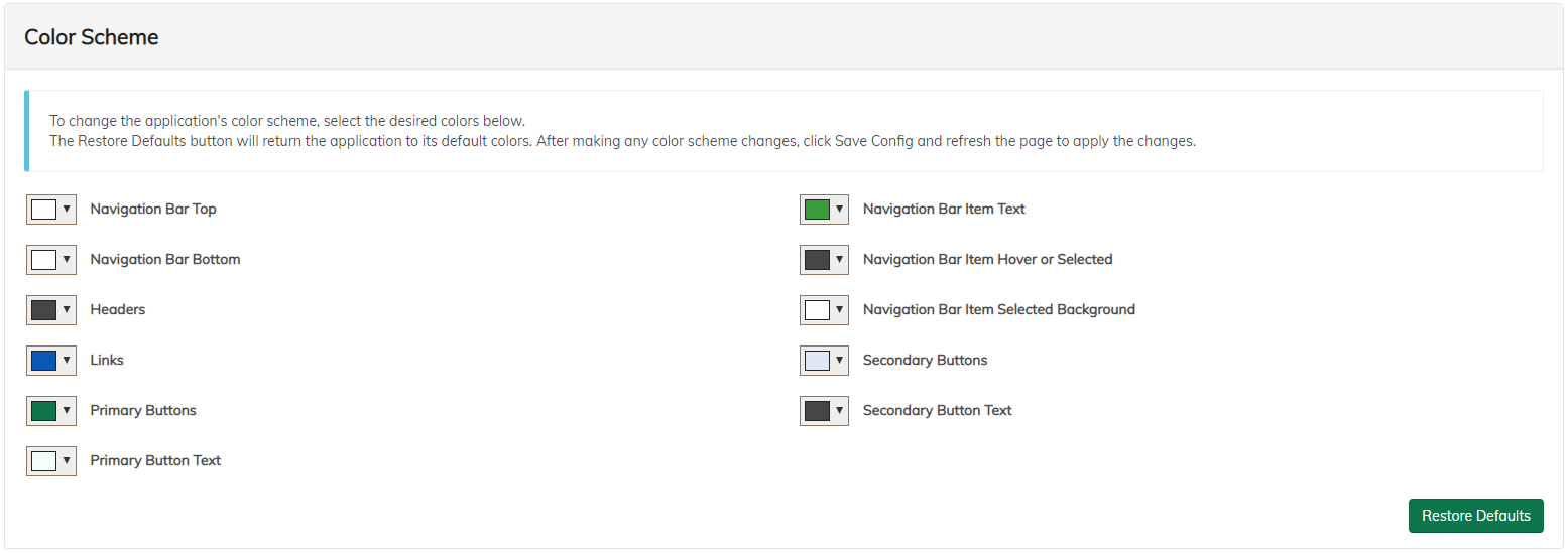
Content Accelerator Themes
This section provides the ability to style the application with a custom color themes.
To change the colors, simply navigate to the Application Config and update the color settings in the Themes section. Remember that after saving any changes, you must refresh the page to see the updates. Any users currently in the application would need to refresh as well.
Application Security
This section provides the ability to choose which groups that have access to the Content Accelerator Admin. If no groups are selected, then all users will be allowed to access the admin screens.
Note: Even if users can access the Admin, repository security will prevent unauthorized users from making any changes.
Header Actions
This section provides the ability to configure global actions for the application. Actions configured here are available to all users in the application’s header. See the Action Configuration in the User Guide for more details on how to configure specific actions.
OC Settings
This section displays the applicationId for the Content Accelerator configurations and provides the ability to refresh the backend Dictionary service.
Object Type
Add all types that will be used in the Content Accelerator (all repo types will be pulled in from the backend repository). Configure labels, filters, and more as needed. Types must be added to the Object Type config before continuing.
Notes:
- The Object Type Config must contain at least one type for the rest of the Content Accelerator admin to work properly. Configure all types before continuing.
- Configure any container types as having Container set to
true. Common types that require this setting: - Any folder types
- Active Wizard Page Set Instance (Form Instance) object and any subtypes
- Available filters include User Display Name, Date, Date Time, Time, Content Size, Mimetype, and Picklist.
- Date and Date Time filters will honor the application config date format.
- Picklist filtered values will utilize a single picklist named
OTCFilterPicklistto filter the value. If the value is not found in the picklist, the original value will be displayed. For example, configuring thePicklistfilter on theobjectTypeReadOnlyproperty can formatdm_documentas Document ortsg:qualityDocumentasQuality Documentfor the end user to see when searching, viewing properties, etc. -
There is the ability to create a
Composite Type, which is a type that can include multiple Types. This is used only for types with overlapping attributes and there is a requirement to search on multiple types at once through the search interface.Note:
Composite Typeis deprecated and will be removed in a future release.
Non-Mandatory Aspect
Configure Alfresco aspects that can be attached to Object Types in order to add aspect properties to the Object Type. After attaching the Non-Mandatory Aspects to Object Types in the Object Type configuration, the aspect properties can be used on forms and search results just like any other property in the Object Type Config.
This section is useful if Non-Mandatory Aspect properties need to be used throughout the Application and are not directly forced upon Object Types.
Picklists
This section discusses picklists.
Simple Picklist
In the Admin’s Picklist Config section, Administrators can configure Simple picklists. A simple picklist is a list of labels and values managed directly in the admin. Each picklist can be ordered at will by the administrator and can have a default value.
OpenContent and Web Service Picklists
Other picklist types are available upon request. See the picklist documentation for more information.
Forms
Create forms for the types users will interact with. Examples of parts of the application that require forms are Advanced Search, View/Edit Properties, Add Documents, Bulk Edit Properties.
Note: Forms can be reused. For example, the same form can be used for View/Edit Properties and Bulk Edit Properties.
Types
Add types to a form config by selecting the type from the available options. All types configured in the Object Type Config will be shown as options. Once a type is selected, you will be given further configuration options available for that type (i.e. what properties for that type should be included in the form). Adding a type to a form config means that the type specific configurations will be shown whenever that form is being filled out for that particular object type.
Editable/Required/Repeating Checkboxes
- Editable Checkbox: Enables an attribute to be editable.
Note that not all attributes may be editable, such as internal attributes that cannot be changed.
-
Required Checkbox: Makes an attribute required on the form, providing the ability to require an attribute that may not be required in the underlying ACS model. Keep in mind that the ACA will default the checkbox to checked if the attribute is required in the ACS model, but it may not be aware of all backend constraints. Avoid marking an attribute as not required in an ACA form if it is required in the underlying ACS model.
- Repeating Checkbox: Allows an attribute to have multiple values. By default, this checkbox is checked for attributes that are repeating in the underlying ACS model. If unchecked for a repeating attribute, the attribute will appear as single to the user, and the resulting value entered will be stored as the only value in the repeating list. However, marking a non-repeating attribute as repeating is not recommended as the first value entered by the user will be the only value stored in ACS.
Control Types
- ApproveOrReject is reserved for use within services.
- Authentication is reserved for use within services.
- AutoComplete allows for input text autocompletion based on a picklist.
- CheckBox provides a selection of checkboxes based on a picklist.
- Computed creates a field based on a predefined pattern, utilizing attributes and hard-coded tokens in value calculation.
- DateBox is a field for entering dates, with the option to restrict input to dates before or after the current day.
- DatetimeBox is a field allowing users to enter a date and time, with the option to restrict input to dates before or after the current day.
- Dropdown provides a dropdown menu based on a picklist.
- NumericRange defines a control for a numeric range. The underlying datatype must to be a number to work properly.
- ProximityDateSearch enables searching based on proximity to a specified date.
- RadioButton offers a group of buttons defined by a picklist.
- TextArea allows for text input.
- TestAreaList is deprecated and should not be used
- TextBox is a text form control.
- ReadOnly is reserved for use within services. If read only functionality is needed, a textbox configured as Not Editable is recommended.
Rules
Rules are standard front-end rules used for validation. All rules are contained within the front-end and cannot be expanded.
Rule Types:
| Rule Type | Description |
|---|---|
| Hidden | Hides the field |
| Remember Last Search Term | Remembers the last search term used |
| Visibility Dependent | Makes a field visible based on specified criteria |
| Enable Dependent | Enables a field only when specified criteria is met |
| Lock | Locks down fields by group |
External Rules
External rules are conditions which are configured in OpenContent and made available in the configuration to use as an extra validation. You can select a rule which will run a condition against OpenContent to allow validation.
Recommended Forms
Forms allow for a broad range of flexibility in the Content Accelerator. The below forms are recommended:
| Form Name | Configured Types | Notes |
|---|---|---|
| createObj{tracName} | Any type that can be created using a Content Accelerator form. Examples: Documents, Folders, Notes. | This form name should contain a trac name if certain tracs only allow certain types. Or, a generic createObject form could be used across tracs if desired. Active Wizard Form Instances do not need to be configured here since they are not created with an Content Accelerator form. The createObject form should be selected for actions such as: bulkUpload, createFolder, folderNotes. |
| search{tracName} | Any type that can be searched for on the given trac. | Using the typical trac names for the Controlled Document Solution, this would give two search configs: searchWizard and searchControlledDocs. This form should be selected for the Advanced Search for the given trac. |
| viewProperties | Any type that can utilize the view/edit properties action in Content Accelerator | This form should be used for the viewProperties and bulkProperties actions. |
Form Details
Once a new form is created, select all types to be on the form. Each type allows for adding attributes and multiple different options for how it should be displayed (Textbox, AutoComplete, Date, etc.) as well as if it should be editable or required. Depending on the control type selected different options are available to choose from. For example, choosing an AutoComplete prompts to choose which picklist should be displayed as the options among other options.
There are also Rules and External Rules available for each attribute. Rules include items such as being able to hide a field (if a user doesn’t need to see it) which is particularly useful when creating a new object, Visibility Dependent (only show the field if a different field is filled out in a particular way), and others.
External Rules are used as extra validation for an attribute. There is a rule to check that an attribute is unique across the entire application or unique within a certain folder.
Ad Hoc Forms
Ad Hoc Forms have multiple uses across the Content Accelerator. First, they are used when configuring workflow. Several Activiti based workflows are offered out of the box and an administrator can configure these Ad Hoc Forms to be utilized by the workflows.
Ad Hoc Forms are very similar to regular forms with an additional feature to create new Attributes (not being pulled from the Object Type Config) on the fly. Custom created attributes are generally used for more advanced customizations to Content Accelerator, the provided attribute values are used for Workflows.
Template Management
-
Content Template - allows administrators to create template documents that can be utilized in the Bulk Upload action for users to create documents from a template starting point.
-
FreeMarker Template - allows administrators to override default FTL templates provided in the ACA deployment and create their own FTL templates. For example, FTL template overrides can be used to change notification email content. To override, simply select a template to override in the dropdown of the FTL template management area and upload a new file to replace the existing template. Once overridden, the template can be edited in plain text.
-
Wizard Form Template - allows administrators to provide a Word document template that is used to apply Wizard form data to create the form PDF rendition and optionally a separate document.
Tracs
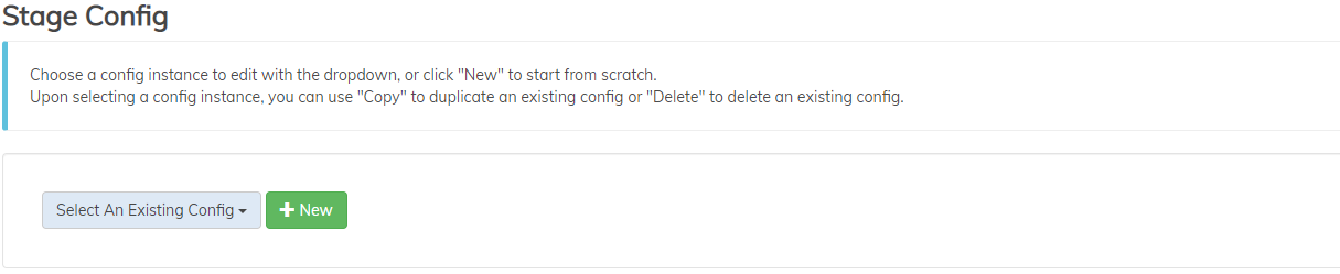
Add a trac config for every trac in the application. Select the appropriate search config and stage config that the trac will use.
Types Used In Trac:
Select the types this trac will use. This configuration is to tell Content Accelerator what trac to put documents on if there is no trac context. Content Accelerator uses the following logic:
- If coming from a trac-aware module, the document will be sent to the stage on the context trac. For example, searching for a document in the ‘Engineering’ trac, clicking on the document will take you to the document using the Engineering Trac’s stage config.
- If coming from a non trac-aware module, the document will be sent to the stage on the trac as configured in the trac config. For example, if the user clicks on an Engineering document in the Dashboard or in a Notification, Content Accelerator will look for any trac configs that contain the Engineering document’s type in the “Types used in trac” list. If only one trac is found, the user will be taken to the stage for that trac. If the Engineering document’s type is found in more than one trac, the user will be given a choice as to what trac to use.
To limit what users have access to each trac, see this.
Trac Security
Security can be configured at the trac level to limit what groups are allowed to access each trac. See here for further information.
Event Logging
A single option to turn event logging on or off. If on, log files will be kept on the server that can be used to see performance statistics across the application. For example, if a user launches a document in the Stage using Enterprise Viewer, the load statistics would be recorded (how long the document took to load).
Views
This section covers Views, the different areas of the application a user can navigate to.
Dashboard
The Dashboard is a powerful View that, when configured, is usually the first place a user is taken upon logging in to the application.
Sample Dashboard:

Dashboard Main Settings
In this section, choose how many columns to allow on the Dashboard and whether users may rearrange their Dashlets.
Dashboard Tab Settings
This section allows for the creation of multiple Dashboard tabs. Each tab can have different dashlets and a dashlet can be used on more than one tab if desired. Tab configurations can also supersede the general configuration in terms of number of columns. For example, the general configuration can be set to have 2 columns but a Tab can be configured to have one dashlet and for that individual Tab to be configured to have a single column.
Dashlets
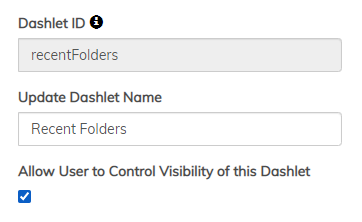
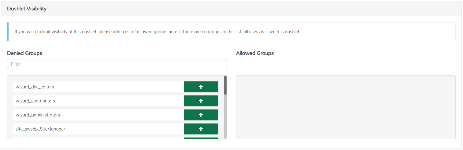
All dashlets have a few common configurations, these include the display name, whether an individual user wants the dashlet to be displayed and which groups should have access to the dashlet. There are 9 different types of dashlets that can be configured. Below is a description of each.
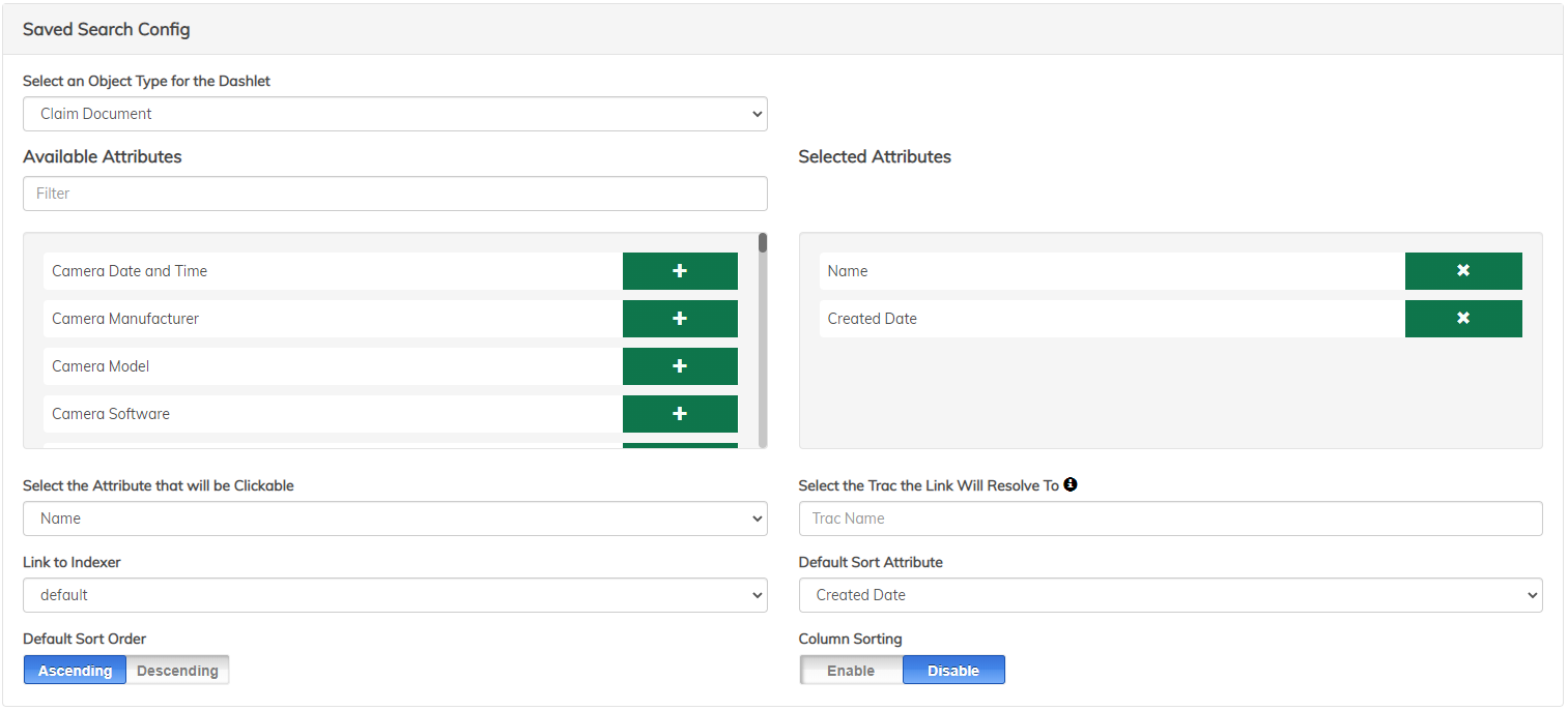
Saved Search
This dashlet can be configured to run a search and display the results on the dashboard. It includes the following configuration options:
-
Search Config
-
Select Object Type
-
Select visible attributes
-
Select “Linked” attribute
-
Select sort attribute and order
-
Link to Indexer (only used if the saved search is an indexing queue)
-
Trac to resolve to (only necessary if the object type is used on multiple tracs)
-
Allow users to sort the columns themselves
-
-
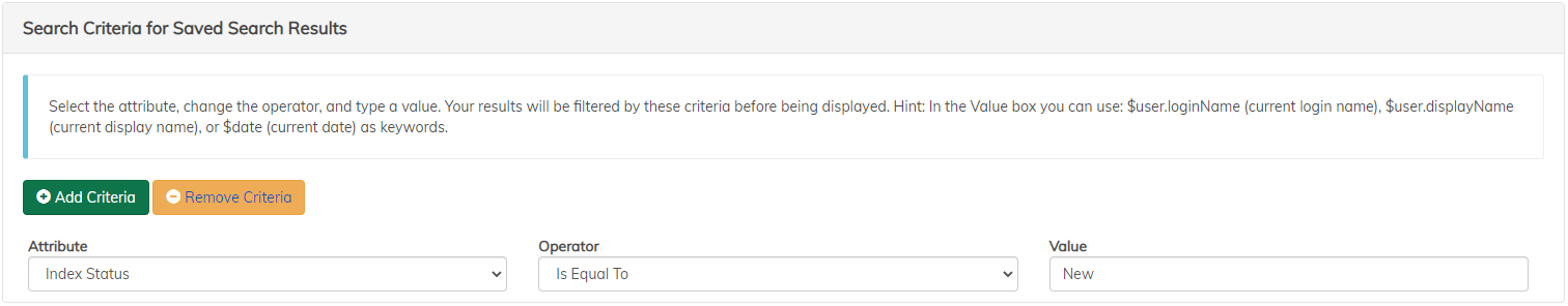
Search Criteria
-
Configure the search by adding criteria
-
Each criterion has an attribute, an operator and a value
-
There are 3 special values available:
$user.loginName(current login name)$user.displayName(current display name)$date(current date)
-
Below is an example of the Saved Search Dashlet custom configuration.
Recent Objects
Configure a dashlet to show the last 5 or 10 items (folders or documents) that the user has viewed in the stage. After choosing folders or documents, select the desired object type and properties to be displayed in the dashlet.
Inbox
The Inbox dashlet will allow users to see both individual and group Activiti Workflow tasks that are assigned or available to the current user. This dashlet doesn’t have any extra configuration.
Active Wizard Inbox
The Active Wizard Inbox will show individual and/or group Wizard Workflow tasks for the current user. The Admin has the ability to show only individual tasks, only group tasks or both individual and group tasks.
Reporting
The Reporting dashlet displays line, bar, and pie chart reports of repository-based metrics. Any metadata that is stored in the repository can be reported on, so it is frequently configured to show trends in incoming content, workflow task actions, and deadline readiness.
Some example high-level reports are:
- Vendor submissions that were “right first time”
- Documents approaching a periodic review date
- Content created by type in the past month
- Number of documents owned per user
- Items submitted on-time vs. late
A Reporting dashlet is configured similarly to a Saved Search dashlet, in that the data populating the graph is driven by configured queries. While there are many configuration options, the basic steps to creating a reporting dashlet are:
-
Add query terms - Each query term is a query that will be run to plot one component of the graph. For example, to create a graph comparing incoming pharmaceutical batch documents that were right the first time vs. requiring rework, create two query terms: one for the Batch Documents with property
RFT=true, one for Batch Documents with propertyRFT=false. -
Configure query terms - Each term can contain many query criteria that are ANDed together to generate the query.
-
Add term
-
Select metadata field to query on
-
Select operator
- Equality operators (
Is Like,Is Equal,Is Not Equal) - Enter a value next to the operator for comparison. Tokens$user.loginName,$user.displayName,$dateare supported. - Date range operators (
Within,Past,Next) - Enter a number and a time interval. - Distinct - This is a special case that should be used when looking to plot all values of a property, without creating a term for each possible value. This is useful for when there are many possible changing or unknown values, such as user names. Consider the example of Claims per Claimant.
- Equality operators (
-
-
Configure graph properties - There are two broad categories of graphs: Snapshot and Date Range. Static graphs capture the results of the queries configured above for the current moment, while Date Range graphs will run the configured queries for various time intervals and plot the results over time.
Date Range graphs must be bar or line charts, and must additionally specify a date property to plot against such as Created Date, Approval Date, Modified Date, etc.
Graph properties such as title, axis labels, and color variation can also be configured.
Workflow Reporting
This dashlet will give detailed reports on Active Wizard Workflows, including any workflow the current user is an approver for, the history of pending workflows and workflows with tasks available for groups the user is a part of.
Incomplete Tag Dashlet
A visual representation of Folders that are missing any number of required documents. To configure, select the desired Object Type to search on, and then select the number of results to show.
IFrame Dashlet
This dashlet is a simple IFrame that can be configured by the Admin to display an external URL on the dashboard. For example, a view from an external performance application can be configured to load in the IFrame.
Notifications
This dashlet visualizes the current user’s Activiti notifications. This dashlet doesn’t have any extra configuration.
Search
When creating a new search configuration consideration, you are generally creating a search tool for a particular object type. Different types generally have very different relevant metadata, and therefore separate search configurations.
A search configuration can also represent an entire Trac, with each of the trac’s types searchable from a type dropdown.
Finally, composite searches can be set up, which will use the same search criteria to search across the repository and deliver type-agnostic results. This is a less common strategy.
There are various components of search that are separately configurable.
Search Main Settings
High-level search settings including:
- Search form to display - This is an important configuration, as it is the search form that will be displayed and drives the setup of several other search components.
- Limit search results to - If lower than the repository setting for number of search results returned, this value will restrict search results. If higher than the repository search results settings, the repository value will be used. In other words, this setting cannot allow for more search results than the repository is set up to return.
- Enable type-to-path security - For each type in the selected search form, a user can indicate a repository folder path (generally the path to the folder being searched) to pull the security setup from. Basically, this allows search to use repository folder level security to determine who can perform the configured searches.
Sidebar Settings
Sidebar settings relate to the left-hand search tools beyond the Advanced Search form. The following settings are available for configuration:
- Quick Search - Quick Search leverages Solr full-text indexing in order to allow a user to perform a free-form search against all properties and content. This is commonly enabled in addition to property-based Advanced Search.
- Saved Search - For commonly run searches, users can save their entered search terms and execute them with one click for all future searches.
- Public Saved Search - This allows users to make their Saved Searches available to all users that have access to that search. An admin group or groups that have the ability to modify public saved searches can also be configured.
- Alfresco Enterprise Viewer Search Term Highlighting - If Quick Search is enabled, and used to search a document’s content, that search term will be highlighted in the content when the document is launched in Alfresco Enterprise Viewer.
Attribute Search
Search > Configure Search Modules > Attribute Search
The Attribute Search section covers the configuration of the property-based search form. To configure, for each type in the selected form:
-
Toggle the “Enabled” switch under Attribute Search Controls.
-
Configure the default sort attribute.
-
Configure sort attribute and order.
-
Configure whether to allow search on all versions, which determines whether all versions or just the current version are brought back in the search results.
Search on all versions will only work for ACS documents that utilize the Chain Versionable Module. Out of the box, this is only the
Controlled DocumentandQuality Documenttypes that are included in Policy and Procedure Accelerator. If search on all versions is configured for a type that does not use Chain Versioning, the slider will appear but will not search across versions when enabled.
- If search on all versions is allowed, select whether it should be the default method.
Search Results
There are several functional components of search results.
General Table Configurations
Search > Configure Search Modules > Search Results
- Timing Data - Display timing data on how long the search took to run. Additionally, configure time ranges for what a good, medium, and bad response time are.
- Object Icon - Enable the mimetype icon to be displayed next to the object name
- Export Via Email - When enabled users can execute a search and export the results to an Excel spreadsheet that will be emailed to them.
- SlickGrid Display Options - SlickGrid is the dynamic table tool used to display search results. You are able to configure 3 different options:
- Synchronous Resize - Slickgrid will continually resize the column as you drag, vs, waiting until you stop dragging
- Enable Force Fit in Dual Pane - when selected it will resize all the columns if the table changes size when launching a document in Dual Pane mode (utilized by View All Documents in the Stage)
- Enable User Controlled Force Fit - When enabled, users can choose to force all visible columns in the table to avoid having a horizontal scroll bar
Type Specific Configurations
Search > Configure Search Modules > Search Results > Type Configurations
This section dictates the table configurations specific to each search result type, such as columns displayed, linking to stage, etc. For each type configured in the form configure the following:
-
Search result opt-in features
- Show Thumbnails in Table View - If selected search results in the table view that have a thumbnail will display the thumbnail.
- Enable separate thumbnail view - Will enable a grid-style thumbnail view in addition to the table metadata view. This is great for image-based scenarios.
- Sort repeating attributes - Repeating attributes appear as comma-separated values. This will sort the comma-separated values alphabetically.
- Enable Reset Button - Users can order or hide columns for the search results table, and those local configurations are stored under their user preferences. Reset clears out search-related user preferences, and resets the look of the table to the default.
- Enable standardized table view - When enabled, users can click this view and ALL users will see the exact same table sorted the exact same way.
-
Result Link Display Attribute - Configure which attribute in the table should be clickable.
-
Indicator Icons - Configure icons that are displayed next to the Title attribute in the table if the criteria is met for a particular document. The most common scenario this is used for is displaying a lock icon next to checked out documents. This scenario is so common that its configuration is mapped to a single button click > “Add Lock/Key”
- Search result Link Resolver dictates where the user is taken when clicking a search result link.
- Stage - This is the most common setting, and will open the document or folder in Stage using the Stage configuration for the given Trac the user is on.
- Stream - open content stream in new browser tab
- Wizard - Wizard form stage is set up differently from normal content’s stage. In order for this to work, you must have a specific Stage configuration for Wizard Forms.
- DocViewer - A Viewer-only option, which excludes all actions/stage details.
- External Link - If configured you will be prompted to enter a base URL and then add in the objectId
${objectId}as a parameter. This is utilized if you want the search to launch an external application and pass in the objectId.
-
Search result attributes. These are the attributes that will be displayed as columns in the search results. There are two subcategories when configuring - hidden and visible. Visible columns appear immediately upon return of results. Hidden columns can be toggled to be displayed per the user’s preferences. Resetting to default will restore the hidden/visible fields configured in the admin.
-
Individual document actions These are the actions that appear in the right-click menu of a particular search result. The actions are executed on the selected document only (as opposed to Group Actions, which can be executed on one or more returned results).
To configure an action:
-
Select the action from the list of available actions
-
Once the action is selected, click the edit icon
-
The configuration section contains general action configuration, as well as options for the individual action. See the Action Configuration section for more details on how to configure specific actions.
-
Group Actions
Search > Configure Search Modules > Group Actions
Group actions can be executed on one or more search results using the checkboxes in the far left column of the search results table to select the desired results. Commonly configured group actions are Export Selected Results to Excel Report, Download as Zip, and Bulk Edit Properties.
To configure a group action:
-
Select the action from the list of available actions
-
Once the action is selected, click the edit icon
-
The configuration section contains general action configuration, as well as options for the individual action. See the Action Configuration section for more details on how to configure specific actions.
Facets
Search > Configure Search Modules > Attribute Search
In addition to the standard filter bar to narrow down search results, facets can be configured to group search results based on returned values. While this is not good for unique or highly variable attributes such as ID or serial number, it can be helpful for categorization metadata, such as department.
To configure facets, simply select the desired attributes to facet on for each searchable type.
Restrictions
This section allows for configuration of additional query clauses that will be appended to every search run. The first levels to configure are group and object type applicable for the additional query terms, so it is generally used as a way to apply additional restrictions on visible search results for particular groups.
Advanced Search
Allows the administrator to configure advanced search forms for each object type in a given trac. Typically, the admin is configuring about 3-5 attributes a primary search criteria, with other attributes as secondary. Secondary attributes appear below the more fields button.
Stage
Configure how documents should appear in the Content Accelerator stage. This includes configurations for the following modules Search Result Traversal, Stage Info, Workflow Info, Related Objects, Folder Actions and Doc Viewer. As with search configs, stage configs are typically named with the trac name.
Stage info
Configure the at-a-glace properties that appear in the top-left corner for each content type in a trac. Can be configured for a containing folder or the document that is in the viewer.
Stage > Trac > StageInfo
Configuration options:
- Object type
- Document
- Select the Type of Document to configure from Current types not configured
- Once a type is selected, it is visible under Types that have Stage Info Configured
- To configure the stage info view of the selected Object Type, drag and drop the attributes from the not selected list to the selected list.
- Tab Title Configuration - Create a pattern for the stage title that will be resolved based on the object in the stage. This will basically be the browser tab title when the document is opened in stage.
- Folder
- Select the Type of Document to configure from Current types not configured
- Once a type is selected, it is visible under Types that have Stage Info Configured
- To configure the stage info view of the selected Object Type, drag and drop the attributes from the not selected list to the selected list.
- Tab Title Configuration - Create a pattern for the stage title that will be resolved based on the object in the stage. This will basically be the browser tab title when the document is opened in stage.
- WebService
- Document
Search Result Traversal
This option can be turned on to allow users to navigate through the search results without leaving the Stage.
Workflow Info
When this option is configured on, if a document is in a workflow, the detailed information of the workflow will be displayed in the left sidebar.
Related Objects
The Related Objects section of the stage allows for organized quick links to relevant content. There are several methods for configuring related objects, which allow for relations to be set up within the folder or with content in a completely different area of the application. Below is a breakdown of the common ways to configure related objects.
- Query Based - This style is used to set up a relationship between the content in the stage and another useful grouping of content that does not have a formal repository relation. It is used to link content with similar metadata, for example insurance claims made in the same year as the current claim.
- Relation Based - This configuration is based on actual repository-level relations between content. For example, in a quality scenario there is an Alfresco relation between a change request and the content the change request relates to.
- Folder Tags - This is a strategy for organizing content within a folder as opposed to outside a folder. Documents in a folder are tagged on import, generally by subtype or other descriptor, then are grouped by tags in the related objects section.
- External Relations - This is a lesser-used strategy that generally requires some customization. It takes an external endpoint and will display objects returned from the request.
For further information click here.
Folder Actions
Configure the available actions on the folder loaded in the stage. See the Action Configuration section for more details on how to configure specific actions.
Document Viewer
Content Accelerator contains support for several specialized content viewers, and support for various renditioning, download, and markup strategies. These components can be configured in the Document Viewer configuration section.
Viewers
Stage > Select Trac > Configure Stage Modules > DocViewer
Available Viewers (RE-ORG W/ PRIORITY)
Note: Multiple viewers can be configured at a time, and will automatically be used based on the content formats they support. If multiple configured viewers overlap in supported formats, the first configured will take precedence.
| Viewer | Description |
|---|---|
| Alfresco Enterprise Viewer | This is the default and recommended document viewer. It supports high-speed collaborative markup, redaction, indexing, large documents, reordering, and secure viewing. Supported formats: .pdf, .jpg, .gif, .png Additional Options: Configure the default mode Alfresco Enterprise Viewer opens in: (default) Annotation Mode - Add annotations to the document Indexer Mode - Select text on the document to quickly populate document metadata Open Viewer Mode - View just content without annotations, etc. Redact Mode - Block out sensitive data Signature Mode - Enables signing the PDF rendition |
| Alfresco Enterprise Video/Audio Viewer | This is the default and recommended viewer for video and audio. It supports high-speed collaborative markup of mp3 and mp4 formats. Supported formats: .mp3, .mp4 |
| Image Viewer | Image viewer creates a standardized image viewing experience. In general, it is configured in addition to Alfresco Enterprise Viewer, with precedent for image types. Supported formats: .gif, .png, .jpeg |
| XML Viewer | XML Viewer allows XML files to be streamed in a standardized viewing platform. If configured with another viewer, it will be automatically launched if XML format is detected. Supported formats: .xml |
| HTML Viewer | HTML Viewer allows HTML files to be streamed in a standardized viewing platform. If configured with another viewer, it will be automatically launched if XML format is detected. Supported formats: .html |
PDF.js Viewer |
A standard PDF viewer using Mozilla’s PDF.js library. This should only be configured if Alfresco Enterprise Viewer is not available. |
Video.js Viewer |
A standard video viewer using the video.js library. This should only be configured if Alfresco Enterprise Viewer Video is not available. |
| DICOM viewer | The DICOM viewer allows .dcm files to be displayed and interacted with via a DICOM specific viewer. The DICOM viewer includes a slider bar for interacting with images. As the slider bar is moved, the images move accordingly. To use the slider bar, first use your mouse to select the bar, then use your mouse or arrow keys to move left or right and see the image progress. |
Additional Viewer Configurations:
Renditioning:
- Elevate Renditioning Priority for Folder
- Enable View Time Renditioning - Enable this option if types utilized in this trac do not have the
tsg:renditionedaspect applied and require view time renditioning functionality. Note that all ACA Accelerator types are pre-configured with thetsg:renditionedaspect and do not require view time renditioning. Therefore, you only need to enable this option for out of the box accelerator types. - Rendition Check Period
Configure:
- Which file types should be streamed vs. downloaded in Content Accelerator.
- Actions that should display above the document when loaded in the stage. See the Action Configuration section for more details on how to configure specific actions.
- Whether to burn in Annotations when viewing PDFs.
Additional Properties
Other items that can be configured in the Doc Viewer include:
- Rendition Check Period - How often the viewer should check the back end to see if a document has had a rendition generated.
- View-Time Renditioning - If enabled, and the current document doesn’t have a PDF rendition, then the Content Accelerator will automatically request a PDF rendition be made for the document.
- Attribute to Show - Configure this to be the OCName of an attribute and if the document has that property it will be displayed as the “Name” of the document in the upper right-hand corner of the Viewer.
- External Launch Toggle - When enabled there will be a launch arrow in the upper right corner of the viewer which will open the document content in a new window.
- Doc Viewer or Browser - If External Launch Toggle is enabled, then when the content is launched in a new window you can configure it to be just a regular browser viewer or the Doc Viewer.
Document Actions
Configure actions that can be performed on the document being viewed in the Stage. See the Action Configuration section for more details on how to configure specific actions.
Actions
Document Actions are the grouping of actions that appear above the content in the stage. Each of these actions performs an operation on the document in the viewer, as opposed to the containing folder.
Stage > Trac > DocViewer > Actions
Folder Actions are the grouping of actions that appear to the left of the viewer. Each of these actions performed an operation at the folder level as opposed to on a particular document.
Stage > Trac > FolderActions
Configuring an action:
-
Select the action from the list of available actions
-
Once the action is selected, click the edit icon
-
The configuration section contains general action configuration, as well as options for the individual action.
Common action configurations: (snapshot with various sections)
-
Change action name and subtitle
- Set the action handler to change the action launch method
- Modal will open the action as a popup, keeping the context of Content Accelerator in the background. If the modal action handler is configured, modal size can also be adjusted.
- Right-side will open the action to the right of document viewer
-
Set the default action to launch when navigating to the folder level. This is commonly set to View All Documents, which displays a list of documents in the selected folder.
-
Set the action icon
- Toggle whether the action’s permissions are evaluated in “Why Can’t I…”, which will indicate to the user what requirement is preventing them from executing the action.
For more detail on configuring actions, see the Action Configuration section.
Collections
Collections is a View that can be configured by the Admin as a way to show a group of unrelated documents in a single results table. In order to configure collections select the Document Object Type then proceed to configure it the same way you would configure Search Results and Group Actions. If you select an Object Type that is not the top level Document type, collections will still work however depending on the individual objects that get added to the collection, not all metadata will be populated in the results table.
Indexer
Please note that this feature is experimental and is being evaluated for future full inclusion. Currently supported for customers via a Services Arrangement only.
The indexer view is a side by side viewing of a document and a form. It allows a user to select text directly from the document (document must be OCRed) and populate metadata. Indexer configs can be selected as views from a Saved Search dashlet. There is a configuration on the Saved Search dashlet to select an Indexer Config, when selected, any link clicked in the Saved Search dashlet will bring up the document in the Indexer view (instead of Stage view).
Common Configuration
- Allow the user to change the Object Type within the Indexer view. This ability is used when a document gets uploaded with a generic Object Type and it’s the user’s job to determine the sibling or subtype it should be.
- Auto-Save changes in the Indexer. When configured on, any time a user changes focus from one field in the form to another, Content Accelerator will automatically save their progress back to the server.
Type Configuration
When configuring an Object Type on the Indexer view, there are several configurations to review.
- Record Position Data. This will automatically set the positional data on the document as metadata when the document is indexed.
For each type you configure, you can set attributes on the document automatically once the user clicks the document and after the user is done indexing the document. Depending on how the user filled out the form (valid or invalid) you can automatically set different values. The most common example of this is to set the Index Status attribute to “Indexing” when initially clicked and then either to “Done” or “New” depending on if the user filled out the form completely or not.
For each attribute you are setting you have the ability to configure whether to process that value, for instance there might be a certain attribute you only want to set if the form is valid and if the form is invalid you don’t want anything to happen to it at all. A common example of this would be if a user successfully indexes a document (form is valid) you’d want to set the Indexed By attribute to that user, however if it was not indexed successfully (form is invalid) you don’t want to set that attribute at all.
There are a few special values you can set:
${currentUser}- The current user performing the indexing${currentDate}- The current date at the time of indexing
Activiti Workflow
Content Accelerator comes with many out of the box Activiti workflows. These workflows can be configured to allow for more customization. In Workflow config, an Admin can select a workflow to configure and depending on the workflow, the Admin can confIgure different Ad Hoc Forms to display for each step of the workflow.
All workflows have a “Start Form”, this is the form that is displayed when the user is starting the workflow. Most forms have at least one other opportunity for an Ad Hoc Form to be displayed, whether it’s an approval or review task or just a complete workflow task, the Admin has the ability to display an Ad Hoc Form for each step of the workflow.
Active Wizard
This section of the document explains tasks associated with users who are allowed access to the Active Wizard Admin application.
Administrative User Tasks
Administrative users have the ability to create new, dynamic Form Templates and make them available for contributing users to work with. Additionally, administrative users are allowed to edit, copy, and delete existing Form Templates.
Working with a Form Template
To navigate to the Form Template administration portion of the application:
- Click the Admin tab to bring the administration pane to the front
- Click the Manage Form Templates link
This screen is the landing page for Form Template administration. From here you may either select an existing Form Template to work with or create a new one. Each existing set can be found in the Form Templates dropdown, which is ordered alphabetically.
Creating a New Form Template
To create a new Form Template:
- Click the new button on the Manage Form Templates page
- Enter a unique name for the Form Template title
- Select the type of output that is to be generated by instances of the Form Template. By default only XHTML is enabled.
- Click the continue button
Form Templates are tracked by their name, so the application requires you to enter a unique name. If the name you entered has already been chosen, the page will refresh informing you to choose another name.
Upon clicking continue, you will be taken to the Edit Form Template screen.
Selecting an existing Form Template
To select an existing Form Template to edit:
- Select a Form Template title from the Form Templates dropdown
- Click continue
Upon clicking continue, you will be taken to the Edit Form Template screen.
Editing a Form Template
Creating Form Templates requires working with the set at two different levels: the Form Template as a whole, and the individual page. To allow contributing users to create instances based on the Form Template it must be published and activated. A set may also be copied into a new set or deleted.
Working with the Form Template can also be thought of as working with a collection of pages. You may create, modify, and rearrange pages. Additionally, you may make certain pages required and others hidden until specific criteria are met. For information on how to work with an individual page including creating and modifying pages, see Working with an individual Page and its Inputs.
Checking out a Form Template
To check out a Form Template:
- Click the check out button at the bottom of the Edit Form Template screen
When you check out a Form Template, a small key icon appears next to the Form Template name. Hovering over this icon displays a tool tip informing you that the set is indeed checked out by you. Checking out a Form Template also enables other features to manage the set, including copying and deleting.
If you enter the Edit Form Template screen of a set checked out by another user, a small padlock icon is displayed where the key icon would normally be displayed. Hovering over this icon displays a tool tip informing you of the user who currently has the set checked out.
Checking in a Form Template
To check in a Form Template:
- Click the cancel all changes button, or
- Click the save all changes button
Clicking the cancel all changes button discards any changes that have been made to the collection of pages, including any new pages added during the checkout. The set is then available for any administrative user to check out.
Clicking the save all changes button saves any changes that have been made since the set was last checked out. The set is then checked in and is available for any other administrative user.
Setting Form Template Options
To change the options on a Form Template:
- Ensure that the source Form Template is checked out to you
There are several options that can be set on the Form Template to change the overall behavior.
The completed pages required option determines whether all reached pages must be completed in the Form Template in order for the Form Template to be submitted from the Summary page. This option is particularly useful when implementing Stop Pages, or to enforce that every required page in the Form Template is visited before the form is submitted.
The all questions required option determines whether a page must have all its questions filled in out in order to fully complete the page. By unchecking this checkbox, logic that checks whether all questions have been answered is disabled.
The above two options allow a variety of behaviors to be implemented in a Form Template.
- Neither “Completed pages required” nor “All questions required” is checked: Verification of Form Template answers is minimal - a user is not required to visit all the pages or provide answers to any of the questions.
- “Completed pages required” is checked, “All questions required” is unchecked: No warnings about unanswered questions are given to the user while completing the Form Template; however, the Form Template cannot be completed unless all pages have been viewed.
- “Completed pages required” is unchecked, “All questions required” is checked: Warnings about unanswered questions are given to the user, but the user can complete the Form Template at any time from the Summary page regardless of missing answers.
- Both “Completed pages required” and “All questions required” are checked: Full verification of Form Template answers is done. The user cannot complete the Form Template unless all questions have been completed on all of the visible pages.
Note that if all questions required are not checked, you can still control which questions are required on a question by question basis.
The workflow active option determines whether workflow is active for this particular Form Template. This allows for certain Form Templates to use workflow while others do not. Note that workflow must be enabled in the wizard configuration for this option to have effect - enabling workflow here does not override a workflow disabled system-wide setting.
The instance type field allows you to modify which object type will be used for all Forms. You may choose Page Set Instance (default) or any subtypes. This object will be used when determining which attributes can be driven by a page input.
For Form Templates used in the streamline view, you can specify the name of a confirmation document if you do not wish to use the default.
Copying a Form Template
To copy a Form Template:
- Ensure that the source Form Template is checked out to you
- Click the save as button
- Enter a new, unique name for the destination Form Template
- Click continue
- Choose whether to continue editing the source set, or begin editing the destination set
Initiating the save as functionality makes an exact copy of the Form Template as it was the last time it was checked in, the only difference being the name of the set. Any changes that have been made since the set was checked out will not show up in the destination set.
Note: To make changes to a set and then copy those changes over to a new set, first click the save all changes button, and then re-checkout the set and click the save as button.
The name of the new set must be unique, as is required with any new set. If an invalid name is entered in the Form Template title, the page will refresh informing you to select another name.
Note: If you choose to begin editing the destination set after making a copy, the source set will remain checked out to you until you return to check it back in. The set will be unavailable to other administrative users until this time.
Deleting a Form Template
To delete a Form Template:
- Ensure that the Form Template is checked out to you
- Click the delete Form Template button
- Confirm the delete by clicking Ok
- Choose whether to return to the main menu, or select another Form Template to work with
By deleting a Form Template, you will be removing all records of the set’s existence from the application. This frees up the name held by the Form Template and makes it available to be used in new sets. If you click the Cancel button on the confirmation popup, the set will remain unchanged.
Deleting a Form Template also removes any published versions of the set available to contributing users. However, any existing Forms that are based on the deleted set will remain untouched.
Publishing (Versioning) a Form Template
To publish a Form Template:
- Click the publish button
- If the set has been published previously, choose a version number to attach to it
- Enter a comment in the Comment textbox
- Click the publish button
Publishing a Form Template takes a snapshot of the set as it was the last time it was checked in. Any new pages added will not show up in the published version unless save all changes have been clicked. The version of the Form Template published will be available until the set is deleted.
Except for the first publishing, you will have the option to choose the version number attached to the Form Template. The first publishing attaches the version 1.0. All subsequent publishes will allow you to choose from either a minor (1.0 to 1.1, 1.1 to 1.2) or major (1.0 to 2.0, 1.6 to 2.0) version number. The comment should generally be used to identify the major changes that were made to the Form Template since it was last published.
Managing published versions of a Form Template
To activate a version of the Form Template for use by contributing users:
- Click the manage versions button
- Select a version of the Form Template to activate
- Click the radio button next to the version to select it
- Click the make active button
Activating a Form Template makes it available for contributing users to base Forms off of it. You may also make the Form Template completely unavailable by checking the none option and clicking the make active button. You may also revert to a previous version of the Form Template at any time.
Changing the version of the activated Form Template only affects Forms that are created new. Any existing sets that are based off of other versions will remain untouched.
Filtering Sub Pages by category
To filter the sub-pages table by category:
- Choose a category from the dropdown on the top right of the Sub Pages table
- Click the change button
Once a page has been assigned a category, and the Form Template has been checked in, the category will appear as an option in the dropdown. Clicking the change button after a category has been selected refreshes the page and filters the Sub Page table by that category. The VIEW ALL option shows all sub-pages that have been created.
Changing Whether a Page is required
To make a page required:
- Select the desired page by checking the box next to its title
- Click the up arrow located in the top left-hand corner of the Sub Pages table
Making a page required ensures that users creating a Form off of this Form Template will be required to provide inputs to the page before an output process is initiated.
To make a page not required:
- Select the desired page by checking the box next to its title
- Click the down arrow located in the top left-hand corner of the Required Pages table
Making a page not required makes it unavailable to users creating Form Templates instances off of the Form Template unless certain criteria are met. For more on how to use required pages to lead to sub-pages, see Working with an individual Page and its Inputs.
Note: For users creating Forms to see changes made to the requirement of pages, the changed version of the Form Template must be published and activated.
Reordering Pages
To change the order of the required pages:
- Click the reorder button on the top right of the Required Pages table
- In the popup window, select the desired page
- Click the up or down arrow icon to change the page order
- Click reorder to accept the new ordering, or cancel to cancel the reordering
Note: For users creating Forms to see changes made to the order of pages, the changed version of the Form Template must be published and activated.
Deleting Optional Pages
To delete an Optional (non-required) Page:
- Check out the Form Template
- Click the scissors’ icon for the page to delete
Note: A page cannot be deleted if it is led to by another page. If this is the case, a message will be displayed showing the user which pages need to be modified before a delete operation will succeed. If the page contains certain actions, such as Mpower variable mappings, a warning will be displayed to the user.
Working with an Individual Page
This section covers creating and managing individual pages.
Creating a new Page
To create a new page:
- Check out the Form Template by clicking the check out button
- Click the new page button
At this point, you will be taken to the Manage Page screen. From here you may specify data about your page, including title, category, and description. See the next section, Editing a Page, to continue.
Editing a Page
After creating a new page, you are taken to the Manage Page screen where you may begin to edit the page’s contents. If you are attempting to edit an existing page, you must first enter the Manage Page screen.
To edit an existing page:
- Click the edit icon next to the desired page
The Manage Page screen is the right of the two frames on the page. The left pane allows you to navigate through the page’s inputs, options, and actions. For more on page navigation, see Navigating a Page.
In the Manage Page screen there are three text boxes corresponding to the page category, title, and description. You must specify a value for each of these fields to continue. A category may be chosen from the list of values in the dropdown, or a new one may be specified by clicking the new button.
Once you have entered data in these fields you are able to save your progress or move on to providing values for new questions, answers, and actions.
There are also multiple optional page-specific parameters, including reference document (specify the name of a document in the docbase to be linked or shown in the page), hide this page in PDF output, include an Outlook contact drop area, and enable cookie tracking.
Hide this page in PDF output
Selecting this box will cause the answers from this page to be hidden in the default PDF output as well as the summary page of the form.
Question Groups
Each page can contain up to one repeating and one non-repeating question group. A repeating group denotes a set of questions that often will have repeating values (such as the information about multiple people), and is used instead of repeating pages. This checkbox denotes that the block itself requires an answer or not.
To select questions to belong to this group, leverage the group column in the question table at the bottom of the page. Click the checkbox for any question that should belong in the group. Note that currently only textbox, date, and select boxes that are not driven by a query are available to be used in question groups. Additionally, answer actions applied to values in the select box will not be applied within a question group.
A non-repeating question group will display the grouped questions in a separate area with the non-repeating group label specified.
Stop Pages
It may be desired to enforce that a user cannot finish filling out a form. By creating a page with no questions on it, a “stop page” is created. This is often reached by adding an action to a question that leads to another page. Once this page is reached, the user will be prohibited from submitting the form from the Summary page as long as the “Completed Pages Required” option is enabled on the Form Template.
HTML Text
The administrator can write HTML in the following parts of a page that will display Rich Text for the user:
- Page Description
- Reference Link Label
- Question Label
- Answer Label (Checkbox/Radio Button only)
- Checklist
- Help Text
Note that only the following HTML tags are supported.
Note: All HTML tags MUST have closing tags, they may NOT have a single tag close itself.
- Bold -
<b></b> - Italic -
<i></i> - Underline -
<i></i> - Paragraph -
<p></p> - Font -
<font></font> - Link -
<a href="..." target="_blank"></a> - List with no
<ul>or<ol>wrapper -<li></li> - Image -
<img></img> - Line Break -
<img></img>
The following escape characters are also supported:
<-<>->&-&
Previewing an existing Page
To preview an existing page:
- Click the preview icon next to the desired page
A new window will open showing the page as it will appear when a user is creating a Form. The inputs on the page are unlinked from their actions, so no validation is performed on the answers.
When finished with the page preview, click the close button or the X close button in the corner of the popup.
Navigating a Page
Navigating through a page can be done in one of two ways:
- Using the navigation pane on the left, or
- Clicking the buttons in the details’ pane on the right
The navigation pane displays a Windows Explorer-style tree structure with nodes representing each input, option, and action. Each of the nodes in the tree is collapsible and expandable.
To view the details’ pane for any input, option, or action:
- Click on the corresponding node in the left navigation pane
Clicking on the link to an input, option, or action immediately refreshes the details pane without saving the information on the current page.
You may also navigate through a page by clicking the lower buttons in the details’ pane on the right. Clicking save changes or save and continue updates the page with the current information and takes you to the next higher-level component, if applicable. For example, when editing an input, clicking the save and continue button saves your changes temporarily and returns you to the page detail.
Clicking the cancel button returns you to the next higher-level component without saving modifications made to the current component.
Clicking the new <component> creates a new component and takes you to the details screen for that component. For example, when editing an input, clicking the new option button creates a new option and brings up the Manage Option details screen.
Saving your progress
To quit editing a page, and return to the Manage Form Template screen:
- Click the save button in the left navigation pane, or
- Click the cancel button in the left navigation pane
Clicking the save button saves all changes made to the page and stores the page in the application. The save button is only enabled when a change to the page, or its inputs, has been made.
The cancel button requires confirmation, and upon clicking Ok, all changes are discarded, and you are returned to the Manage Form Template screen. Clicking Cancel on the confirmation popup returns you the page with no change.
Working with Questions, Answers, and Actions
The question display text will be displayed to users while interacting with a Form. The display text is generally written in the form of a question, with the answers providing the available options to the question.
The label is used in the left navigation pane to save space while still identifying the question from others. Question labels should be unique within the form template.
Questions
To create a new question:
- Ensure that you are on the Manage Page screen
- Click the new question button
- Enter a question label, display text, and type
- Add answers if necessary
- Click save and continue
The type of question may be one of the following:
- Checkbox
- Radio button
- Select box (dropdown)
- Multiple select box
- Textbox
- Text area
- Multiple textbox
- Date
- The options button is enabled on Date fields to allow for blackout date ranges
- File
- Calculation
- The options button is enabled on Calculation fields to set up the calculation
- WYSIWYG text input
- This input type allows the user to enter data into a rich text editor
- Note that this field is only recognized when using the embedded flex Active Form control or Active Wizard Lite. If you are using classic Active Form, these fields will display as text areas.
- See the documentation in Active Wizard – Installation Guide under the
wizard-config.xmlsection,active-form-viewproperty.
To edit a question:
- Ensure that you are on the Manage Page screen
- Click the edit icon next to the desired question
To delete a question:
- Ensure that you are on the Manage Page screen
- Click the delete icon next to the undesired question
- Confirm deletion by clicking Ok
Deleting a question permanently removes it from the page. Clicking the Cancel button on the confirmation popup returns you to the page with no changes being made.
Working with User Input Masks
When managing a question, the user has the option to specify an input mask. These masks enforce a pattern on user input into the wizard. The following input masks are available out of the box:
- At Least 3 Characters
- Currency (USD)
- Email Address
- Number
- Phone Number
- Phone Number or N/A
- Social Security Number
- Time
- Military Time
- Zip
Since input masks only pertain to values inserted into the wizard, only the following input types are affected by masks:
- Textbox
- Text area
- Multiple textbox
Managing Required and Disabled Questions
On the manage question page, there is a section where the administrator can control whether the question is required and/or disabled.
Required / Not Required
Before discussing this question setting, we must first examine the all questions required setting at the form template level:

If the above box is checked, then the setting at the question level is ignored. All questions will be required. However, if the above checkbox is not checked, then the setting at the question level will be evaluated:

Assuming that all questions are not required at the form template level, then questions marked required will be required the question module, and will be marked with a red *.
Disabled / Not Disabled
Disabled questions can be controlled through the following setting on the Manage Question page:

Questions marked as disabled will not allow user input. At this time, disabled questions must be populated through another process. Typically, this is done through an application customization.
Answers
To create a new answer:
- Ensure that you are on the Manage Input screen
- Click the new answer button
- Enter an answer label and value
- Click save and continue
The answer display text will be displayed to the user while interacting with a Form. The display text is generally written as an available answer for the question.
The answer value is used in the left navigation pane to save space while identifying the option from other options. The value also can be used as a secondary notation for the option. For example, if the option display text is entered as “1 Million”, the value could be entered as 1,000,000.
Answer values must be unique within the question.
To edit an answer:
- Ensure that you are on the Manage Question screen
- Click the edit icon next to the desired answer
To delete an answer:
- Ensure that you are on the Manage Question screen
- Click the delete icon next to the undesired answer
- Confirm deletion by clicking Ok
Deleting an answer permanently removes it from the page. Clicking the Cancel button on the confirmation popup returns you to the page with no changes being made.
Actions (Impacts)
To create a new action:
- Ensure that you are on the Manage Answer Action screen
- Click the new impact button
- Select the type of action to be performed
- Specify data for the type of action chosen
- Click save and continue
There are numerous types of actions that may be initiated when an option is chosen. Actions available for any given option or input are determined by the output type of the Form Template, the level (input or option) and the display type of the input. The following table lists the actions available for each combination of output type and display type.
Available Impact Types:
- Leads to another page
- Run a query
- Email Form
- Custom
To edit an action:
- Ensure that you are on the Manage Answer screen
- Click the edit icon next to the desired action
To delete an action:
- Ensure that you are on the Manage Answer screen
- Click the delete icon next to the undesired action
- Confirm deletion by clicking Ok
Deleting an action permanently removes it from the page. Clicking the Cancel button on the confirmation popup returns you to the page with no changes being made.
Working with Date Rules
The following functionality is supported:
- The selected date must be the same date or before the date in another question
- The selected date must be the same date or after the date in another question
- The selected date must be the same date as the date in another question
When the input type is ‘Date’, the options button becomes enabled to allow the administrator to set up date rules.
The following sections are available:
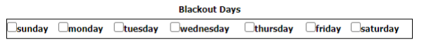
The blackout days section allows the administrator to specify that certain days of the week should not be available for selection. In the example above, Sunday and Saturday will not be available in the calendar.
Note: As of v3.4, blackout date functionality is reserved for future use.
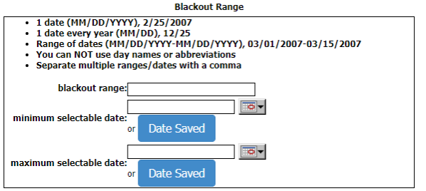
The blackout range section allows the administrator to set up more complex rules:
- Blackout Range – set a specific range of dates to blackout
- Minimum Selectable Date – this can be set to a specific date or “date saved”. If the date saved is selected, the minimum selectable date will be the date the user is filling out the form.
- Maximum Selectable Date – this can be set to a specific date or “date saved”. If the date saved is selected, the maximum selectable date will be the date the user is filling out the form.
For example, if users can only enter dates in the future, the administrator would set up the minimum selectable date to ‘Date Saved’.
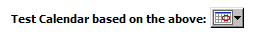
A test calendar is provided to test how the calendar will look to the user, based on all rules up to this point.
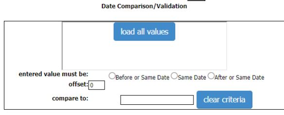
The date comparison section allows the administrator to set up date rules based on other questions in the form. For example, this can be used to specify that an answer to the “end date” question must be after the “start date” question. Simply select the question you want to compare to after clicking the load all values button (question selected must be a Date field), and select the operand value. Click the clear criteria button to clear out the question token if needed.
Click the save button to save changes. Date rules can also be deleted to return the calendar back to an open calendar if needed.
Working with Calculation Rules
When the input type is ‘Calculation’ the options button becomes enabled to allow the administrator to set up the calculation. The following sections are available on the Calculation Options screen:
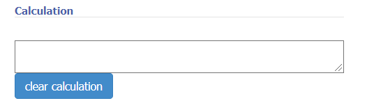
The calculation section displays the calculation that will be executed. This area is not editable since tokens are heavily used. To clear the calculation, click the button provided.
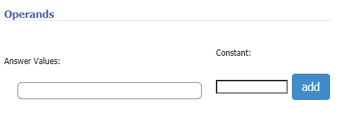
Operands of the calculation can be made up of answer values or constants. Therefore, two or more answers to questions can be used in the calculation, as well as constant values.
Note: that only questions with the number or currency mask can be used as an operand.
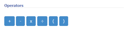
The available operators are addition, subtraction, multiplication and division. Parentheses are included to denote the order of operations.
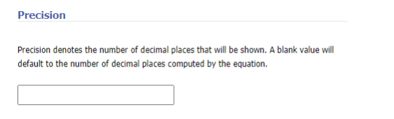
Precision is available to default a certain amount of decimal places on an answer. If this field is left blank, precision is turned off, and the entered value is not rounded. For currency, the precision defaults to two decimal places unless the precision is set differently.
After setting up the desired calculation, click the save button.
Working with Query Actions
A question can derive all or part of its answers from a server side query. Before setting up a query for a question, the administrator must first define the query in the Manage Queries section of the admin.
Note: If you are running a 3.x version of the wizard or if you are editing a form that was created with a 3.x version, you will not see the manage query page shown below. In Active Wizard 3.x, queries were defined each place they are used. See documentation from the 3.x version you have installed.
Query actions can be applied to an answer. The answer is used as a template for all results returned by the query. This template answer is not displayed to the user as a valid option. When using a database query, the answer value and display text are used to format the results based on column names.
For example, say we have a query that returns two columns: user_name and user_login_name. And, let’s say that we want each answer value to be the user login name and display to the user as User Name. In this case, we would set the following values:
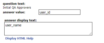
For each result returned, the wizard will replace the column names with the actual database values.
When using a web service type query, the answer value and display text do not matter. The web service is responsible for setting these values.
Once the template answer is set up, add a “Run a Query” action to the answer. The Manage Query page will appear. Once the page loads, the first task is to select the query to be run.
Select the query to run in the Query dropdown as shown above. You can type in the selectbox to narrow results if needed. Once the query is selected, the query information will be shown:

Query Placeholders
Some queries are created to use a placeholder value that can be filled in at the time the query is added to the question. For example, let’s say we only want to return users within a particular group, not all the users. Here, we’ve set up a query to filter users by group name:
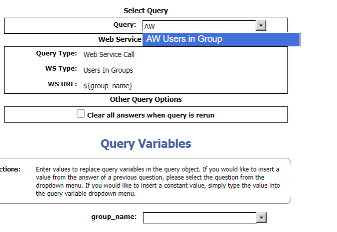
In the above query, there is a token, ${group_name} that is a “query variable”. There is a query variables section below that can be used to satisfy the filter:
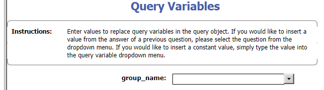
The control next to each query variable contains each question label in the form. There are two ways to fill the query variable – you can either select one of the given question labels, or type a literal value into the textbox.
For example, let’s say we want the group_name to be just wizard_doc_editors. We can simply type that within the input as a literal value:

However, we may want to drive the query variable from another question in the form. To do this, we simply select the appropriate question in the dropdown:
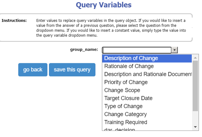
In this form’s case, the User Filter question is a simple textbox. By selecting the “User Filter” question here, the query will replace the ${nameFilter} token with whatever the user filling out the form puts in that textbox.
Note: When typing literal values into the textbox, be sure that the value you type is not the same value as a question label in the form. If this situation occurs, the wizard will use the value(s) set by the user, not the intended literal value.
Other Query Options
Queries also have a section for other options:
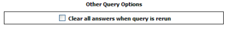
The “clear all answers” checkbox allows the administrator to control whether selected options should be cleared out upon returning to the page and rerunning the query. Note that this checkbox does not affect queries that pull data from the same page. This option is typically used when updates earlier in the form are frequently made after the query is run, and future visits to the page must clear out answers since previously selected answers are most likely invalid. This situation is rare but has come up before.
Leading to another Page
An action to lead to another page based on selected answers can be configured on a per answer basis. Multiple answers can lead to the same optional page, different pages, or no pages. If no action to lead to another page is specified, the next page in the flow path will be the next required page. If another page is specified via a chosen answer’s action, that page will be inserted into the flow path and visited next, prior to the next required page.
In order to support leading to another page using query-based answers, there is a field that allows the administrator to configure a value that the answer must match in order to invoke the lead to another page. For a static answer, this value can be blank, and it will always lead to another page if the answer is selected. For a query driven answer, where the value is not known until the page is rendered, this value field allows multiple answers to be defined for each expected value that will be returned by the query. In order to set multiple answers in the text box, delimit each potential answer with the token ~,~
Working with Email Actions
Email actions can be used to email the form PDF and any attached supporting documents out to any valid email address. When adding an email action, the following settings are available to the administrator:
The address source sets the email address for this email action. The administrator can specify a specific address by typing in the address box. If user input is selected, the user filling out the form will supply the address. If this is selected on a text-based input, the administrator should also apply the email mask to the question to ensure that the user enters a valid email address.
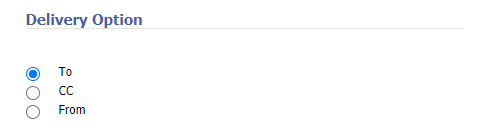
The delivery option lets the administrator configure how this address will be used in the email being sent. If an email is being sent out ‘To’ or ‘CC’ with no ‘From’, a system defined from address will be used. If more than one ‘From’ is tripped for a single email, the first one found will be used.
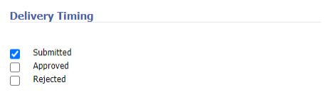
The delivery timing lets the administrator control when the email is sent:
- Submitted – send the email when the form is submitted for workflow
- If workflow is not used for the form, the email is sent when the user finishes the form
- Approved – send the email when the form is approved
- Rejected – send the email when the form is rejected
Working with Queries
Queries are managed separately from the question where they are used. This allows administrators to define a query once, and then use the query on multiple questions and potentially multiple page sets. To manage a query, click the “Manage Queries” link on the admin menu. This will bring up a screen to select an existing query to manage, or create a new query. There are three main sections to this page – query name, query type and query variables:
Query Name
The query name is a simple textbox. You may name the query anything you like, but be sure to make the query name descriptive as to what is the intended result of the query. This will make it easier to choose a query when working with the query on a form template.
Note: query names must be unique across the system.
Query Type
The only query type supported at this moment for this environment is the Web Service Call query:
| Query Type | Description |
|---|---|
| Web Service Call | Execute a query from the OpenContent web services layer. |
Web Service Queries
Web Service queries can be used to call out to other systems for answer data. Only REST style web services are supported. A web service type must be chosen. The following are the web service types and their query variable if they need one:
- Users In Groups
- Query Variable:
${group_name}
- Query Variable:
- Users In Groups minus Current User
- Query Variable:
${group_name}
- Query Variable:
- Current User
- Query Variable: no query variable needed
- Users Details From User ID
- Query Variable:
${user_id}
- Query Variable:
- Users Display Name From User ID
- Query Variable:
${user_id}
- Query Variable:
- Users Email From User ID
- Query Variable:
${user_id}
- Query Variable:
- ACA Picklist (refers to picklist defined in Content Accelerator)
Here is an example of the Web Service Query that uses a web service type, Users in Groups. The query will bring back users within a particular group, see Testing Queries documentation.
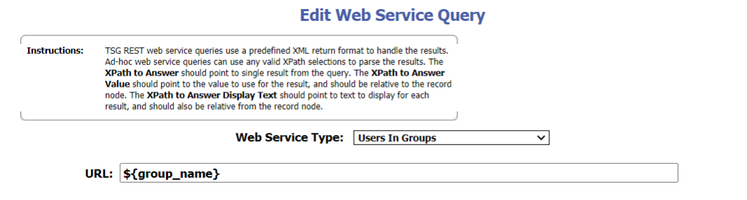
Deprecated Functionality:
-
Upon initial load after choosing the
Web Service Call, the following screenshot can be seen. Ignore this section.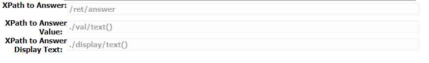
-
Get PDF Page Count & External Link
Query Variables
Sometimes it is necessary to insert variable data into a query. For example, in the database query above, we are simply returning all users. There may be a case where we want to filter users by username. By adding a query variable, we can allow the form administrator to specify how the variable should be populated when that particular form is run.
Query variables are inserted in the URL for a web service call. Query variables are inserted by using the following form:
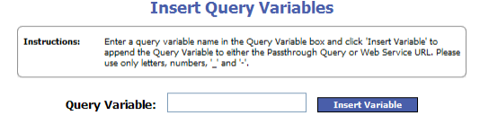
To insert a query variable, simply type the variable name and click the Insert Variable button.
Notes: Query variables can be reused within one query, but you cannot mix case. For example, you cannot use a query variable called “user” and another called “USER”.
Editing Queries
Once a query is run on a form instance in a production environment, it is very important to avoid making changes to the query that could break the form created in production. Therefore, when you edit an existing query, the following warning will appear, graying out the rest of the page:
If you are still working in a test environment, or if the query has not yet been used, all changes are safe. However, if any forms have been created with this query in production, do not make any changes in the unsafe list. As mentioned in the warning text, if these changes are necessary, it is better to create a new query object instead.
Testing Queries
While creating a query, it is possible to test the query to make sure it is returning the correct results. This will allow the administrator to ensure the query is correct before it is used on form pages. To test a query, first setup the query as needed, and then click the Test Query button at the bottom of the Edit Query page. This will bring up the Test Query page. If the query does not use any query variables, simply click the Run Test button to see the query results. If the query does have variables, fill out each variable with a sample value to substitute into the query.
For example:
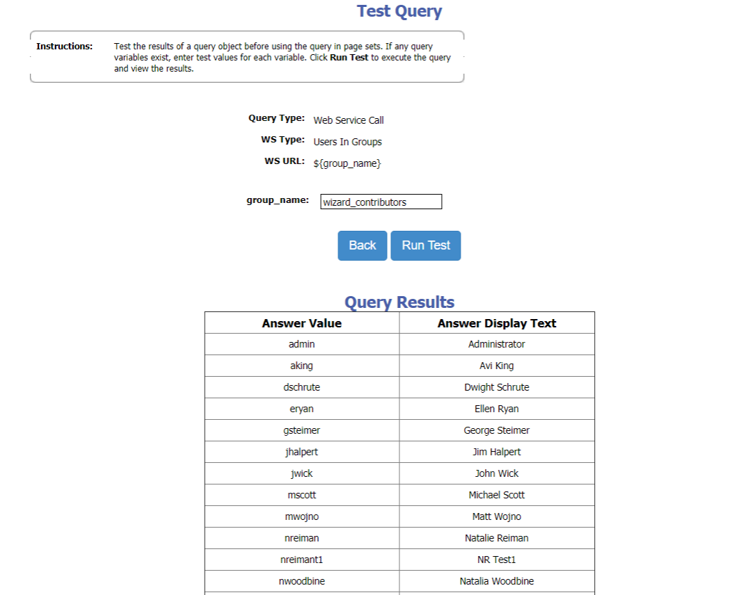
Configuring Workflow Rules
When the workflow module is turned on, a new administration link is available in the admin tab called “Manage Signature Assignments.” Optionally, a new workflow option is available for Form Templates as well. See the Workflow Module Installation Guide for instructions on installing and configuring the Workflow Module.
Note: This document assumes that the reader is familiar with the Active Wizard. See the Active Wizard User Guide for more information on working with Form Templates and Form instances.
Working with Form Templates
When both the workflow module and the admin choice option are on, a new checkbox option is available on the Edit Form Template administration page called “workflow active.” When checked, all instances of this Form Template will use workflow. If unchecked, the instances will not use workflow. In order to modify the workflow active value, simply check out the Form Template, set the workflow active checkbox to the desired setting, and check the Form Template back in. Note that changes will not take effect until the Form Template is published and made active.
Managing Roles
Upon clicking the “Manage Signature Assignments” administration link, the user is presented with a list of Form Templates. The Form Templates that appear in the select box are those that have at least one published version. If the Form Template you are working with does not appear in the list, check to make sure it has been published.
On the select Form Template screen, select the Form Template for which you would like to manage roles, and click ‘continue’.
Next, the Roles Overview page will appear. This page lists the roles that are present in the docbase for the desired Form Template, and related functionality. For added convenience, a Form Template select box appears on this page to easily allow the user to jump to roles defined for other Form Templates.
Creating a Role
To create a new role, click the New Role… button on the Manage Roles page. When first creating a role, the administrator must choose whether the role will be “user based” or “group based” (“automatic” is deprecated).
Creating a User Based Role
The Role Detail page will appear. If the cancel button is clicked on this page, a role will not be created. Once the OK button is clicked, the role is created in the docbase. On the Role Detail page, the following elements are available:
| Field Name | Field Value |
|---|---|
| Role Name | The name of the role. This value must be unique in the docbase. |
| Role Owner | The role owner. The user selected as the role owner will be the default workflow participant if this role is selected for workflow, but no other users in the role are selected. |
| Users | The Documentum users that should be used to pull role users from. |
| Form Esignature | If checked, an eSignature will be applied to the form PDF when the role user approves the task. |
| Workflow Document Esignature | If checked, an eSignature will be applied to all attached workflow documents that were approved by the user during the selective approval process. Note that if this option is checked, the system will ensure that a PDF rendition exists for all approved documents. In addition, the user must at least have RELATE permissions on all approved documents to apply the eSignature. |
| Top Level Rules | The list of top level rules for this role. Top Level Rules are used to select the Role for workflow. |
| User Rules | The list of user rules for this role. If the role is selected for workflow, these rules will be evaluated to narrow down workflow users. If a role has at least one tripped top-level rule, but no user rules or user input rules, the role owner is selected for workflow. |
| User Input Rules | The list of questions that drive user input for this role. User Input Rules, like User Rules, are only evaluated if the role is selected for workflow. |
Creating a Group Based Role
The Role Detail page will appear. This page will look much like the User Based Role page except for the following:
- The role owner will be a group that is contained within wizard_contributors
- Role users are not available.
- Only Top Level Rules are available. User Rules and User Input Rules are not available for group based roles.
Managing Role Users
To manage role users, click the edit button next to the users list on the Role Detail page. The Role User Detail page will appear.
Note: that if your role does not utilize user rules (ex: only utilizes top level rules and user input rules), then managing role users is NOT needed.
Two multi select boxes will appear on the page:
| Field Name | Field Value |
|---|---|
| Available Users | The list of docbase users that are not a part of the role. |
| Selected Users | The list of docbase users that are a part of the role. |
Move the desired role users to the Selected Users box. To save changes, click ‘OK’. To cancel, click ‘cancel’. The Role Detail Page will appear.
Managing Top Level Rules
Top Level Rules are listed in the first table on the Role Detail page. These rules determine if the role should be selected for workflow.
To add a rule, click the New Rule… button at the top of the Top Level Rules table. The Rule Detail page will appear. To add a rule condition, click the Add Condition… button. All conditions listed on this page have an AND relationship. Therefore, if two conditions are added to a rule, both conditions need to be true for the rule to be tripped.
For each condition, the user is asked to fill out the following information:
| Field Name | Field Value |
|---|---|
| Question | The question label to base this rule off of. The questions listed are the questions on the Form Template selected when this rule was created. If these values are hard to understand, consider updating the question labels in the Manage Form Template portion of the wizard admin. |
| Type | The type of answer to expect. The available options are: Number, Boolean, String and Date. If the type selected is not the actual type of the question label selected, the condition will never evaluate to true. |
| Operator | The operator to evaluate this rule with. Examples: Equal, Not Equal, Like, Less Than, etc. |
| Value | The value of the answer that trips this condition. If the type is number or string, this value is a text box. Number values must be a valid number. If the type is a boolean, the value is either true or false. If the type is a Date, the field value can be manipulated with a calendar. |
After filling out the form, click OK. The Role Detail page appears. To edit the rule, click the question label link. To delete a rule, select the checkbox next to the rule and click the Delete button.
Note: All rules are considered to be OR’ed. Therefore, if the role has two top level rules, only one needs to be tripped for the role to be selected for workflow. Within a rule, all conditions are AND’ed. Therefore, if a role has one top level rule, and that rule has two conditions, both conditions have to be satisfied for the role to be selected for workflow
Managing User Rules
Once the administrator has selected the top level rules that determine if the role is selected for workflow, user rules further narrow down workflow participants within that role. If a role is selected for workflow, but no user rules are tripped, the role owner is set as the workflow participant.
To create a user rule, click the New Rule… button at the top of the User Rules table. The User Rule Detail page appears.
The following fields are available for a user rule:
| Field Name | Field Value |
|---|---|
| Name | The name of the User Rule |
| Rules Table | The list of rules that make up this user rule. |
| Available Users | The list of users in the role that are not a part of this user rule |
| Selected Users | The list of users that will be selected for workflow if the user rule is tripped. |
The User Rule can be given a name using the name form field. Below the name is a table containing the rules that make up the User Rule. This table works much like the Top Level Rules table. Rules can be added by clicking the New Rule… button, and deleted using the Delete.
Manage the User Rule’s users by moving the desired users to the Selected Users box. If this User Rule is tripped by the wizard, the users in this box will be selected as workflow participants.
Note: If a User Rule is tripped by the users, selected users of the User Rule will only appear in the workflow list if at least one Top Level Rule is also tripped for that particular role. Therefore, if user A is in the Credit role, the Credit role must be selected for workflow before user A’s rules are evaluated.
Managing User Input Rules
Like User Rules, User Input Rules can be used to narrow down workflow participants within the role. User Input Rules are different in that the rule simply specifies a question in the Form Template. The user filling out the form, then, effectively is choosing approvers as he or she sees fit. The main pro with using a User Input Rule is that it gives the user more flexibility to choose the approver. If the user filling out the form “knows” who to route it to, a User Input Rule is appropriate. A User Rule, on the other hand, builds the logic of picking the approver into the system, thus eliminating a user decision.
To create a user input rule, click the New Rule… button at the top of the User Input Rules table. The User Input Rule Detail Page Appears.
The following fields appear for a user input rule:
| Field Name | Field Value |
|---|---|
| Selected Page | This selectbox lists all of the pages in the published Form Template. Select the page that you would like to add to the user input rule. Once you have selected a page, you may not select another page unless there are no questions added. To add another page, you must create a new user input rule. |
| New Button | Clicking the new button generates a question selectbox for the page. |
| Question Selectbox | Lists all of the questions on the selected page. Select the question that should drive the user input rule. |
| Delete Button | Deletes a question. |
Clicking the ok button will save the user input rule based on the values selected.
Note: If the question selected in a user input rule does not refer to actual docbase users, the Form Instance editor will receive a warning message on the workflow summary page. For example, this can occur if the user selected no longer exists in the system, or if the administrator makes a mistake, and a user input rule is tied to another type of question (ex: county).
Managing Role Priority
Roles within a Form Template can have a priority number set for each role. Roles with a lower priority number will be earlier in the workflow process than roles with a higher priority. The actual number value set for the priority does not matter. The only thing that matters is the order.
Consider the following scenarios:
| Role name | Priority |
|---|---|
| Accounting | 1 |
| Sales | 1 |
| CIO | 1 |
In the above scenario, if the accounting role, sales role and CIO roles are all tripped for workflow, users selected from these roles will all see the workitem at the same time. This is essentially a broadcast review.
| Role name | Priority |
|---|---|
| Accounting | 1 |
| Sales | 2 |
| CIO | 3 |
In the above scenario, if the accounting role, sales role and CIO roles are all tripped for workflow, users selected from the accounting role will see the workitem first. When the accounting users are finished, then the sales users will see the workitem. When the sales users are finished, then the CIO users will see the workitem. This is a serial review process.
| Role name | Priority |
|---|---|
| Accounting | 1 |
| Sales | 2 |
| CIO | 2 |
In the above scenario, if the accounting role, sales role and CIO roles are all tripped for workflow, users selected from the accounting role will see the workitem first. When the accounting users are finished, then the sales users and CIO users will see the workitem. This is a serial review process that contains a broadcast review. This is essentially a combination of the above two.
If none of the top-level rules are tripped for a role, the entire role will not participate in workflow. For instance, in the last example, if the accounting role is not tripped but sales and CIO are, the workflow will consist of only a broadcast review to the Sales and CIO roles.
Click the Change Priorities button from the Roles Overview page to update the Role priorities. This will enable the priority text boxes next to each role. Enter the priority number desired for each role, and click OK. The Cancel button will return the priority numbers to their previous state.
Note: If the Change Priorities button is disabled, another user is currently updating role priorities on the Form Template.
Group Based Roles and Priority
All group-based roles must exist in a unique priority. If the administrator attempts to combine, for example, two group-based roles or one user based and one group-based role in a single priority, the application will revert to the original priority numbers and display an error message.
Managing Activity (Task) Names
When the workflow is generated, each priority becomes a separate activity within the workflow template. The name of each activity is what the user sees when the workitem appears in their inbox.
To manage the activity names, either update priorities or click the Update Activity Names button. The Manage Activity Names page appears:
| Field Name | Field Value |
|---|---|
| Priority | Each priority number (uneditable) represents a row of the table |
| Use Default Name | Checkbox that indicates whether or not the activity should be created using the default name |
| Custom Activity Name | Textbox that becomes editable when the default name is not desired. |
If the default name checkbox is checked for a particular priority, the workflow template will be created using the default name for the activity. The default name is the form’s title plus the priority number in the format:
<psi-title> <priority>
The priority number is necessary since Documentum enforces that all activity names are unique. The wizard inbox looks for this number and strips it off of the link visible to the user. At this time, the WebTop inbox will show the priority number.
If the default name is not desired, the administrator can specify a custom activity name. All activity names across the priorities must be unique. An error message is displayed to the administrator if an attempt is made to name two priorities with the same name.
Tools
The following section describes the available tools.
Action Information
This section displays all the possible actions and conditions that are available in Content Accelerator and give a detailed description of each.
Config Archiver
The Config Archiver is a tool that allows you to move Content Accelerator configuration from one environment to another. There are two methods, Export and Import.
When exporting a Content Accelerator configuration, you can choose to include user preferences or not. If you chose to include them, it will bring over all user preferences that exist in the Content Accelerator environment (you should only do this if moving configs between a Dev, QA, Prod environments where the same users will be using the system in each environment).
To import a Content Accelerator configuration all you need to do is upload the archived config zip file and click Import.
License Manager
The Content Accelerator license manager allows an Administrator to view the current license information and import a new license if needed.
Action Configuration
While many actions require little to no configuration beyond enabling the action (self-documentation can be found under Admin > Tools > Actions Information > Available Actions), some more complicated actions have additional configuration options. See the Action Configurations section for further details about how to configure certain commonly used actions in Content Accelerator. Individual action links listed in the table below.
Addition Action Configuration Information
| Action Name/Link | Type |
|---|---|
| Send Email | Folder and Document Action |
| Send Notification | Document Workflow |
| Send External Notification(MS Teams/ Slack) | Document Workflow |
| Export Folder | Folder Action |
| Bulk Upload | Folder or Contextless Action |
| Download Document | Document Action |
| Edit Online | Document Action |
| Sign with DocuSign | Document Action |
| Document Info View | Document Action |
| Refined Search in View All Documents | Action Add-On |