Related Objects
Relation Types
Relation Based
Relation-based related objects should be used when you want to display related content based on an actual repository relationship or association. For example:
- When displaying a document, also display the emails that the document has been attached to.
- When displaying an email, display the list of documents that were attached to the email.
Since ACA creates a relationship between the email (parent) and the attached documents (children), a relation-based Related Objects module makes sense.
There are three types of relation-based Related Objects:
-
Parent - show the parent(s) of a relationship, where the current document or folder is the child. Using the email example, this relationship would show the emails that a document was attached to.
-
Child - show the child(ren) of a relationship where the current document or folder is the parent. Using the email example, when viewing an email, it would show the documents attached to the email.
-
Sibling - show other objects that share a parent with the current document or folder. Using the email example, if looking at a document that was attached to an email (or emails), it would show any other documents attached to the same email (or emails).
Query Based
Query-based related objects should be used when no repository relationship is available, but you can construct a simple query to find related objects. For example, say we have:
- A folder subtype called
Policythat has a policy_number attribute - A folder subtype called
Claimthat has claim_number and policy_number attributes
In the above case, we could setup a query based relationship to show related claims. You would set up a query-based relationship that looks for Claim objects that have a policy_number equal to the policy_number of the current folder loaded in the stage.
Folder Tags
Folder tags (also known as categories) sort child documents on the stage based on a repeating attribute on documents. Tags can be used in View All Documents to filter documents by category as well as in related objects to list documents under fake sub folders keyed by the values of the folder tags attribute. The default attribute is hpi_folderTags.
If you want to change the folder tags attribute from the default attribute, edit your property overrides file in OC and set the attribute hpi.tags.trackingattr to the desired attribute.
Notes To get Folder Tags to work properly:
- The base
Foldertype must be configured in the Object Type Config (OTC) - The base
Folder(or whatever folder type you are using in your trac) must be configured to be a container in the OTC. This defaults to false for all types. - You must add
hpi:folderTaggableas a mandatory aspect on your target document type(s). This sets up the default repeating attribute expected byhpi.tags.trackingattr.
External Relation
This configuration should be used when a relation is stored in an external service. It requires the development of a custom OpenContent endpoint. The current implementation assumes that the endpoint configured is an endpoint in OpenContent that returns an array of OpenContentObjects. The custom OpenContent endpoint makes a call to one or more external services and uses information from the response to determine which respository objects to display.
Related Objects Configurable Options
Enable Auto Expand
Automatically load this relation when the stage loads. If this is set to ‘false’ the user must click an expand button to load the results of the relation.
Enable Info Block
Next to each result, show an infoblock with the attributes configured in admin.
Enable Show Annotations
Next to each result, have a link to Alfresco Enterprise Viewer for that document.
Enable Object Icon
Show an icon next to each object that matches the content type.
Enable Dual Screen
Have a button next to each result to view it in ‘dual screen’ mode with the current doc.
Number of Results Displayed
Set the number of results visible on loading of the relation, if there are more than this, a user must click to see them.
Export Doc
Show an icon next to document objects to download them directly without having to navigate to the document in the stage.
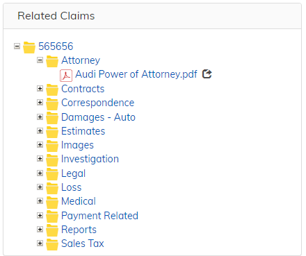
Expand With Folder Tags
When ON, documents are categorized by the Folder Tag value on each document. Expanding the folder will show one “sub-folder” for each Folder Tag and the documents with that Folder tag will be displayed under the corresponding subfolder. See this example with the config on, these folders dont actually exist but are displayed based on the folder tags on the documents in the top level folder.
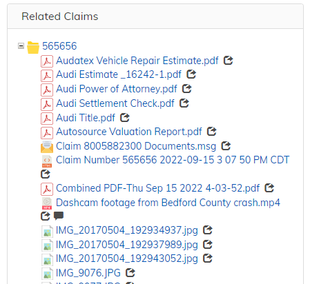
When OFF, expanding the folder will simply display documents and subfolders as they exist in the repository. See this example of expanding the same folder with the config off.
Picklists
The following sections overview the different types of picklists available in ACA.
Simple Picklist
In the ACA Admin’s Picklist Config section, adminstrators can configure “Simple” picklists. A simple picklist is a list of labels and values managed directly in the ACA admin. Each picklist can be ordered at will by the ACA administrator and can have a default value.
Note - ACA Simple picklists should not be used for picklists that have many (20+) rows or that can cascade from other picklists.
OpenContent Picklist
OpenContent Picklists can be overriden in a custom Amp in the opencontent-extension-override-config.xml file.
All picklists are configured using a Spring MapFactoryBean, as follows below. Note that the bean id, class, and property name must match this for your picklist bean to be picked up:
<bean id="ProjectPicklists" class="org.springframework.beans.factory.config.MapFactoryBean">
    <property name="sourceMap">
        <map>
        </map>
    </property>
</bean>
Each map entry describes an OC picklist, using the following syntax:
<entry key="picklistKey" value="picklistValue"/>
The key must be unique across all OC picklists (including other picklist types such as Simple Picklists). The text entered for the picklist value will depend on the type of OC Picklist you’re trying to create.
# symbol
If a picklist is not prefixed with a #, errors will occur attempting to use it. An example is below:
#SELECT name FROM areas;" />
#lucene|tsg:documentNumber|TYPE:tsg\:document|tsg:documentNumber"/>
Static OC Picklists
OC’s picklist parsing can interpret static picklists successfully. Current implementation supports a mixture of values and labels. Simply separate values and labels with a “,”, and separate separate picklist entries (made up of just a value, or of a value and a label) with a “;”. If you want your picklist label or value to contain a “,” or a “;”, escape a character with “\,” or “\;”.
Note: It is assumed that the string before the comma is the label and the string following the comma is the value. (“Item_Label,Item_Value;Item_Label_2,Item_Value_2”)
Some examples of valid static picklist configurations:
"Indiana,IN;Illinois,IL;Ohio,OH""Apples;Oranges;Bananas""Short;ReeeeeaaaaaalllllllyyyyyLooooonnnggggg,RealLong""Larry\\, Moe\\, Curly,threeStooges;Lana\\, Archer\\, Cyril,archerCharacters"
Alfresco OC Picklists
There are a number of ways to setup OC picklists in Alfresco:
Lucene Picklists
Basic set-up for all entries should be in the following format:
lucene|labelColumn,valueColumn|query|sortAttr
Or, to create a label by concatenating multiple attributes:
lucene|labelAttr0+' '+labelAttr1+' '+labelAttr2,valueColumn|query|sortAttr
where the quotes can include any string to concatenate between attributes.
In the above setup there are four parts:
-
The language to use for searching - currently only lucene queries are supported.
-
The label and value columns to use. The value column is optional.
-
The actual query to execute.
-
The attribute to sort the returned results by (optional).
Here is an example OC picklist using lucene:
<bean id="ProjectPicklists" class="org.springframework.beans.factory.config.MapFactoryBean">
  <property name="sourceMap">
    <map>
      <!-- selects cm:name (label and value) for all objects of type cm:content that contain the phrase 'banana' in their name. -->
      <entry key="oneColumnPicklist" value="lucene|cm:name|TYPE:cm\:content AND @cm\:name:'banana'"/>
      <!-- selects cm:name (label) and sys:node-uuid (value) for all objects of type cm:content that contain the phrase 'banana' in their name. -->
      <entry key="twoColumnPicklist" value="lucene|cm:name,sys:node-uuid|TYPE:cm\:content AND @cm\:name:'banana'"/>
      <!-- selects cm:name (label and value) for all objects of type cm:content that contain the letters 'ban' followed by anything else in their name. -->
      <entry key="wildCardCharPicklist" value="lucene|cm:name|TYPE:cm\:content AND @cm\:name:ban*"/>
      <!-- selects cm:name (label and value) for all objects of type cm:content that contain the phrase 'banana' in their name and sorts the results by cm:modified. -->
      <entry key="sortPicklist" value="lucene|cm:name,sys:node-uuid|TYPE:cm\:content AND @cm\:name:'banana'|cm:modified"/>
      <!-- selects cm:firstName and cm:lastName as label and cm:userName as value for all objects of type cm:person sorted by cm:lastName -->
      <entry key="concatenatedPicklist" value="lucene|cm:firstName+' '+cm:lastName,cm:userName|TYPE:cm\:person|cm:lastName"/>
      <!-- Example Cascading picklist -->
      <entry key="policyNumberForClaim" value="lucene|insuranceDemo:policyNumber|TYPE:insuranceDemo\:claimsFolder AND insuranceDemo\:claimNumber:'$insuranceDemo_claimNumber$'|insuranceDemo:policyNumber" />
    </map>
  </property>
</bean>
Cascading queries are configured using $prop_oc_name$ syntax in the picklist value.
For more detailed information on writing queries. The Apache Lucene Syntax page is also helpful, but note there may be differences as the parser it uses may be different.
Datalist Picklists
Picklists with a datalist source may be configured if the Alfresco and Share repositories as long as you have the TSG Cascading Value Assistance Alfresco and Share AMPs installed. This configuration option is useful because this allows business users to maintain picklist values without IT involvement.
Steps to create the datalist:
-
Once the TSG Datalist AMPs have been installed navigate to Share. Navigate to a site and open up the “Data Lists” tab. (This might need to be configured using the site settings tool located in the upper right corner).
-
In the upper left hand corner click the “New List” button.
-
Select one of the Value Assistance lists and give it a title then click save.
-
Add as many items as you would like.
After a datalist has been added in Alfresco or Share, use the following syntax to use the values as a picklist:
datalist|datalistName|labelColumn,valueColumn|cascadingQuery
The above value has four parts:
-
datalist- tells OC that this picklist is driving from a datalist -
The name of the datalist
-
The label and value columns to use. This section is optional. If omitted, OC will return the label and value from the first level of the datalist.
-
Cascading query to use for multi-level datalists. This section is optional, see below for details.
For non-cascading datalist picklists, OC will automatically look for the label and value columns and return them sorted by the label column. For example, say we have a datalist named ‘Business Departments’, the picklist entry config is as simple as:
<entry key="businessDepartments" value="datalist|Business Departments"/>
When using a cascading picklist against a datalist, using the above syntax will populate the picklist with the level 1 values and labels. If you want to use the other columns of the data list, use a lucene query to get the desired result.
For example, say we change the above datalist to be a cascading list from a ‘region’ column. Region is the level 1 value, and business department is the level 2 value. Your picklists would then look like this:
<entry key="regions" value="datalist|Business Departments"/>
<entry key="businessDepartments" value="datalist|Business Departments|cva:2LevelLabel,cva:2LevelValue|TYPE:cva\:2LevelValueAssistanceListItem AND @cva\:1LevelValue:"$myApp_region$""/>
In the above query, the $ prefixed tokens should refer to the OC Name of the attribute you’re cascading from.
Users in Group Picklists
A usersInGroup picklist was created to allow querying users in a given Alfresco group. The syntax is simple:
usersInGroup|groupName|query|format
For example, to get users in the Wizard Contributors group, you could define an OC picklist like the following:
<entry key="wizardContributors" value="usersInGroup|GROUP_wizard_contributors|$query$|$firstName$ $lastName$"/>
If you want to list all users in a group and ignore any queries(in other words, not have an async picklist), you can simply omit the last 2 parameters, as follows:
<entry key="wizardContributors" value="usersInGroup|GROUP_wizard_contributors"/>
The currently supported tokens are $firstName$, $lastName$, and $userName$ for the format.
There is currently no control over the picklist label/value or sorting. The defaults are:
- Label =
FirstName LastName - Value =
userId - Sorting = however Alfresco’s
serviceRegistry.getAuthorityService().getContainedAuthorities()returns users - Depth - users in the given group and any subgroup are returned
DataDictionary Picklist
DataDictionary picklists will get their values from the underlying data model.
Note: DataDictionary picklists are reserved for future use and are not currently supported.
Configuring Picklists in ACA
Create your Picklist
-
In the aca admin under the Picklist configuration section, enter the name for your new picklist. This name is not visible to the user and must be unique across all picklists in ACA. This name can match the name of your OC picklist.
-
In the dropdown, choose the type of picklist you would like to create.
- Simple Picklist - your picklist will be added immediately to the list of picklists. Click it to begin configuring your picklist.
- OpenContent Picklist - you will now see a dropdown appear with the name of the keys in your
ProjectPicklistsbean you created (see above). Select the picklist and click ‘Add’.
-
If you select a picklist from the list of picklist, you can see all the possible values for the picklist. You can choose a value in the list to be the default value of the picklist.
-
A select box allows you to choose the Picklist Load Type:
- Normal - When the view is rendered, the picklist’s values will be queried. While this ensures the most up-to-date information, very large picklists or many picklists on a single view can cause the application to slow down.
- Async - Picklist values are not queried until the user enters three characters OR the dropdown arrow is clicked (see below for more information about the dropdown arrow). Values are filtered on the server side, so your picklist query needs to account for this. Async picklists are recommended for very large picklists or cases where you have a lot of picklists on a view at once. See the
Configuring a Picklist on a Formsection below for more information about configuring async picklists. - Cache at Login - Picklist values will be cached at login and will remain in browser memory until the user logs out. This means that cascading picklists cannot be cached. Large picklists should not use this setting.
- When finished configuring your picklists, click ‘Save Config’ to save the changes.
To delete a picklist, click the x next to the name of the picklist in the list of picklists and click ‘Save Config’ to save the changes.
Configuring a Picklist on a Form
-
In Form Config, select a form and click/add the Object Type you would like to work on.
-
Select/add the attribute you would like to tie to a picklist. Change the control type to a type that supports picklists (ex: DropDown, AutoComplete, RadioButton, Checkbox) - AutoComplete is recommended.
-
Click the options dropdown and select the desired picklist.
Configuring a Cascading Picklist
-
In the options dropdown, click the ‘cascading’ option. A ‘Depends On’ dropdown will display the type’s attributes. Choose the attribute(s) that this field should cascade from.
-
When a user attempts to fill out a form with a cascading picklist, the ‘cascaded to’ field will only be editable if all the attributes that the field depends on have values.
Configuring Async Picklists
Since the user is forced to type characters into the Autocomplete box before the query is fired, we want to filter the results on the server side based on the value typed in. A special token called query is passed when an Async picklist fires. This token should be used in the query, similar to a cascading query. For example:
<entry key="vendors" value="select vendor_name from dm_dbo.vendors where vendor_name like '$query$%'"/>
In the above query, we are filtering vendors with the name that starts with whatever the user has typed. We can easily change this to a contains search by updating the query to: ... vendor name like '%$query$%'.
Dropdown Arrow: By default, the Autocomplete field that loads an async picklist will not have a dropdown arrow that allows the user to load all values. ACA defaults this way since typically an async picklist has a lot of values (10,000+).
In this case, there is never a time where you want the user to load all values in a dropdown since it would be a) slow, and b) not all that helpful. However, there are some cases where you would want the dropdown arrow. One example would be a form in ACA that has many medium-size queries. Rather than having all of them fire on page load, or cached in memory upon login, it may be better to make these async picklists. In this case, it’s not harmful or user-unfriendly to load all values. To enable this, check the ‘Allow Dropdown’ checkbox in the Options section. This checkbox only affects the control if it is an Autocomplete. For performance reasons, when ‘Allow Dropdown’ is enabled, the async picklist the only loads first time the dropdown arrow is clicked.
Configuring Growable Picklists
A growable picklist should be used when you want to allow the user to enter values that are not already in the picklist. Growable picklists are only available for the ‘Autocomplete’ control type in ACA. Simply check the ‘Growable’ checkbox in the Options dropdown to allow users to enter arbitrary values.
When using growable picklists, keep in mind that your query must account for the new values entered in the field. For this reason, you’d only use the growable option with OpenContent picklists. For example, a growable picklist entry may look like:
<entry key="regions" value="lucene|myApp:region|TYPE:myApp\:projectFolder|myApp:region"/>
In this example, we’re getting the distinct region value from all project folders in the system. If an arbitrary value is entered, it will be retrieved in the next query.
From a governance standpoint, be careful with growable picklists as typos and other human errors can cause the list to grow unwieldy.
Limiting User’s Trac Access
How To Limit a User’s Trac Access
As of ACA 2.5, Trac Security can be configured based on repository groups in the ACA admin.
-
Navigate to the ACA Admin and click “Trac Security” from the menu on the left
-
Select the trac(s) you would like to secure from the list of tracs on the left hand side of the config
-
Click on the new trac bar that appeared and a list of groups will appear
-
Select all groups you would like to have access to this trac and save the config - if you would no longer like to secure the trac, click the “remove trac security” button instead
Now, every time a user tries to access a secured trac, the application will check the Trac Security config to see if they a part of a group that is allowed to access the trac. If the user has no tracs they are allowed to access, they will be logged out of the application and be notified to contact their system administrator.
Collections
Put simply, a collection is an object that contains associations to none, one, or many nodes in the repository. Collections allow users to group unrelated objects into identifiable sets.
Collections are created in ACA through the “Add To Collection” action. In either Search or Collections view, select one or more items and select this action. Once the modal appears, you can either choose to add to an existing collection or to create a new collection. If creating a new collection, you must select whether this collection will be public or private. As simple as it sounds, private indicates that your collection cannot be viewed by any other users in the repository, and public indicates it can be found by all users.
To view the collections you create, go to Collection view and select the “My Collections” tab. (WARNING: If relying on Solr to search, be sure to wait 5-10 seconds after creating your collection before trying to view it. Solr indexing causes this process to be rather slow.) You can change the visibility (public vs. private), change the label, or delete a collection you own.
To search public collections of other users, use the “Search Collections” tab in Collections view.
For details on how to configure the Collections view, see the Attribute Search configuration. The process of configuration is the same for the Collections view and the Attribute Search.
DocInfo View
The purpose of this feature is to display an additional information pane that can contain specified attributes and associations for documents that abide by restrictions that are configured through ACA Admin. In order for this informational pane to show up, the view must be enabled in the ACA Admin and the document being opened in the docviewer must match the given configuration restrictions.
Configuring the DocInfo View
In the ACA Admin, navigate to Views->Stage and select the trac you would like to configure. In Configure Stage Modules, select DocViewer and find the Doc Info section switch. By default, this view is turned off. When enabled, there are three switches: Display Attributes, Additional Restrictions, and Display Associations.
To display document attributes of a specific object type, enable the Display Attributes view and select an object type from the dropdown. This object type will be used as the first possible set of restrictions when determining whether to display the Doc Info View for a document. The available attributes list will show all attributes configured through the Object Type config in Application Setup. Select which attributes you would like to be displayed by moving the attributes to Selected Attributes.
The second possible set of restrictions that can either be used alone or in addition to the prior section’s restrictions is Additional Restrictions. If enabled, you will need to select a picklist that contains key/value pairs that correspond to the properties and values that will be used as a filter on the documents being opened up. This picklist’s key value pairs are specified such that if the properties of the document being viewed matches the property values in the picklist, the document info pane will display. To create a picklist go into Application Setup->Picklists in the ACA Admin and create a new simple picklist. The labels and values of the picklist should match the name of the property that you want to check and its corresponding value. For example, if you only want the document info pane to appear for documents that are outlook emails you would put:
Label: mimeType
Value: application/vnd.ms-outlook
The third switch allows you to display links to documents associated with the document being viewed. Once enabled, supply the name of the association that links the document you are viewing to the documents you would like to see links for. For example, if you input hpi:emailed in the textbox, all the documents linked to the document you are viewing with the hpi:emailed aspect will appear in the document info pane.
After configuring these three possible sections of the Doc Info View, your document should show an informational pane with your selected attributes, if Display Attributes is enabled, and if Additional Restrictions is enabled it should only show up for documents that also have properties that correspond to those key/value pairs. Finally, if Display Associations is enabled and configured, it will show any associations that match the specified association type for that document.
Table View Indicator Icons
In table view, it’s possible to place icons in the table based on result data. This can be useful to display extra information to the user at a glance. Before configuring the icons, ensure you have configured table view to include the correct columns for each type you’re displaying to the user.
To configure the icons, open the table view config. Expand the type you would like to apply icons to. Go to the indicator icons section and add the icon. The various sections are described below:
- Show - type in the glyphicon name here
- next to - select the attribute you want the icon to appear next to in the table
- if - this section allows you to control when the icon appears
- Choose Attribute - select an attribute in the table
- operator - the following operators are available:
- Matches - show the icon if the attribute matches a given regular expression
- Equals - show the icon if the attribute equals a given value
- Exists - show the icon if the attribute is not null or blank
- Regex or value - if you’re using Matches or Equals, type the regular expression or value here
- Hover Text - optional hover text for the icon when it appears