This section details everything that you need to know in order to take complete advantage of the Enterprise Viewer application.
Mode Dropdown
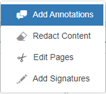
The Enterprise Viewer has four modes:
- Add Annotations
- Redact Content
- Edit Pages
- Add Signature
Users can be launched directly into any of these modes. By default, a document is launched into annotation mode. The mode dropdown can also be disabled:

Add Annotations
Add Annotations mode allows the user to annotate the document.
See the Add Annotations Interface section for more information.
Redact Content
Redact Content mode allows the user to redact text and images in the document.
See the Redact Content Interface section for more information.
Edit Pages
Edit Pages mode allows the user to edit pages by reordering, splitting, rotating, or sectioning them.
See the Edit Pages Interface section for more information.
Add Signatures
Add Signatures mode allows the user to add a signature to the document.
See the Add Signatures Interface section for more information.
Add Annotations Interface
This section walks through the interface used to add annotations.
Toolbar
The toolbar contains all the core functionality of the Enterprise Viewer in Annotation mode. This is where document navigation and zooming occur, and where annotations can be created, saved, and more information on Enterprise Viewer is found.
It is located at the top of the Enterprise Viewer window:

Dark grey buttons cannot be used until certain actions are made. A button that is in use will have a blue interior.
Manual Page Navigation
If the page number entered is not a number, this value gets reset to the current page. If the page number entered is lower than the first page, the user is navigated to the first page. If the page number entered is higher than the last page, the user is navigated to the last page.

Manually entering a value into this text field and then hitting the Enter key will navigate to the new page number.
This text field is located to the right of the Enterprise Viewer logo and to the left of the Fit to Height button.
Total Number of Pages
This is a non-editable field denoting the total number of pages for the document.
Fit to Height
The Fit to Height button is located to the right of the Manual Page Navigation text field and to the left of the Fit to Width button.

Clicking this button automatically calculates the zoom level to make the window show the entire height of the document. This does not take into account the width of the document, and thus scroll bars may appear horizontally depending on the page’s aspect ratio against the size of the window.
Fit to Width
The Fit to Width button is located to the right of the Fit to Height button and to the left of the Next Page button. The Fit to Width button is to the left of the Zoom Out button if the Next Page button is not displayed in the toolbar:

Clicking this button automatically calculates the zoom level to make the window show the entire width of the document. This does not take into account the height of the document, and thus scroll bars may appear vertically depending on the page’s aspect ratio against the size of the window.
Next Page
The Next Page button is located to the right of the Fit to Width button and to the left of the Previous Page button.

Clicking this button takes the user to the next page of the document. The button will become disabled once the user reaches the end of the document.
Note: This feature is unavailable if the document does not have more than one page.
Previous Page
The Previous Page button is located to the right of the Next Page button and to the left of the Zoom Out button.

Clicking this button takes the user to the previous page of the document. The button will become disabled once the user reaches the beginning of the document.
Note: This feature is unavailable if the document does not have more than one page.
Zoom Out
The Zoom Out button is located to the right of the Previous Page button and to the left of the Zoom In button. The Zoom Out button is to the right of the Fit to Width button if the Previous Page button is not displayed in the toolbar.

Clicking this button zooms out in increments of ten. While zooming out, if possible, the current middle of the page will remain in the middle (unless zooming out reveals an image that does not need to be scrolled).
If the target zoom level is below the minimum zoom level, the zoom is set to the minimum zoom level. This is set for performance and usability reasons.
Zoom In
The Zoom In button is located to the right of the Zoom Out button and to the left of the Download dropdown.

Clicking this button zooms in using increments of ten. While zooming in, the current middle of the page will remain in the middle.
If the target zoom level is above the maximum zoom level, the zoom is set to the maximum zoom level. This is set for performance and usability reasons.
Download Dropdown
Provides various options related to downloading, checking in, or checking out documents:

Annotated PDF Download
Clicking the following button downloads the document to be used for annotating documents offline. All annotations other than the current users will be locked in the downloaded PDF:

Checkin Annotated PDF
Clicking the following button will allow the user to check-in a document that has been checked out for offline use. This will update the online annotations with any differences present in the offline copy. The annotations in the repository will match the annotations from the offline copy following check in, regardless of any changes made in the repository between the annotated pdf download and checking in the document:
Attempting to check in a PDF not downloaded via the “Offline Annotated PDF Download” action, or a PDF downloaded from a different document will fail.
Print Annotated PDF
Clicking the following button will print a version of the PDF with annotations. This is unrelated to checking in and checking out documents:

Extract Pages
Clicking the following button will allow the user to choose which pages to download. The user can type in the selected pages or select them by clicking the box in the top left corner of each page. The user must then select split PDF which will download the user’s selected pages:

Note: This feature is unavailable if the document does not have more than one page.
Annotated PDF Download
Similar to Offline Annotated PDF Download, but this is not meant for annotating documents offline and checking them back in. This is simply for downloading. Other users’ annotations will not be locked:

Download Original
Clicking the following button will download a version of the PDF without annotations, only the base document:

Save
Clicking the following button will save any new or modified annotations to the server, as well as refresh any unmodified annotations from other users that have been updated:

The Save button is located to the right of the Download dropdown and to the left of the Undo button.
Undo Last Change
Clicking the following button will undo the last modification that was made to the document prior to the last save of the document:

The Undo button is located to the right of the Save button and to the left of the Redo button.
Redo Last Change
Clicking the following button will redo the last change made to the document prior to the last save of the document:

The Redo button is located to the right of the Undo button and to the left of the Refresh button. The Redo button is to the left of the Show/Hide Annotations button if the Refresh button is not displayed in the toolbar.
Refresh Annotations
Clicking the following button will refresh any unmodified annotations from the server that have been updated by other users:

The Refresh Annotations button is located to the right of the Redo button and to the left of Show/Hide Annotations button.
Note: This feature will not appear if “Collaboration Mode” is active, as annotation refreshes happen in real-time.
Show/Hide Annotations
Clicking the following button will show or hide the annotations made to the document. If the button is active the annotations can be seen. Annotations cannot be seen if the button is deactivated:

The Show/Hide Annotations button is located to the right of the Refresh Annotations button and to the left of the Keep Tool Selected button. The Show/Hide Annotations button is to the right of the Redo button if the Refresh Annotations button is not displayed in the toolbar.
Keep Tool Selected
Clicking the following button will keep the currently selected annotation tool selected. This allows users to be able to make multiple annotations of the same type without having to select their chosen tool multiple times:

The Keep Tool Selected button is located to the right of the Show/Hide Annotations button and to the left of the Selection Tool button.
Annotation Tools
The buttons listed below denote the different types of interactions the user can have with the document itself, as opposed to single events of the previous toolbar items. The selections will persist until another selection is made, or they are unselected due to a particular event:
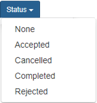
All of the annotation tools can be used for clicking a toolbar button, dragging annotations around a page, dragging and resizing annotation dialogs. The user can also set the status of the annotation to None, Accepted, Cancelled, Completed, or Rejected. If the user does not set the status of the annotation, then it is set to None by default.
After an annotation is created, the annotation tool returns to its default cursor.
Selection Tool
The Selection Tool button is the default cursor when opening Enterprise Viewer and signifies that the mouse does not do anything out of the ordinary:

The Selection Tool button is located to the right of the Keep Tool Selected button and to the left of the Sticky Note button.
Sticky Note
The Sticky Note button is used when a sticky note needs to be added to a page. Once the cursor is selected, the user can click anywhere on the page to add a sticky note. The sticky note will set its top left corner to where the user clicked, and an annotation dialog will pop up to allow the user to edit the text. The user can also use the Color Selection menu to change the color of the sticky note annotation:

The Sticky Note button is located to the right of the Selection Tool button and to the left of the Add Attachment button.
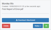
Add Attachment
The Add Attachment button is used when a file needs to be attached to a page. Once the cursor is selected, the user can click anywhere on the page to add an attachment annotation. The attachment will set its top left corner to where the user clicked, and an annotation dialog will pop up to allow the user to edit the text. The user can also use the Color Selection menu to change the color of the attachment annotation:

The Add Attachment button is located to the right of the Sticky Note button and to the left of the Text Select dropdown.
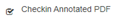
Downloading Attachment
Once an attachment annotation is added to the page, a user can download the file by simply clicking the Download Attachment button in the dialog box of the annotation:
Text Select Dropdown
The Text Select dropdown includes all the available text select annotations. These include Select Text, Highlight, Strikeout, Insert Text, Underline, and Replace Text. The user can select one or more lines of text from any section to make an annotation from this group.
The dialog box will appear from the top left corner of all the annotations in this group except for select text. The select text annotation allows a user to copy their selection of text in order to paste it into another application:
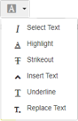
The Text Select dropdown is located to the right of the Add Attachment button and to the left of the Color selection box.
Select Text
The Select Text button is used when text on the page needs to be selected to copy it. Once the cursor is selected, the user can click on the text they wish to select. The user can then drag the mouse over the text to select it until the mouse is released:

The Select Text button is located in the Text Select dropdown above the Highlight button.
Highlight
The Highlight button is used when text needs to be highlighted on the page. Once the cursor is selected, the user can click on the text they wish to highlight. The user then can drag the mouse over the text to highlight it until the mouse is released:

The Highlight button is located in the Text Select dropdown below the Select Text button and above the Strikeout button.
Strikeout
The Strikeout button is used to strikethrough text on the page. Once the cursor is selected, the user can click on the beginning point of the text they wish to strikeout. The user can then drag the mouse over the text striking it out until the mouse is released:

The Strikeout button is located in the Text Select dropdown below the Highlight button and above the Insert Text button.
Insert Text
The Insert Text at placeholder button is used to add text to the document in an annotation dialog box. Once the cursor is selected, the user can click on any text to add a placeholder. The placeholder will set its top left corner to where the user clicked:

The Insert Text button is located in the Text Select dropdown below the Strikeout button and above the Underline button.
Underline
The Underline button is used to underline text on the page. Once the cursor is selected, the user can click on the beginning point of the text they wish to underline. The user can then drag the mouse over the text underlining it until the mouse is released:

The Underline button is located in the Text Select dropdown below the Insert Text button and above the Replace Text button.
Replace Text
The Replace Text button is used to replace text in the document in an annotation dialog box. Once the cursor is selected, the user can click on any text to add a placeholder. The placeholder will set its top left corner to where the user clicked:

The Replace Text is located in the Text Select dropdown below the Underline button.
Color
Clicking this button will open a box displaying the available colors the user can choose. The user can select a color to change the color of the annotation when using the line, arrow, ellipse, rectangle, free draw, highlight, strikeout, or insert text as placeholder buttons. Once the desired tool is selected, the user can then select a new color that will appear on the page when the tool is used. Only one color can be chosen at a time.
The annotation tools each have their own default color, which will appear when the user selects a new tool and a color has not been chosen yet:

The Color selection box is located to the right of the Text Select dropdown and to the left of the Drawing Tools dropdown.
Set Default Color
The user can set the default color by choosing a color, then clicking the Set Default button. The user will be prompted by a popup window asking whether they want to set the selected color as the default color. Setting the default color in the picker specifies the color that will be set on page load and used for all types of annotations. This value is saved in relation to the browser it was saved on:

The Set Default button is located in the Color dropdown above the Reset button.
Reset Color
The user can reset the default color by clicking the Reset button. The user will be prompted by a popup window asking whether they want to reset the default color. Doing this will default the color back to red.

The Reset button is located in the Color dropdown below the Set Default button.
Drawing Tools Dropdown
The Drawing Tools dropdown includes all the available drawing annotations. These include Line, Arrow, Ellipse, Rectangle, Text Box, and Free Draw. The drawing annotation tools are drawn from where the user clicks on the page to where the user’s mouse is when unclicking:
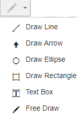
If the mouse has not been dragged far enough from the starting point, the annotation will not be drawn, and the selected annotation tool will not be changed. Additionally, all drawing annotations can be resized by clicking on them to highlight them and dragging them.
An annotation dialog will pop up to allow the user to edit the text. Clicking on drawing objects will also open a dialog for notes.
The Drawing Tools dropdown is located to the right of the Color selection box and to the left of the Stamps dropdown.
Draw Line
The Draw Line button is used when a line needs to be added to a page. Once the cursor is selected, the user can click anywhere on the page to start the line. The user can then drag the mouse anywhere else on the page to put the other end point of the line. A line will be drawn from one point to the other:

The Draw Line button is located in the Drawing Tools dropdown above the Draw Arrow button.
Draw Arrow
The Draw Arrow button is used when an arrow needs to be added to a page. Once the cursor is selected, the user can click anywhere on the page to start the arrow. The user can then drag the mouse anywhere else on the page to put the tip of the arrow. An arrow will be drawn from one point to the other. The arrow will point to the second point. Dialog boxes will be anchored at the beginning of the arrow:

The Draw Arrow button is located in the Drawing Tools dropdown below the Draw Line button and above the Draw Ellipse button.
Draw Ellipse
The Draw Ellipse button is used when an ellipse needs to be added to a page. Once the cursor is selected, the user can click anywhere on the page to start the rectangle that will contain the ellipse. The user can then drag the mouse anywhere else on the page to put the other end point of the rectangle containing the ellipse. An ellipse will be drawn within the two points so that the top is the highest point in the rectangle containing it, the bottom is the lowest point, and the sides are the two widest points. Dialog boxes will be anchored in the center of the ellipse:

The Draw Ellipse button is located in the Drawing Tools dropdown below the Draw Arrow button and above the Draw Rectangle button.
Draw Rectangle
The Draw Rectangle button is used when a rectangle needs to be added to a page. Once the cursor is selected, the user can click anywhere on the page to start the rectangle. The user can then drag the mouse anywhere else on the page to put the other corner of the rectangle. A rectangle will be drawn from one point to the other. Dialog boxes are anchored in the beginning of the rectangle:

The Draw Rectangle button is located in the Drawing Tools dropdown below the Draw Ellipse button.
Add Text Box
The Text Box button is used to add a text box to the document. Once the cursor is selected, the user can click anywhere on the page to start the text box. The user can then drag the mouse anywhere else on the page to put the other corner of the text box. A text box will be drawn from one point to the other. The user can use the comments section in the dialog box to add their text:

The Text Box button is located in the Drawing Tools dropdown below the Draw Rectangle button and above the Free Draw button.
Free Draw
The Free Draw button is used for free hand drawing on the document. Once the cursor is selected, the user can click anywhere on the page to start the free draw. The user can then drag the mouse anywhere else on the page until the drawing is complete. Dialog boxes are anchored to the top left corner of the drawing:

The Free Draw button is located in the Drawing Tools dropdown below the Text Box button.
Stamp Tools Dropdown
The Stamps drop-down list includes all of the available stamp annotations, including Approved, Paid, Reviewed, Accepted, Rejected, and Checkmark. If one of these stamps is selected, a preview is displayed on the document, allowing you to see what the stamp annotation will look like before it is placed on the document. The dialog box is displayed from the top left corner of the stamp annotation every time the annotation is selected:
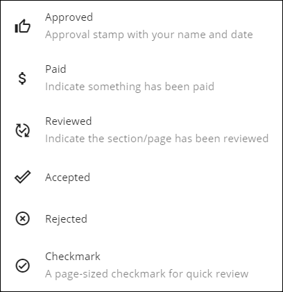
The Stamps drop-down list is located to the right of the Drawing Tools drop-down list and to the left of the Help button.
Approved Stamp
The Approved stamp is used when an approved stamp needs to be added to a page. Once the Approved stamp button is clicked, a preview of the stamp is displayed on the document, allowing you to see what the stamp annotation will look like before it is placed on the document:
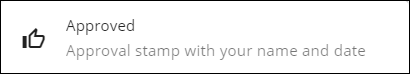
The Approved stamp is located in the Stamps drop-down list above the Paid Stamp button.
Paid Stamp
The Paid stamp is used when a paid stamp needs to be added to a page. Once the Paid stamp button is clicked, a preview of the stamp is displayed on the document, allowing you to see what the stamp annotation will look like before it is placed on the document:

The Paid stamp is located in the Stamps drop-down menu above the Reviewed stamp button.
Reviewed Stamp
The Reviewed stamp is used when a reviewed stamp needs to be added to a page. Once the Reviewed stamp button is clicked, a preview of the stamp is displayed on the document, allowing you to see what the stamp annotation will look like before it is placed on the document:
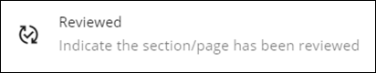
The Reviewed stamp button is located in the Stamps drop-down list below the Paid stamp and above the Accepted stamp button.
Accepted Stamp
The Accepted stamp is used when an accepted stamp needs to be added to a page. Once the Accepted stamp button is clicked, a preview of the stamp is displayed on the document, allowing you to see what the stamp annotation will look like before it is placed on the document:
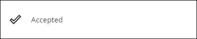
The Accepted stamp button is located in the Stamps drop-down menu below the Reviewed stamp button and above the Rejected stamp button.
Rejected Stamp
The Rejected stamp is used when a rejected stamp needs to be added to a page. Once the Rejected stamp button is clicked, a preview of the stamp is displayed on the document, allowing you to see what the stamp annotation will look like before it is placed on the document:
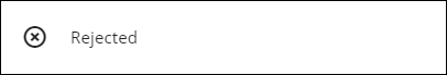
The Rejected stamp button is located in the Stamps dropdown below the Accepted stamp button and above the Checkmark stamp button.
Checkmark Stamp
The Checkmark stamp is used when a checkmark stamp needs to be added to a page. Once the Checkmark stamp button is clicked, a preview of the stamp is displayed on the document, allowing you to see what the stamp annotation will look like before it is placed on the document:

The Checkmark stamp button is located in the Stamps dropdown below the Rejected stamp button.
Custom Stamp
There are five configurable Custom Stamps available with Enterprise Viewer. These custom stamps can be used to create new stamps with configurable stamp text on a page. It must be configured by admin on server using override properties to use it.
For more information on configuring custom stamps, see AEV stamp properties.
Once the Stamp button is clicked, a preview of the stamp is displayed on the document, allowing you to see what the stamp annotation will look like before it is placed on the document:

The Custom Stamps are located in the Stamps drop-down menu below the Checkmark stamp button.
Support for Non-AEV Generated Stamps
Stamps with predefined images and subject text are fully supported without restrictions. Limited support is available for custom stamps not generated directly in AEV. To view non-AEV stamps, which are stamps that are not generated in AEV, you must set the configuration excludeEmbeddedAnnotations to false. For more information on excludeEmbeddedAnnotations, see Exclude Embedded Annotations.
Custom stamp requests that fall outside these supported capabilities will be treated as enhancement requests and may require additional development work. For configuration details, refer to AEV Stamp Properties.
Help
The Help button is used to give the user more information regarding Enterprise Viewer. When this button is clicked a new tab in the browser will open with Technology Services Group information regarding their services and description of Enterprise Viewer:

The Help button is located to the right of the Stamp Tools dropdown and to the left of the Active Users box.
Active Users
The Active Users box shows the user how many users are currently viewing the current document. Clicking this button will change the tab in the sidebar to the Participants tab:

The Active Users box is located to the right of the Help button and to the left of the Load Time text.
Note: The Active Users box is only displayed if “Collaboration Mode” is active.
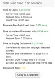
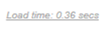
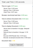
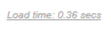
Load Time
The Load Time text shows the user how many seconds it took to load the document:
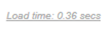
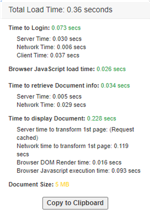
The user can see more details when clicking on the text:
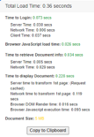
The load time takes into consideration the time it took the user to login, the browser JavaScript load time, the time it took to retrieve document information, the time it took to display the document, and the document’s size. The user can copy the load time information into their clipboard by clicking the Copy to Clipboard button found in the load time information window:
The Load Time text is located to the right of the Active Users box.
Right Sidebar
The right sidebar displays the annotation summary and search tabs. It is to the right of the document and below the toolbar.
Hide Sidebar
The Hide Sidebar button allows the user to hide or show the sidebar depending upon the current state of the view. By default, the sidebar is in view. When clicked, the sidebar will be hidden from the display. When the sidebar is not in view, the button can be clicked to show the sidebar, and the sidebar will reappear in its default position:

This button is located in the upper right corner of the sidebar.
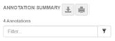
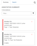
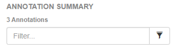
Annotation Summary
The annotation summary tab is used to show the summaries of the annotations that have been made in the document:
The user can export the summary to excel, print the summary, filter through the annotations, and view the summaries in this tab:
Export Summary to Excel
This Export Summary to Excel button is used to export the summaries to excel:

When clicked a message will appear stating that the Excel sheet is being downloaded, and the user can continue to annotate the document. The Excel sheet will display the annotation summaries in a table format. It will include but is not limited to the title of the document, creation date, page, author, type, status, and comments.
The Export Summary to Excel button is located near the top of the Annotation Summary tab, to the right of the Annotation Summary title, and to the left of the Printable Summary button.
Printable Summary
The Printable Summary button is used to print the annotation summaries:

When clicked, a new window will open displaying all the annotation summaries in a table format. It will display the
object name, title, creation date, page, author, type, comment, status, and replies if any. The user can print the page
by selecting the window and clicking Ctrl + P or in a form of the user’s choosing.
This Printable Summary button is located near the top right corner of the Annotation Summary tab and to the right of the Export Summary to Excel button.
Filter Text Box
The filter text box allows the user to sort through the annotation summaries efficiently:
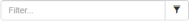
When the user types in the text box, the annotation summary boxes will be sorted. The annotation summary boxes with text matching the user’s input will appear below the filter search box. The filter field will filter on the:
- Username of the annotation creator
- Contents of the annotation comment
- Date of the comment
- Page Number
- Annotation type (ex: Highlight, Cross-Out, Sticky Note)
This text box is located at the top of the Annotation Summary tab below the Export Summary to Excel and Printable Summary buttons.
Filters
The Filters button allows the user to filter through the annotation summary boxes based upon the status and author:

When clicked, a checkbox list will appear displaying status, author(s), and type options for user to select. Multiple statuses, authors and/or types can be selected. The filters box can be used with the filter text box.
The Filters button is located on the immediate right of the Filter Text Box.
Clear Filters
The Clear Filters button is used to clear all filters from the filter text box and the filters button:

When clicked, the text in the filters text box will be cleared as well as the selections made in the filters list.
The Clear Filters button will appear to the right of the Filter Text Box when there is text in the filter text box or when a selection is made in the filters list.
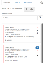
Annotation Summary Boxes
The annotation summary boxes appear in the sidebar below the filter text box:
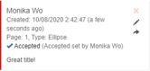
They are used to display information regarding each annotation. Each annotation will have one corresponding annotation summary box. An annotation summary box will display the author of the annotation, the date the annotation was created, the page the annotation was made on, the type of annotation, and the status of the annotation.
If the status is set to none the status will not be displayed on the annotation summary boxes. The left side of the box will display a color corresponding to the color of the annotation. When an annotation summary box is clicked the user will be taken to that annotation in the document and the annotation dialogue box will appear.
The user can delete and edit their annotations through the annotation summary or in the dialogue box. The user can also reply to theirs’ and others’ annotations.
Delete
Clicking this button will delete the annotation:

This button will not appear if the user is trying to delete another user’s annotation.
The Delete button is located in the top right corner of the annotation summary box and above the Edit button.
Edit
Clicking this button will open the text area of the annotation summary box and allow the user to edit their annotation comment:

This button will not appear if the user is trying to edit another user’s annotation.
The Edit button is located in the annotation summary box below the Delete button and above the Reply button.
Reply
Clicking this button allows the user to reply to an annotation:

A user can reply to their annotation as well as other’s annotations. If an annotation with a reply is deleted, the reply will be orphaned.
The Reply button is located in the annotation summary box below the Edit button.
Search
Clicking on the search tab will display the search tab which includes a search text box and arrows to move through the search matches:
Text Search
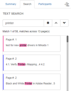
The text search box allows the user to search for text in the document:
It does not search through annotation summary boxes or annotation dialogue boxes. When a user inputs text into the search box, matching results will appear below the text search box. The results will be highlighted on the document. The result the user is currently viewing will be highlighted a different color than the other results.
The matching result box that is in view has a corresponding color to the result text on the document. The text search box is not case-sensitive.
Match Whole Words Only
Clicking this button will only display the results which match the whole word searched for in the text search box:

For example, if the user searches for the word the with the Match Whole Words Only button activated, words such as
them or there will not appear in the search results.
The button is located to the right of the text search box and to the left of the Previous Result button.
Previous Result
Clicking this button will display the previous matching result from the text search:

If there are no results previous to the result currently in view the button will not be in use.
This button is located to the right of the Match Whole Words Only button and to the left of the Next Result button.
Next Result
Clicking this button will display the next matching result from the text search:

If there are no results after the result currently in view the button will not be in use.
This button is located to the right of the Previous Result button.
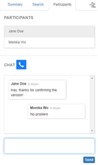
Participants
Clicking on the Participants tab will display the participants tab which includes a list of the current users and a chat box that allows the user to chat with the other users viewing the document:
Note: The Participants tab only appears when “Collaboration Mode” is active, and the user is connected to the collaboration server.
Participants List
This section of the Participants tab shows the list of the current users viewing the document:
When a new user starts viewing the document, their name will be added to the bottom of the list. When a user stops viewing the document, their name will be removed from the list.
Following
This section of the Participants tab allows the user to follow another user when they are scrolling.
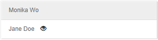
Follower
A user can follow another user by clicking on the other user’s name:
The user will jump to the page of the user they are following. The zoom level will also change to match that of the followee. A icon will be displayed next to the name of the user they are following, and a notification will pop up at the bottom of the page that says which user is being followed. The user can unfollow the user by clicking on the other user’s name.
Followee
A user will be notified that they are being followed by another user. An icon will be displayed next to the name of the user that is following them, and a notification will pop up at the bottom of the page that says the user is being followed:
The user can stop others from following them by clicking on the other user’s name or clicking the Stop All button in the notification.
Note: The followee cannot follow another user while they are being followed.
Activate Chat
This section of the Participants tab allows the user to activate the chat box:

The chat box is activated if the button is blue. The user can disable the chat box by clicking the Activate Chat button. The button will turn grey and disable the text input box.
This button is located below the Participants List, to the right of the Start Zoom Call button, and above the Chat Box.
Start Zoom Call
The zoom integration feature allows a user to start a Zoom call within the Enterprise Viewer window between everyone that is viewing the same document:

The Zoom call can be recorded and saved back to the user’s repository.
The Start Zoom Call button is located to the right of the Activate Chat button and to the left of the Start Microsoft Teams Call button.
Start Microsoft Teams Call
The team integration feature allows a user to start a Microsoft Teams call within the Enterprise Viewer window between everyone that is viewing the same document:

The Microsoft Teams call can be recorded and saved back to the user’s repository.
The Start Microsoft Teams Call button is located to the right of the Start Zoom Call button.
Chat Box
This section of the Participants tab allows the user to view the conversation with the other users who are also currently viewing the document:
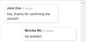
Each new message that a user sends contains the user’s name, the time at which they sent the message, and the content of the message itself.
Send
The Send button allows the user to send a message of their own composition to the other participants of the conversation:

This button is located at the bottom right corner of the Participants tab, below the chat box.
Left Sidebar
The left sidebar displays the thumbnails, bookmarks, and the attachments. It is located to the left of the document and below the toolbar.
Hide Sidebar
The Hide Sidebar button allows the user to hide the sidebar containing the list of bookmarks. When the button is clicked, the sidebar will collapse into the left side of the Enterprise Viewer window. When the button is clicked again, the sidebar will expand back into view:
This button is located in the upper right corner of the sidebar.
Thumbnails
The thumbnails sidebar displays all the thumbnails of the document, if available:
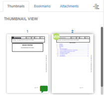
Clicking on an entry in the list will take the user to the page the user selected. Thumbnails are unavailable for large documents.
It is located on the left side of the Enterprise Viewer window.
Annotation Indicator
An annotation indicator will appear on the page’s thumbnail if an annotation was made on that page:
If no annotations have been made on the page, then an annotation indicator will not be displayed on the thumbnail:
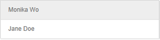
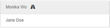
User Icon
A user icon will appear on the thumbnail of the page a collaborator is on:
The icon will have the initials of the collaborator and will display the full name when the user hovers over the icon. Multiple icons will appear as users view the same page.
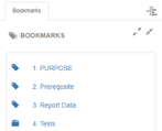
Bookmarks
The bookmarks sidebar displays all the bookmarks that the document has, if available:
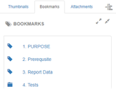
Clicking on an entry in the list will take the user to the section of the document where the bookmark begins.
It is located on the left side of the Enterprise Viewer window.
Expand All Bookmarks
The Expand All Bookmarks button allows the user to expand all the sub-lists in the bookmarks list in order for the user to see all bookmarks in all categories:

This button is located in the top right corner of the Bookmarks sidebar and to the left of the Collapse All Bookmarks button.
Collapse All Bookmarks
The Collapse All Bookmarks button allows the user to collapse all the sub-lists in the bookmarks list in order for the user to see only the categories of bookmarks:

This button is located in the top right corner of the Bookmarks sidebar, to the right of the Expand All Bookmarks button, and below the Hide Sidebar button.
Internal Links
Internal Links allow the user to jump to different places within the document:
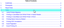
NOTE: Only internal links with a page number are supported in Enterprise Viewer.
An internal link will be highlighted light blue when a user hovers over it.
Attachments
The Attachments sidebar displays the attached documents that the document has, if any:
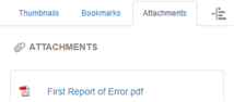
If there are no attached documents, the Attachments sidebar tab will not be displayed. Clicking on an entry in the list will automatically download the attached document.
The Attachments sidebar is located on the left side of the Enterprise Viewer window.
Document List
The Document List sidebar displays documents that have been added to the document list, if any:
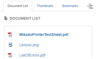
If no documents were added to the list, the Document List sidebar will not be displayed. The document list allows you to easily switch between documents in Enterprise Viewer. To switch to a new document in Enterprise Viewer, click on a document in the list.
The Document List sidebar is located on the left side of the Enterprise Viewer window.
Note: The user will not be able to see the previous document in the document list unless it is added.
Redact Content Interface
This is where document navigation and zooming occur, and where redactions can be created, saved, and more information on Enterprise Viewer is found.
Toolbar
The toolbar contains all the core functionality to Enterprise Viewer in Redact Content mode:

It is located at the top of the Enterprise Viewer window.
Dark grey buttons cannot be used until certain actions are made. A button that is in use will have a blue interior.
Manual Page Navigation
Manually entering a value into this text field and then hitting the Enter key will navigate to the new page number:

If the page number entered is not a number, this value gets reset to the current page. If the page number entered is lower than the first page, the user is navigated to the first page. If the page number entered is higher than the last page, the user is navigated to the last page.
This text field is located to the right of the Enterprise Viewer logo and to the left of the Fit to Height button.
Total Number of Pages
This is a non-editable field denoting the total number of pages for the document.
Fit to Height
Clicking the Fit to Height button automatically calculates the zoom level to make the window show the entire height of the document:

This does not take into account the width of the document, and thus scroll bars may appear horizontally depending on the page’s aspect ratio against the size of the window.
The Fit to Height button is located to the right of the Manual Page Navigation text field and to the left of the Fit to Width button.
Fit to Width
Clicking the Fit to Width button automatically calculates the zoom level to make the window show the entire width of the document:

This does not take into account the height of the document, and thus scroll bars may appear vertically depending on the page’s aspect ratio against the size of the window.
The Fit to Width button is located to the right of the Fit to Height button and to the left of the Next Page button. The Fit to Width button is to the left of the Zoom In button if the Next Page button is not displayed in the toolbar.
Next Page
Clicking the Next Page button takes the user to the next page of the document:

The button will become disabled once the user reaches the end of the document.
The Next Page button is located to the right of the Fit to Width button and to the left of the Previous Page button.
Note: This feature is unavailable if the document does not have more than one page.
Previous Page
Clicking the Previous Page button takes the user to the previous page of the document:

The button will become disabled once the user reaches the beginning of the document.
The Previous Page button is located to the right of the Next Page button and to the left of the Zoom In button.
Note: This feature is unavailable if the document does not have more than one page.
Zoom In
Clicking the Zoom In button zooms in using increments of ten:

While zooming in, the current middle of the page will remain in the middle.
If the target zoom level is above the maximum zoom level, the zoom is set to the maximum zoom level. This is set for performance and usability reasons.
The Zoom In button is located to the right of the Previous Page button and to the left of the Zoom Out button. The Zoom In button is to the right of the Fit to Width button if the Previous Page button is not displayed in the toolbar.
Zoom Out
Clicking the Zoom Out button zooms out using increments of ten:

While zooming out, if possible, the current middle of the page will remain in the middle (unless zooming out reveals an image that does not need to be scrolled).
If the target zoom level is below the minimum zoom level, the zoom is set to the minimum zoom level. This is set for performance and usability reasons.
The Zoom Out is located to the right of the Zoom In button and to the left of the Save button.
Save
Clicking the Save button will save any new or modified redactions to the server, as well as refresh any unmodified redactions from other users that have been updated:

The Save button is located to the right of the Zoom In button and to the left of the Undo button.
Selection Tool
The Selection Tool button is the default cursor when opening Enterprise Viewer and signifies that the mouse does not do anything out of the ordinary:

The Selection Tool button is located to the right of the Save button and to the left of the Draw Redaction button.
Draw Redaction
Clicking the Draw Redaction button allows the user to draw a redaction in a specific area of the page:

Redactions are drawn in the form of rectangles. Once the cursor is selected, the user can click anywhere on the page to start the redaction. The user can then drag the mouse to anywhere else on the page to put the other corner of the redaction.
A dim gray rectangle will be drawn from one point to the other as a preview of what the redaction will look like. Dialog boxes are anchored in the beginning of the redaction.
The annotation comment from the dialog box will appear on the redacted area once the redaction is saved:

The redacted area will become dark grey with white text if there is an annotation comment, otherwise it will turn black.
The Draw Redaction button is located to the right of the Save button and to the left of the Text Redaction button.
Text Redaction
Clicking the Text Redaction button allows the user to redact text in a document:

Once the cursor is selected, the user can click on the text they wish to redact. The user can then drag the mouse over the text to redact it until the mouse is released. The user may redact multiple lines. Certain text such as Social Security numbers will be redacted automatically.
The annotation comment from the dialog box will appear on the redacted area once the redaction is saved:

The redacted area will become dark grey with white text if there is an annotation comment, otherwise it will turn black.
The Text Redaction button is located to the right of the Draw Redaction button and to the left of the Help button.
Help
The Help button is used to give the user more information regarding Enterprise Viewer:

When this button is clicked a new tab in the browser will open with Alfresco information regarding services and description of the Enterprise Viewer.
The Help button is located to the right of the Text Redaction button and to the left of the Load Time text.
Load Time
The Load Time text shows the user how many seconds it took to load the document:

The user can see more details when clicking on the text:
The load time takes into consideration the time it took the user to login, the browser JavaScript load time, the time it took to retrieve document information, the time it took to display the document, and the document’s size. The user can copy the load time information into their clipboard by clicking the Copy to Clipboard button found in the load time information window.
The Load Time text is located to the right of the Help button.
Right Sidebar
The right sidebar displays the annotation summary and search tabs. It is to the right of the document and below the toolbar.
Hide Sidebar
The Hide Sidebar button allows the user to hide or show the sidebar depending upon the current state of the view:

By default, the sidebar is in view. When clicked the sidebar will be hidden from the display. When the sidebar is not in view, the button can be clicked to show the sidebar, and it will then reappear in its default position.
The Hide Sidebar button is located in the upper right corner of the sidebar.
Annotation Summary
The annotation summary tab is used to show the summaries of the redactions that have been made in the document:
The user can filter through the redactions and view the summaries in this tab:
Filter Text Box
The Filter text box allows the user to sort through the annotation summaries efficiently:
When the user types in the text box, the annotation summary boxes will be sorted. The annotation summary boxes with text matching the user’s input will appear below the filter search box. The filter field will filter on the:
- Username of the annotation creator
- Contents of the annotation comment
- Date of the comment
- Page Number
- Redaction type (ex: Redaction, Text Redaction)
This Filter text box is located at the top of the Annotation Summary above the summaries.
Filters
The Filters button allows the user to filter through the annotation summary boxes based upon the status and author:

When clicked, a checkbox list will appear displaying status, author(s), and type options for user to select. Multiple statuses, authors and/or types can be selected. The filters box can be used with the filter text box.
The Filters button is located on the immediate right of the Filter text box.
Clear Filters
The Clear Filters button is used to clear all filters from the filter text box and the filters button:

When clicked the text in the filters text box will be cleared as well as the selections made in the filters list. The clear filters button will appear to the right of the filter text box when there is text in the filter text box or when a selection is made in the filters list.
Annotation Summary Boxes
The Annotation Summary boxes appear in the sidebar below the filter text box:
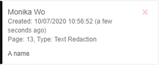
The Annotation Summary boxes are used to display information regarding each redaction. Each redaction will have one corresponding annotation summary box. An annotation summary box will display the author of the redaction, the date the redaction was created, the page the redaction was made on, the type of redaction, and the status of the redaction.
If the status is set to none the status will not be displayed on the annotation summary boxes. The left side of the box will display a color corresponding to the color of the annotation. When an annotation summary box is clicked the user will be taken to that redaction in the document and the redaction dialogue box will appear.
Search
Clicking on the Search tab will display the search tab which includes a search text box, arrows to move through the search matches, and a redact search result option:
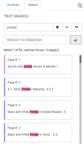
Bulk Redaction
The reason for redaction box and redact results button allows the user to redact all the search results:
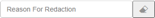
The user can type their reason for redacting the search results in the reason for redaction box. This reason will be applied to each search result redaction. The redactions will be displayed in the annotation summary. A preview of the redactions can be seen in the document.
The Bulk Redaction feature is located below the Text Search box and above the search results.
Text Search
The Text Search box allows the user to search for text in the document:
It does not search through annotation summary boxes or annotation dialogue boxes. When a user inputs text into the search box, matching results will appear below the text search box. The results will be highlighted on the document. The result the user is currently viewing will be highlighted a different color than the other results. The matching result box that is in view has a corresponding color to the result text on the document. The text search box is not case-sensitive.
Match Whole Words Only
Clicking the Match Whole Words Only button will only display the results which match the whole word searched for in the text search box:

The button is located to the right of the Text Search box and to the left of the Previous Result button.
Previous Result
Clicking the Previous Result button will display the previous matching result from the text search:

If there are no results previous to the result currently in view, then the button will not be in use.
The Previous Result button is located to the right of the Text Search box and to the left of the Match Whole Words Only button.
Next Result
Clicking the Next Result button will display the next matching result from the text search:

If there are no results after the result currently in view the button will not be in use.
The Next Result button is located to the right of the Previous Result button.
Left Sidebar
This sidebar contains the bookmarks.
Bookmarks
The bookmarks sidebar displays all the bookmarks that the document has, if available:
Clicking on an entry in the list will take the user to the section of the document where the bookmark begins.
It is located on the left side of the Enterprise Viewer window.
Edit Pages Interface
This is where document navigation and zooming occur, where the user can split the PDF, delete pages, rotate pages, and section the document, and where more information on Enterprise Viewer is found.
Toolbar
The toolbar contains all the core functionality to Enterprise Viewer in Edit Pages mode.

It is located at the top of the Enterprise Viewer window.
Dark grey buttons cannot be used until certain actions are made. A button that is in use will have a blue interior.
Manual Page Navigation
Manually entering a value into this text field and then hitting the Enter key will navigate to the new page number:

If the page number entered is not a number, this value gets reset to the current page. If the page number entered is lower than the first page, the user is navigated to the first page. If the page number entered is higher than the last page, the user is navigated to the last page.
This text field is located to the right of the Enterprise Viewer logo and to the left of the Fit to Width button.
Total Number of Pages
This is a non-editable field denoting the total number of pages for the document.
Fit to Width
Clicking this button automatically calculates the zoom level to make the window show the entire width of the document:

This does not take into account the height of the document, and thus scroll bars may appear vertically depending on the page’s aspect ratio against the size of the window.
The Fit to Width button is located to the right of the Manual Page Navigation text field and to the left of the Fit to Height button.
Fit to Height
Clicking this button automatically calculates the zoom level to make the window show the entire height of the document:

This does not take into account the width of the document, and thus scroll bars may appear horizontally depending on the page’s aspect ratio against the size of the window.
The Fit to Height button is located to the right of the Fit to Width button and to the left of the Next Page button. The Fit to Height button is to the left of the Zoom Out button if the Next Page button is not displayed in the toolbar.
Next Page
Clicking this button takes the user to the next page of the document:

The button will become disabled once the user reaches the end of the document.
The Next Page button is located to the right of the Fit to Height button and to the left of the Previous Page button.
Note: This feature is unavailable if the document does not have more than one page.
Previous Page
Clicking this button takes the user to the previous page of the document:

The button will become disabled once the user reaches the beginning of the document.
The Previous Page button is located to the right of the Next Page button and to the left of the Zoom Out button.
Note: This feature is unavailable if the document does not have more than one page.
Zoom Out
Clicking this button zooms out in increments of ten:

While zooming out, if possible, the current middle of the page will remain in the middle (unless zooming out reveals an image that does not need to be scrolled).
If the target zoom level is below the minimum zoom level, the zoom is set to the minimum zoom level. This is set for performance and usability reasons.
The Zoom out button is located to the right of the Previous Page button and to the left of the Zoom In button. The Zoom Out button is to the right of the Fit to Height button if the Previous Page button is not displayed in the toolbar.
Zoom In
Clicking this button zooms in using increments of ten:

While zooming in, the current middle of the page will remain in the middle.
If the target zoom level is above the maximum zoom level, the zoom is set to the maximum zoom level. This is set for performance and usability reasons.
The Zoom In button is located to the right of the Zoom Out button and to the left of the Save button.
Save
Clicking this button will save any changes to the server, as well as refresh any unmodified annotations from other users that have been updated:

The Save button is located to the right of the Zoom In button and to the left of the Split PDF button.
Split PDF
Clicking the Split PDF button will prompt the user to select the pages for the split:

The user can select the pages by clicking on the box in the upper left corner of the page or by typing the pages in the blue notification located at the button of the screen. The selected pages will become green. The user then must click the Split PDF button which is located in the notification. Doing so will create a new document with the selected pages which has the same metadata and can be found in the same folder as the original document.
The Split PDF button is located to the right of the Save button and to the left of the Delete Pages button.
Delete Pages
Clicking the Delete Pages button will prompt the user to select the pages they wish to delete:

The user can select the pages by clicking on the box in the upper left corner of the page or by typing the pages in the blue notification located at the bottom of the screen. The selected pages will become red. The user then has to click the Delete Pages button which is located in the notification.
The Delete Pages button is located to the right of the Split PDF button and to the left of the Rotate Page Counter-Clockwise button.
Rotate Page Counter-Clockwise
Clicking this button will rotate all the pages counter-clockwise:

If the user wants specific pages to rotate, the user must select them by clicking the box in the top left corner of the page or by writing it in the range section of the notification in the bottom right corner.
The Rotate-Page Counter-Clockwise button is located to the right of the Delete Pages button and to the left of the Rotate Page Clockwise button.
Rotate Page Clockwise
Clicking this button will rotate all the pages clockwise:

If the user wants specific pages to rotate, the user must select them by clicking the box in the top left corner of the page or by writing it in the range section of the notification in the bottom right corner.
The Rotate Page Clockwise button is located to the right of the Rotate Page Counter-Clockwise button and to the left of the Section Document button.
Section Document
Clicking this button will allow the user to split the document into different sections:

Sectioning is an efficient way to reorder large documents. A blue notification will appear in the bottom right corner where the user can name the section and select the range of pages for the section. The user must then select the Create Section button. The new section will appear in the left sidebar.
See how to section a document.
The Section Document button is located to the right of the Rotate Page Clockwise button and to the left of the Help button.
Help
The Help button is used to give the user more information regarding Enterprise Viewer:

When this button is clicked a new tab in the browser will open with Alfresco information regarding services and description of Enterprise Viewer.
The Help button is located to the right of the Section Document dropdown and to the left of the Load Time.
Load Time
The Load Time text shows the user how many seconds it took to load the document:
The user can see more details when clicking on the text:
The load time takes into consideration the time it took the user to login, the browser JavaScript load time, the time it took to retrieve document information, the time it took to display the document, and the document’s size. The user can copy the load time information into their clipboard by clicking the Copy to Clipboard button found in the load time information window.
The Load Time text is located to the right of the Help button.
Left Sidebar
This section covers the left side navigation bar in the Enterprise viewer.
Hide Sidebar
The Hide Sidebar button allows the user to hide the sidebar containing the list of sections:

When the button is clicked, the sidebar will collapse into the left side of the Enterprise Viewer window. When the button is clicked again, the sidebar will expand back into view.
This button is located in the top right corner of the Sections sidebar.
Sections
The Sections sidebar displays all the sections of the document, if available:
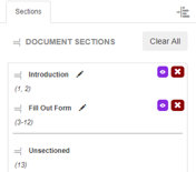
Sectioning is an efficient way to reorder large documents. Unsectioned pages will be listed under Unsectioned. The pages belonging to each section are listed under the section’s name. Clicking on an entry in the list in Add Annotations mode will take the user to the first page of the section.
See how to activate the Section Document feature for more information.
It is located on the left side of the Enterprise Viewer window.
Creating a Section
The user can create a new section through the blue notification that appears in the bottom right corner:
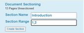
The user can name the section and type the range of pages for the section. The user must then select the Create Section button in the notification. The new section will appear in the left sidebar.
Renaming a Section
Clicking this button allows the user to rename the section:

A text box will appear under the section’s name prompting the user to enter a new section name.
This button is located to the right of the section’s name.
Edit Section
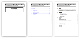
Clicking this button displays the thumbnails of the section:

Thumbnails before reordering pages:
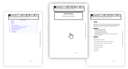
The user can reorder the section by dragging the thumbnails to their desired positions:
Thumbnails in new position with the pages reordered:
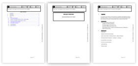
The user must click the button again to exit thumbnail view.
This button is located to the left of the Deleting a Section button and below the Clear All button.
Deleting a Section
Clicking this button allows the user to delete the section:

The pages from the deleted section will then be listed under Unsectioned.
This button is located to the right of the Edit Section button and below the Clear All button.
Reordering Sections
The user can reorder the sections by clicking on a section and dragging it to a new spot:
Note: The user cannot reorder the sections if there are unsectioned pages.
Clear All
Clicking this button will clear all document sections and list the pages under Unsectioned:

The user will be prompted by a question asking whether they are sure they want to clear all sections.
The Clear All button is located in the top right corner of the Sections sidebar below the Hide Sidebar button.
Add Signatures Interface
This section covers the Add Signatures feature of the Enterprise Viewer.
Toolbar
The toolbar contains all the core functionality to Enterprise Viewer in Signature mode:

This is where document navigation and zooming occur, and signatures can be added, saved, and more information on Enterprise Viewer is found.
It is located at the top of the Enterprise Viewer window.
Dark grey buttons cannot be used until certain actions are made. A button that is in use will have a blue interior.
Manual Page Navigation
Manually entering a value into this text field and then hitting the Enter key will navigate to the new page number:

If the page number entered is not a number, this value gets reset to the current page. If the page number entered is lower than the first page, the user is navigated to the first page. If the page number entered is higher than the last page, the user is navigated to the last page.
This text field is located to the right of the Enterprise Viewer logo and to the left of the Fit to Width button.
Total Number of Pages
This is a non-editable field denoting the total number of pages for the document.
Fit to Width
Clicking this button automatically calculates the zoom level to make the window show the entire width of the document:

This does not take into account the height of the document, and thus scroll bars may appear vertically depending on the page’s aspect ratio against the size of the window.
The Fit to Width button is located to the right of the Manual Page Navigation text field and to the left of the Fit to Height button.
Fit to Height
Clicking this button automatically calculates the zoom level to make the window show the entire height of the document:

This does not take into account the width of the document, and thus scroll bars may appear horizontally depending on the page’s aspect ratio against the size of the window.
The Fit to Height button is located to the right of the Fit to Width button and to the left of the Previous Page button. The Fit to Height button is to the left of the Zoom Out button if the Previous Page button is not displayed in the toolbar.
Previous Page
Clicking this button takes the user to the previous page of the document:

The button will become disabled once the user reaches the beginning of the document.
The Previous Page button is located to the right of the Fit to Height button and to the left of the Next Page button.
Note: This feature is unavailable if the document does not have more than one page.
Next Page
Clicking this button takes the user to the next page of the document:

The button will become disabled once the user reaches the end of the document.
The Next Page button is located to the right of the Previous Page button and to the left of the Zoom Out button.
Note: This feature is unavailable if the document does not have more than one page.
Zoom Out
Clicking this button zooms out in increments of ten:

While zooming out, if possible, the current middle of the page will remain in the middle (unless zooming out reveals an image that does not need to be scrolled).
If the target zoom level is below the minimum zoom level, the zoom is set to the minimum zoom level. This is set for performance and usability reasons.
The Zoom out button is located to the right of the Next Page button and to the left of the Zoom In button. The Zoom Out button is to the right of the Fit to Height button if the Next Page button is not displayed in the toolbar.
Zoom In
Clicking this button zooms in using increments of ten:

While zooming in, the current middle of the page will remain in the middle.
If the target zoom level is above the maximum zoom level, the zoom is set to the maximum zoom level. This is set for performance and usability reasons.
The Zoom In button is located to the right of the Zoom Out button and to the left of the Save button.
Save
Clicking this button will save any new or modified annotations to the server, as well as refresh any unmodified annotations from other users that have been updated:

The Save button is located to the right of the Zoom In button and to the left of the Selection Tool button.
Selection Tool
The Selection Tool button is the default cursor when opening Enterprise Viewer and signifies that the mouse does not do anything out of the ordinary:

The Selection Tool button is located to the right of the Save button and to the left of the Draw Signature button.
Draw Signature
Clicking this button allows the user to add a signature to the page:
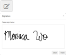
Once the cursor is selected, the user can click anywhere on the page to add a signature. The user will be prompted by a popup window asking them to sign below. The user can clear the signature if needed. The user must click the insert button of the popup window to insert the signature.
The Draw Signature button is located to the right of the Selection Tool button and to the left of the Help button.
Help
The Help button is used to give the user more information regarding Enterprise Viewer:

When this button is clicked a new tab in the browser will open with Alfresco information regarding services and description of Enterprise Viewer.
The Help button is located to the right of the Draw Signature button and to the left of the Load Time.
Load Time
The Load Time text shows the user how many seconds it took to load the document:
The user can see more details when clicking on the text:
The load time takes into consideration the time it took the user to login, the browser JavaScript load time, the time it took to retrieve document information, the time it took to display the document, and the document’s size. The user can copy the load time information into their clipboard by clicking the Copy to Clipboard button found in the load time information window.
The Load Time text is located to the right of the Help button.