The form editor provides a powerful drag and drop interface to let you design forms from a rich set of controls. You can define form outcomes and create forms with multiple tabs. Individual controls and whole tabs can be made visible depending on the value of other form fields and process variables. You can design your form with groups of controls in varying numbers of columns.
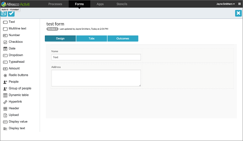
In the example above, the form editor is open on a form containing two controls, a text box, and a multiline text box.
Form Controls
The form controls for each field determine how the field is displayed and handled.
| Control | Description |
|---|---|
| Text | Allows you to enter text. |
| Multi-line Text | Enables you to enter multiple lines of text within a text box. |
| Number | Allows you to enter a number. |
| Checkbox | Allows selection and deselection of the field. |
| Date | Allows selection of a date from a pop-up calendar. |
| Date/Time | The behavior is similar to that of the Date control, with the added capability of allowing selection of a time value. |
| Dropdown | Allows you to select an item from a displayed list of items. |
| Typeahead | On entering data, displays filtered information in a list and allows selection of a value. |
| Amount | Allows you to input data representing an amount of money and to define a currency type. |
| Radio buttons | Allows you to choose an item from a predefined list. |
| People | Allows you to select a person from a list. |
| Group of people | Allows you to create a group of people by selecting names from a list. |
| Dynamic table | Allows you to input multiple rows of data in a table. |
| Hyperlink | Displays a hyperlink. |
| Header | Acts as a container into which you can drag and drop other control fields. You can organize these into columns and label them. You can also add a title in the header element. |
| Attach file | Allows you to upload and attach files from the file system or other sources, for example, Box, Google Drive. |
| Display value | Allows you to display the value of a field or variable previously submitted in any form. |
| Display text | Allows you to display text for a field. You can also display values previously submitted in any form, and include this within the text. |