Tutorials that deal with styling of the Share user interface. For example, how to create a custom theme.
Adding a custom Share Theme
Extension Point: Share Themes
Description:
This tutorial demonstrates how to customize the look and feel of the Share user interface by creating a custom theme. The Share user interface is currently implemented with both Aikau code and YUI code. This has an impact on what you need to do to style the whole Share UI, as Aikau components are styled differently from YUI components.
Implementation Steps:
The following steps are usually needed to customize the Share UI using a custom theme:
- Copy one of the existing out-of-the-box themes and use it as a basis for the new theme
- Give the new theme a name
- Update the CSS files with the new theme name
- Create an XML file
<new theme name>.xmlto let Share know about the new theme - Replace logos and other images
- Customize the look and feel of YUI components by updating presentation.css and skin.css
- Customize the look and feel of Aikau components by overriding LESS variables in
<new theme name>.xml
Important: If you are upgrading to a newer Content Services version, and you are using a custom theme, then it is important to make sure that whatever out-of-the-box theme your custom theme is base on (such as Green Theme) has not changed between Content Services versions. For example, upgrading from version 5.0 to 5.1 will mean that all the out-of-the-box themes will have an extra
images/logo-enterprise.pngfile. So if you upgrade to a newer version you will also have to upgrade your custom theme to match.
Related Information:
This tutorial assumes that you are familiar with the Share architecture. If you are new to it then read up on it here before starting this tutorial.
Source Code: Go to code
This tutorial assumes you have created a new SDK All-In-One project.
Tutorial implementation steps:
-
Create a new themes directory under:
aio/aio-share-jar/src/main/resources/META-INF. -
Copy an existing theme, such as the Green Theme, from
alfresco/tomcat/webapps/share/themes/greenThemeinto the newaio/aio-share-jar/src/main/resources/META-INF/themesdirectory.As you might have guessed, this requires you to actually download and install Content Services. To avoid having to do that you can also run the all-in-one project once and you will have the required theme resources in
all-in-one/share/target/share/themes -
Rename the theme directory to a custom theme name.
Change the
aio/aio-share-jar/src/main/resources/META-INF/themes/greenThemedirectory name toaio/aio-share-jar/src/main/resources/META-INF/themes/tutorialTheme. -
Update the theme name in the CSS files.
In both the
aio/aio-share-jar/src/main/resources/META-INF/themes/tutorialTheme/presentation.cssfile and theaio/aio-share-jar/src/main/resources/META-INF/themes/tutorialTheme/yui/assets/skin.cssfile, search for thegreenThemename and replace it withtutorialTheme. -
Add a theme’s descriptor file called
tutorialTheme.xmlto theaio/aio-share-jar/src/main/resources/alfresco/web-extension/site-data/themesdirectory (you would have to create the themes directory too):<?xml version='1.0' encoding='UTF-8'?> <theme> <title>Tutorial Theme</title> <title-id>theme.tutorialTheme</title-id> <css-tokens> </css-tokens> </theme>The theme ID will be determined by the file name, so from now on this theme is identified by
tutorialTheme. Thetitleelements determine the title of the theme in the UI. Thecss-tokenelement will be covered later on in this tutorial. -
Optionally add an i18n resource file with the Theme title label.
We can use the existing
aio/aio-share-jar/src/main/resources/alfresco/web-extension/messages/aio-share-jar.propertiesfile for this. Add the following property to it:theme.tutorialTheme=Tutorial ThemeThe property name
theme.tutorialThememust match what you specified in the tutorialTheme.xml file astitle-id. If you don’t bother defining any resource label properties in this file, then the theme title will be taken from thetitleelement in the tutorialTheme.xml file. -
Replace logos.
A basic customization of Share usually involves replacing the Alfresco logos with company specific logos. The following list explains where the different logo image files are displayed in the user interface:
aio/aio-share-jar/src/main/resources/META-INF/themes/tutorialTheme/images/app-logo-48.png- this is the logo that shows in the title of each page.aio/aio-share-jar/src/main/resources/META-INF/themes/tutorialTheme/images/logo.png- this is the logo that shows up on the Login page.
Replace these with whatever logos you want, and make sure to keep the same image sizes.
-
Customize the YUI components in the Share user interface.
This is done by updating CSS styles in the
aio/aio-share-jar/src/main/resources/META-INF/themes/tutorialTheme/presentation.cssfile and theaio/aio-share-jar/src/main/resources/META-INF/themes/tutorialTheme/yui/assets/skin.cssfile.For example, to get a theme with more of a purple touch go through and replace the greenish colours as follows:
Green Purple #92c15f -> #BDA0CB #00AE42 -> #7F00FF #5FAC34 -> #BF5FFF #3a6c38 -> #2E0854 #009300 -> #A020F0 #008F22 -> #A020F0 #D4F8C4 -> #ECC8ECReplace only the
colorandbackground-colorcss tokens. To do more detailed customizations you will have to change the CSS classes in these files and see what the result looks like. This styling will not affect the Share Header with the menu and title, and any other Aikau components, how to do this is covered in the next step. -
Customize the Aikau components in the Share user interface.
This is done by overriding LESS variables in the
aio/aio-share-jar/src/main/resources/alfresco/web-extension/site-data/themes/tutorialTheme.xmlfile. Update it to look like this:<?xml version='1.0' encoding='UTF-8'?> <theme> <title>Tutorial Theme</title> <title-id>theme.tutorialTheme</title-id> <css-tokens> <!-- Aikau related LESS variables (requires Aikau 1.0.18) --> <less-variables> @header-background-color: #A020F0; <!-- Purple --> @header-font-color: yellow; @header-hover-background-color: #BDA0CB; <!-- Purple candy --> @header-hover-font-color: #ccc; @header-focus-background-color: #8A2BE2; @header-focus-font-color: red; @header-menubar-font-color: yellow; @header-dropdown-menu-font-color: yellow; @dashlet-background: #fff; @dashlet-border: 1px solid #bababa; @dashlet-border-radius: 0; @dashlet-title-background: #92c15f linear-gradient(to bottom, #a3d07a, #92c15f); @dashlet-title-border-bottom: 0; @dashlet-title-border-radius: 0; @dashlet-title-color: #fff; @dashlet-toolbar-background: #A020F0; @dashlet-toolbar-border-bottom: 1px solid #d3d3d3; @dashlet-body-background: #f9fcfd; @dashlet-body-border-radius: 0; </less-variables> </css-tokens> </theme>Here we have done some customizations to the Share header style by overriding a number of LESS variables starting with
@header-. We also customize the styling of Aikau Dashlets by overriding the@dashlet-LESS variables. Note that by default there are no Aikau dashlets on any of the Dashboards. You would have to install for example the Reporting and Analytics module to get some Aikau dashlets, which you could then style like this.You are probably wondering where all the LESS variable names are coming from, and what others there are that can be overridden? Have a look in the defaults.less file in the Aikau project. It contains the default values for all the LESS variables that are used by the Aikau components’ CSS files.
Note: The LESS variable substitution feature is only available in Aikau version 1.0.18 or newer. So you may need to upgrade to a newer version of Aikau for this to work, add the following dependency yo the aio/aio-share-jar/pom.xml file:
<dependency> <groupId>org.alfresco</groupId> <artifactId>aikau</artifactId> <version>1.0.30</version> </dependency>This will work as the Spring Surf framework will automatically choose the newest version of Aikau that it can find. Unless you have manually disabled/enabled Surf Extension modules and the newer Aikau module is process before the older one.
-
Build and start the application server as follows:
/all-in-one$ mvn clean install alfresco:run -
Now, log in to Share (
http://localhost:8080/share) and set the new theme.Do this by navigating to the
Admin Toolspage and then select the Tutorial Theme from the theme drop down, followed by a click on the Apply button. Then logout and you should see a custom logo in the login dialog:
After logging in you should see the whole Dashboard page custom styled in a purple color:
You should also see a custom logo on each page. If you are also running with the Share header customization installed, then you will see that it overrides the theme customization:

Customizing the Share Header Style (Aikau)
Extension Point: Surf Extension Modules
Description:
This tutorial demonstrates how the style used in the Share Header can be changed in an easy way. We will see how the background color, foreground color, and so on. can be customized for the main menu. This tutorial will also introduce you to the Aikau debug mode so you can find out what widgets are available, and the CSS files that they use. Which means you can find out what LESS variables are available to set custom values for.
The main takeaway from this tutorial is that you can easily customize an existing, or custom, theme by redefining LESS variables. And you can easily find out what Aikau widgets that are used for different components in the UI.
Implementation Steps:
A simple and effective way to customize the Share header, and other parts of the Share UI that uses Aikau widgets, is to follow these steps:
- Enable Aikau Debug mode so you can inspect Aikau pages and widgets
- Identify what Aikau widgets that are used to produce the content that should be customized (that is, the Share Header)
- Find out what CSS files that are used by the relevant widgets
- Inspect the CSS files and find out what LESS variables you can work with
- Override an out-of-the-box Theme, or create a custom Theme, by redefining one or more LESS variables
Related Information:
This tutorial assumes that you are familiar with the Share Header, which contains the main menu and the title. The Header is implemented with the new Aikau development framework and it is possible to customize the CSS files used by the Header widgets via LESS variables.
Source Code: Go to code
This tutorial assumes you have created a new SDK All-In-One project.
Tutorial implementation steps:
-
Identify what Aikau widgets that are used to produce the content that should be customized (that is, the Share Header with the Main Menu).
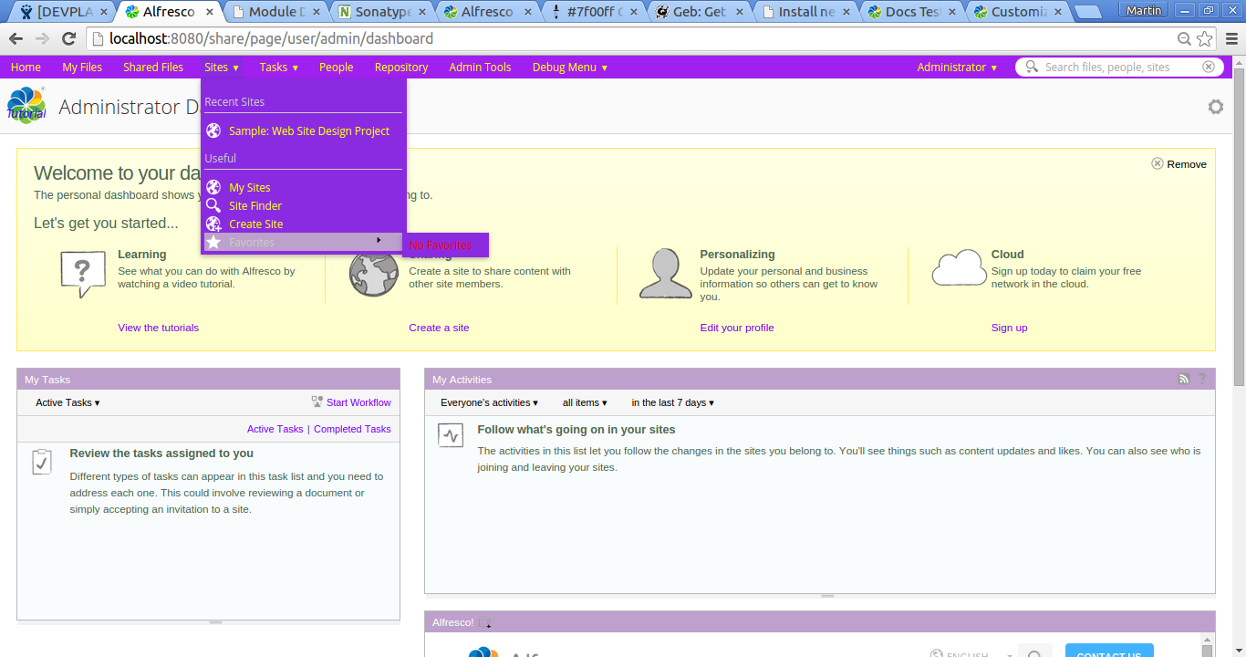
For this we use the Developer View in Share. To enable it select the Debug Menu > Toggle Developer View menu item from the top main menu. The Share UI should change so you see red boxes around Aikau widgets:

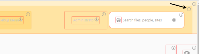
Note that it is only the Share Header that has been implemented with Aikau so far, and a few other pages. So the red boxes are only marking content in the Header (Menu and Title), the rest of the Dashboard page, dashlets, footer, and so on. is not implemented in Aikau, and hence not marked. To customize the background color for the main menu we need to click the information icon (i) in the upper right corner of the big black box surrounding the main menu:
Clicking this (i) icon brings up an information box as follows:
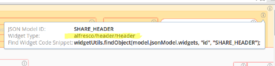
This tells us that the Aikau widget we are looking for is
alfresco/header/Header. To find out what stylesheet (CSS) it uses we can lookup the widget source code online (Aikau is open source). Navigate to the documentation site for Aikau (http://dev.alfresco.com/resource/docs/aikau-jsdoc/), and then search for the widget there. In the source code you should see what CSS file it uses by looking at thecssRequirements: [{cssFile:"./css/Header.css"}]variable.We can find out more about this CSS file by looking at the full source code on GitHub. Here we can see a number of CSS classes that control the style of the header, which contains the menu and title:
.@{alfresco} .alf-home-icon { background: url("./images/home.png"); background-repeat: no-repeat; height: 16px; width: 16px; display: block; float: left; } .@{alfresco} .navigation-menu { margin-top: 23px; } .@{alfresco} .title-menu { margin-top: 23px; } .@{alfresco} .alfresco-header-Header { background-color: @header-primary-background-color; color: @header-primary-font-color; font-family: Open Sans,arial,helvetica,clean,sans-serif; padding: 0; width: auto; } /* Sets the highlight on the menu bar items in the header bar ONLY */ .@{alfresco} .alfresco-header-Header .alfresco-menus-AlfMenuBar .dijitMenuPassive .dijitMenuItemHover { background-color: @header-hover-background-color; color: @header-hover-font-color; } . . .What we should be looking for here are so called LESS variables. These are our way into customizing the Header component style.
Warning: It might be tempting to override these CSS classes with a custom CSS file, such as this:
.alfresco-share .alfresco-header-Header { background-color: #799212; /* Overriding the black background color */ }This should be avoided as this will make upgrades very difficult and it is not supported. LESS variables and themes are the supported way to change the style of Share.
Looking at the Header CSS file we can see that there are quite a few LESS variables that we can work with:
@header-primary-background-color @header-primary-font-color @header-hover-background-color @header-hover-font-color @header-focus-background-color @header-focus-font-color @header-menubar-font-color @header-dropdown-menu-font-colorWhat LESS variables that are available differs slightly between versions of Share, and what Aikau version that is brought in. The best thing you can do is, find out what exact version of Aikau that is being used, for example
aikau-1.0.25.2.jar(checktomcat/webapps/share/WEB-INF/lib). Then make sure it is a version that is newer than Aikau version 1.0.18, which was the first version to introduce LESS. You can find the Header.css file in the/META-INF/js/aikau/<aikau version>/alfresco/header/cssdirectory in the JAR file, which means that you can check exactly what LESS variables are available for you to use. -
Decide if you want to customize an existing theme or use a custom theme.
Customizing the style of the header can be done either by overriding an existing theme, such as the Green Theme, or by creating a new custom theme. In this exercise we will customize the out-of-the-box Green Theme. If we are just customization LESS variables, and we don’t need to change anything else in the Green Theme, then it is enough to just create a Green Theme XML file and override the LESS variables. There is no need to copy over the complete
themedirectory like when creating a custom theme. -
Create a new themes directory under the
aio/aio-share-jar/src/main/resources/alfresco/web-extension/site-datadirectory.This is the standard directory in the Spring Surf model for theme files.
-
Create a new Green Theme XML file called
greenTheme.xmlin the themes directory.This file will contain the overridden LESS variables. It is important that the file name is the same as it is for the Green Theme in the Share webapp, see
tomcat/webapps/share/WEB-INF/classes/alfresco/site-data/themes. Otherwise we will not be overriding the Green Theme but instead start creating a custom theme. -
Override the required LESS variables.
Overriding the default values for the LESS variables, which are defined in the defaults.less file in Aikau, is currently done by adding a particular element to the Theme XML file. A Theme is defined by an XML file that lives in the
themessub-folder of the client’s Surf configuration folder. In our example thegreenTheme.xmlfile looks like this:<?xml version='1.0' encoding='UTF-8'?> <theme> <title>Green Theme Override</title> <title-id>theme.greenTheme</title-id> <css-tokens> <!-- Aikau related LESS variables (requires Aikau 1.0.18 or newer) --> <less-variables> @header-background-color: #799212; @header-font-color: #ccc; @header-hover-background-color: orange; @header-hover-font-color: green; @header-focus-background-color: yellow; @header-focus-font-color: red; @header-menubar-font-color: pink; @header-dropdown-menu-font-color: purple; </less-variables> </css-tokens> </theme> -
The implementation of this sample is now done, build and start the application server as follows:
/all-in-one$ mvn clean install alfresco:run -
Now, log in to Share (
http://localhost:8080/share) and change them to Green Theme (via the Share Admin Tools). You should then see the main menu with the green background color, pink font color, and other changes: