Forms are used to capture data into specially designed field types such as text, date, file uploads and multiple choice radio buttons. They are where human intervention is required within a process and this intervention is handled by filling in a form that is displayed in a user’s task list.
Forms can be used in three different ways:
-
As part of a user task that will create a task for an assigned user, or group of users when the process flow reaches that element.
-
As part of a start event used at the beginning of a process instance. Forms behave in the same way as when they are linked to a user task, however forms linked to start events cannot be saved part way through filling them in.
-
As standalone tasks where the form can be used in a task that is not associated to any process.
Forms can also be based on content models allowing content metadata to be updated within a form and subsequently managed in a process using the content connector.
Properties
The basic properties of a form are:
| Property | Description |
|---|---|
| Form name | Required. The name of the form. Must be in lowercase and between 1 and 26 characters in length. Alphanumeric characters and hyphens are allowed, however the name must begin with a letter and end alphanumerically, for example claims-form. |
| Form description | Optional. A description of what the form should be used for, for example A form to collect the details of any claims.. |
Two additional properties can be set for a form when no form field is selected:
| Property | Description |
|---|---|
| Allow form to be used in standalone tasks | Set whether the form can be used in standalone tasks or not. Standalone tasks are tasks not associated with a process instance. |
| Update form files metadata from fields on submit | If set to true, when the form is submitted and it contains files in an attach file field that have been sourced from Content Services, the metadata for those files will be updated with the values entered into any other fields on the form. |
| Set left label for fields | Set all field labels to appear on the left side instead of at the top of the field. |
| Edit form rules | You can create custom form rules that apply to a form or to the widgets on a form. Form rules are created and run by a user of the form. Each form rule has an event trigger, event conditions, and actions. |
Create a form
To create a form:
-
Sign into the Modeling Application and open a project.
-
Click the NEW dropdown.
-
Select how to create the form:
-
Create > Form creates a new, empty form.
-
Upload > Form allows for uploading an existing form
.jsonfile into the Modeling Application.
Alternatively use the + or Upload buttons next to Forms in the left-hand menu.
-
-
Enter a name and optional description.
-
(Optional) If the form is going to be used to manage content metadata, check the Create initial form content from a content model box.
-
(Optional) Choose which custom type and custom aspects should be used in the form and whether inherited properties should be included. The list will be generated from the content models available to the project the form is created in.
Note: Creating a form based on a content model will automatically create form fields for the properties included in the selected custom type and aspects. These fields will retain any constraints set for them in their content model, such as regular expressions. An attach file field will also be added with the label
nodesfor attaching content to the form.
Form modeling
The Modeling Application contains two tabs for creating and editing forms.
Form Editor
The Form Editor is the GUI for modeling forms by dragging and dropping form fields from the palette onto the form designer. The palette contains all of the form field types that can be used to model a form. The Form Editor also has the ability to create multiple tabs and rows, as well as create custom outcomes.
Tabs
Tabs can be used to logically separate the content of a form into different sections. Use the Add tab button to create additional tabs and set a name that will appear to users at runtime. Visibility conditions can also be set on each tab to show or hide them based on values entered into the form.
Rows
Each row of form fields can be split into a number of columns; 1, 2, 3, 4, 6, 12. To change the number of columns within a row select the row object that contains the fields and use the dropdown.
Outcomes
Outcomes are custom buttons that can be added for users to click to complete a form, for example Agree and Disagree. Use the Add outcome button to add additional outcomes.
JSON Editor
The JSON Editor contains the JSON that describes the form. Changes made in the Form Editor or in the JSON Editor are reflected in the other. When importing or downloading a form the .JSON file will reflect what is in the JSON Editor.
Form fields
All form fields display a field editor when they are created in the GUI. Each field has a tab for general properties that are common amongst the majority of form fields, with some also having a tab for advanced properties that are specific to that field type.
The general properties of form fields are:
| Property | Description |
|---|---|
| Label | The name of the field that will appear on the rendered form, for example First name. |
| ID | The unique ID of the field, for example Text070upd. |
| Required? | Checking this box makes a field mandatory. |
| Read-only | Sets whether the field can be filled in by a form filler or not. |
| Colspan | The number of columns a field spans. This is limited by the number of columns within the row. |
| Placeholder | The default value of the field. |
| Tooltip | Tooltip information that will appear on the rendered form field providing help text to a form filler. |
Note: Any exceptions to the general properties are stated in the section specific to that field type. For example, the header field type does not have the
Required?property.
Each form field can also have a set of visibility conditions set on it where the field will either be hidden or displayed depending upon the values of other fields or variables within that form. The Edit Visibility Conditions button is displayed in the properties of every field.
The steps of visibility conditions are:
| Step | Description | Options |
|---|---|---|
| Depends on | The field or variable that will be evaluated | A field or variable within the form. |
| If it’s | The comparison operator between Depends on and Value | equal to, not equal to, empty, not empty. |
| Value | The value, field or variable that the Depends on step is evaluating against | A field or variable within the form or a static value. |
| Next condition operator | The operator for evaluating against further conditions | and, and not, or, or not. |
Note: Conditions are evaluated in the order they are declared.
Amount fields
Amount fields are for entering a value depicting currency.
The advanced properties for an amount field are:
| Property | Description |
|---|---|
| Min value | Sets the minimum value that can be entered into the field. |
| Max value | Sets the maximum value that can be entered into the field. |
| Currency | Sets the currency symbol for the field, for example $, £ or €. |
| Enable decimals | Checking this box will allow for decimal places to be entered into the field. |
Attach file fields
Attach file fields are used so that form fillers can upload files with their submission.
The advanced properties for an attach file field are:
| Property | Description |
|---|---|
| Allow multiple file attachments | Checking this box will allow for more than one file to be uploaded. |
| File source | Sets the location for where files can be uploaded from. Alfresco Content is from a Content Services instance, whilst Alfresco Content and Local allows uploads from Content Services and a form filler’s local machine. |
| Destination folder path | If you select Static path the location where files uploaded from a local machine should be stored in Alfresco Content Services, composed of an alias and a relative path. For example, -root-/User Homes/hruser or -my- will both store the files in /Company Home/User Homes/hruser. You can also determine how files are uploaded by setting the destination upload path dynamically by selecting either option A: Based on string variable type or option B: Based on folder variable type. |
| Display show file option | Checking this box will allow the form filler to view uploaded files. |
| Display download file option | Checking this box will allow the form filler to download any uploaded files. |
| Display retrieve metadata option | Checking this box will allow the form filler to view the metadata of uploaded files. |
| Display remove file option | Checking this box will allow the form filler to remove uploaded files from the form. |
| Content Properties to display | You can select up to two custom properties to display next to the file name. |
| Display upload new version option | Checking this box allows the Upload new version option to display in the Digital Workspace, when you click the three dots next to a file. If you upload a new version of a file you can indicate if the changes are minor or major, and you can write a comment about what the changes are or why the changes were made. |
Important: Users filling in a form with an attach file field need to be given explicit access to the upload directory if it is outside of the default storage location for the application.
Checkbox fields
Checkbox fields are boolean values. They are either checked or unchecked.
Checkbox fields do not have the Placeholder property, nor do they have an advanced properties tab.
Date fields
Date fields are for date type data.
The advanced properties for a date field are:
| Property | Description |
|---|---|
| Default value | Sets the default date of the field. If you want the default date to be ‘today’ and that is the current day then you can select the Today checkbox. |
| Set dynamic date range | When turned on you can enter a Minimum and Maximum date range. This forces the date picker to only allow a user to select a date within the configured period, and any dates outside of the date range will be grayed out. Note: When using dynamic date range, the Min Date and Max Date fields are unavailable. |
| Min date | Sets the earliest date that can be entered into the field. |
| Max date | Sets the latest date that can be entered into the field. |
| Date format | Sets the format of how a date is entered into the field. For example: YYYY-MM-DD would display as 2001-10-01 for 1st October, 2001. |
Display text fields
Display text fields allow the form designer to display a line of fixed text to the form filler. This text is not editable by the filler themselves. The Text to display property is used to enter the text.
Display text fields do not have the Read-only, Placeholder, and Required? fields, nor do they have an advanced properties tab.
Display Rich text
Display Rich text allows you to add HTML formatted text to forms. You can test how the text will look at design time by using the preview button, before pushing the form to a live environment. The Display Rich text editor includes standard formatting tools such as headings, font color, hyperlinks, and code blocks.
Note: Once created the form only displays read-only text and does not capture any values.

Display value fields
Display value fields allow the form designer to display a value previously entered in the form. The variables property is used to select a form variable to display.
Display value fields do not have the Read-only, Placeholder, and Required? fields, nor do they have an advanced properties tab.
Dropdown fields
Dropdown fields allow the form designer to define a set of options that a form filler must choose from a list.
When you use dropdown fields in Process Automation, you can enter any character of the item you are searching for to limit the amount of returned entries. This includes any part of a sentence. This feature works when there are more than five entries and is useful when your lists are large.
You can select single or multiple entries from a dropdown list to use them further in your process.
When designing a dropdown list in the modeling application, the list items can be:
Manual dropdown fields
The advanced properties for a manual dropdown field allow for a set of options to be entered with a name and id for each option set. Selecting the radio button next to an option will set it as the empty value. An empty value is taken to mean the field is empty if this option is selected when the form is filled in.
REST Service dropdown fields
The advanced properties for a REST Service dropdown field are:
| Property | Description |
|---|---|
| Authentication | The authentication type. |
| REST URL | The URL of the REST service. |
| Path to array in JSON response | The path to the JSON response. Enter . to use the full path. |
| ID property | The ID of the REST service. |
| Label property | The name of the REST service. |
| Conditional | Turn this option on if you would like to link your dropdown widget with another dropdown widget and to create a conditional relationship between them. For example, if you select a country from one dropdown widget, the second dropdown widget will only show cities from that country. |
| Depends on | Select which other dropdown widget you would like to connect with. |
| If equal | Select which child entry of the Depends on field you want to work with and add subordinate entries for it. |
Variable dropdown fields
The following is an example of a Form Variable in JSON format:
{
  "response": {
    "data": {
      "available_cars":
        [
          {
            "car_id": 1,
            "car_name": "Ferrari 458",
            "car_price": "500000"
          },
          {
            "car_id": 2,
            "car_name": "Lamborghini Urus",
            "car_price": "150000"
          }
        ]
    },
    "pagination": {
      "maxItems": 100
    }
  }
}
Note: You must create a JSON type Form Variable, not a Process Variable, prior to configuring a dropdown field to use it. If no such Variable exists, the only selectable option available when configuring the dropdown field is: No form variable (JSON).
The advanced properties for a Variable dropdown field are:
| Property | Description |
|---|---|
| Form variable (JSON) | Form Variable to be used by the runtime application to populate the dropdown options. |
| Path to array in JSON | Path where the dropdown option data is located, for example: response.data.available_cars. |
| ID property | Informs the runtime application which element in the variable value is to be used as an ID for each dropdown option. This value is used as a payload when the user selects a dropdown option. For example: car_id. |
| Label property | Informs the runtime application which element in the variable value is to be used as the label for each dropdown option. This is what the user sees in the dropdown list when selecting it. For example: car_name. |
The modeling application also supports JSON variables structured according to a default configuration. Provided that the data in the JSON type Form Variable has the proper structure, the data is displayed correctly in the dropdown field without needing to specify the path, ID, and label values at the modeling level. The default configuration is the following:
| Property | Default |
|---|---|
| path | data |
| ID | id |
| label | name |
The following is an example of a JSON variable with this structure:
{
    "data": [
        {
            "id": "default-pet-1",
            "name": "Dog"
        },
        {
            "id": "default-pet-2",
            "name": "Cat"
        },
        {
            "id": "default-pet-3",
            "name": "Parrot"
        }
    ]
}
Creating a conditional relationship between dropdown lists
To create a conditional relationship between two dropdown lists using Country and City as an example:
-
Add two dropdown widgets to your form.
-
Name one of them Country and the other one City.
-
Select the City dropdown widget and click the Advanced tab.
-
Select Manual and turn on the Conditional field.
Note: You can only have the following relationships: manual parent and manual child, manual parent and REST child, REST parent and REST child.
-
Select Country from the Depends on dropdown list.
-
Select the Country dropdown widget and click the Advanced tab.
-
Add a name for the label and then add all the Countries using the Add option field.
-
Select the City dropdown widget again and click the Advanced tab.
-
From the If equal dropdown list select the Country you want to work with and then add all the cities you would like available in the dropdown list.
Note: You can link as many dropdown fields as you want.
When using a REST Service you can use the ID of the linked widget in the REST URL. For example, if your URL is https://mydomain.com/get-cities/country=${Country} the value inside ${} is the ID of the linked widget. If my widget had an ID called my-dropdown your URL would be https://mydomain.com/get-cities/country=${my-dropdown}.
The ${my-dropdown-id} can be used in any position of the URL, for example you can also use https://mydomain.com/country=${Country}/get-cities. When authentication is required for the REST service you can select the authentication type from the Authentication dropdown list. For how to create authentication types see, Authentication.
File viewer fields
File viewer fields display the content uploaded from an attach file field.
File viewer fields do not have the Placeholder or Tooltip properties.
The advanced properties for a file viewer field are:
| Property | Description |
|---|---|
| Linked attach file widget | Sets which attach file field should be displayed. |
Group fields
Group fields allow form fillers to select a single or multiple groups from the list of groups available in the application.
Group fields do not have a Placeholder property.
The advanced properties for a group field are:
| Property | Description |
|---|---|
| Mode | Sets whether only a single, or multiple groups can be selected. |
Headers
Header fields are subtitle fields that can be used as section containers on a tab. They cannot be filled in by a form filler as they only display a subtitle.
Header fields have a Number of columns property rather than the Colspan property and they do not have the Read-only, Placeholder, Tooltip and Required? properties.
The advanced properties for a header field are:
| Property | Description |
|---|---|
| Allow collapse | Checking this box allows the header container to be collapsed with a + or - when the form is filled in. |
| Collapse by default | Checking this box will load the form with the header section already collapsed. This property is only available if the Allow collapse property is checked. |
Hyperlink fields
Hyperlink fields allow the form designer to expose a link that form fillers can click on whilst they are filling out a form.
Hyperlink fields do not have the Read-only and Placeholder properties.
The advanced properties for a hyperlink field are:
| Property | Description |
|---|---|
| Hyperlink URL | The URL that the field will launch when clicked. |
| Display text | The text that is displayed for the URL, for example Click here to view the expenses policy. |
Multiline text fields
Multiline text fields are for entering string data across multiple lines.
The advanced properties for a multiline text field are:
| Property | Description |
|---|---|
| Min length | Sets the minimum character count for text that can be entered into the field including whitespace. |
| Max length | Sets the maximum character count for text that can be entered into the field including whitespace. |
| Regex pattern | A regular expression can be entered that will validate the text entered into the field. For example, a regular expression that matches four letters followed by four digits would be /^[A-Za-z]{4}\d{4}$/. |
Number fields
Number fields are for entering integer data.
The advanced properties for a number field are:
| Property | Description |
|---|---|
| Min value | Sets the minimum integer value that can be entered into the field. |
| Max value | Sets the maximum integer value that can be entered into the field. |
People fields
People fields allow form fillers to select a single or multiple users from the list of users that have access to the application.
People fields do not have a Placeholder property.
The advanced properties for a people field are:
| Property | Description |
|---|---|
| Mode | Sets whether only a single, or multiple users can be selected. |
| Select the logged user as default user | Select when you want the logged in user to be pre-populated in the people widget. |
| Groups Restriction | Specify a group or groups of users who are permitted to display in a widget at runtime. If multiple groups are added, the users must belong to all groups in order to be displayed in a widget at runtime. |
Radio buttons
Radio button fields allow the form designer to define a set of options a form filler must choose from. This list can be a manually entered set of options or it can read from a REST service.
The advanced properties for a manual radio button field allow for a set of options to be entered with a name and id for each option set. You can change the position of the radio buttons by dragging them into the order you want them to appear. You can also set if you want your radio buttons aligned vertically or horizontally.
The advanced properties for a REST radio button field are:
| Property | Description |
|---|---|
| Authentication | The authentication type. |
| REST URL | The URL of the REST service. |
| Path to array in JSON response | The path to the JSON response. Enter . to use the full path. |
| ID property | The ID of the REST service. |
| Label property | The name of the REST service. |
When authentication is required for the REST service you can select the authentication type from the Authentication dropdown list. For how to create authentication types see, Authentication.
Text fields
Text fields are for entering string data in a single line.
The advanced properties for a text field are:
| Property | Description |
|---|---|
| Min length | Sets the minimum character count for text that can be entered into the field including whitespace. |
| Max length | Sets the maximum character count for text that can be entered into the field including whitespace. |
| Regex pattern | A regular expression can be entered that will validate the text entered into the field. For example, a regular expression that matches four letters followed by four digits would be /^[A-Za-z]{4}\d{4}$/. |
| Input mask | Set the format for how data may be entered into the field. For example (00) 0000-0000 for a mandatory 8-digit phone number and 2-digit area code will not allow for letters to be entered at all. |
| Reversed | This reverses the entry for an Input mask and reads the text from right to left instead. |
| Input mask placeholder | The placeholder to demonstrate the format of an Input mask. For example (__) ____-____ in the phone number example. |
Metadata viewer
The Metadata viewer can be used to view the metadata of any file you upload or attach to your GUI using the Attach file widget.
To create a form that contains the Metadata viewer:
-
Create or edit an existing form, for more see Create a form.
-
Add the Attach file widget to the form.
-
Add the Metadata viewer widget to the form.
-
Select the Advanced tab of the Metadata viewer widget on the Field Editor pane.
-
From the Linked attach file widget dropdown menu select the Attach file widget you want to link with the Metadata viewer.
You can add more than one Attach file widget and Metadata viewer widgets to a single form.
The advanced properties for the Metadata viewer are:
| Property | Description |
|---|---|
| Expanded | Select the check box to enable the properties viewer to display all of the properties groups and not just the default properties. |
| Display default properties | Select the check box if you want to display the default properties. |
| Display empty | Select the check box to allow the display of empty values in the card view. |
| Editable | Select the check box to display the metadata in an editable view where it can be updated. |
| Multi | Select the check box to allow more than one properties group to be expanded at the same time. |
| Copy to clipboard on click | Select the check box to allow the value of a property to be copied to the clipboard when it is clicked. |
| Use chips for multi-value properties | Select the check box to allow the display of multi-value properties as chips. |
| Display aspect | Select the Aspect you wish to display as an expanded card. |
| Preset | The name or configuration of the the metadata preset. Click the preset button to configure the metadata you would like visible in your GUI, for more on presets see Application config presets. |
Data Table
The Data Table can be used to display data in a table.
To create a form that contains the Data Table:
-
Create or edit an existing form, for more see Create a form.
-
Add the Data Table widget to the form.
The advanced properties for the Data Table are:
| Property | Description |
|---|---|
| Rowspan | The number of rows a field spans. |
| Form variable (JSON) | Displays a drop-down list of all available JSON type form variables. These variables can be used by the application to populate the data table. If there are no JSON variables, the list is empty. You can create one, following instructions in Create a form variable. |
| Path to array in JSON | Configuration of the path where the fetched data belongs. Each nested object is added using a dot as a separator. |
The following Data Table types are available: text, number, amount, date, boolean, json, and icon.
You can define additional properties for:
| Property | Type | Description |
|---|---|---|
| locale | number, amount, date | Language code in ICU format, for example en_US. It impacts the format of the shown data, such as dates. |
| digitsInfo | number, amount, date | Decimal places, according to the Angular Decimal Pipe. |
| decimalConfig | number | Configuration of the displayed decimal number, including properties: locale and digitsInfo. |
| currencyConfig | amount | Configuration of the displayed currency, including properties: locale (currency formatting), digitsInfo, code (currency code, such as USD or EUR), display (currency symbol, such as $ or €). |
| dateConfig | date | Configuration of the displayed date, including properties: locale (date formatting), format (selection of pre-defined Angular Date Pipe formats), tooltipFormat (formatting of the displayed tooltip). |
You can edit the schema definition, using the Edit Schema Definition under the Data Table properties pane. The column schema definition is used to specify how the table is displayed in detail, including the column header (title) or sorting. The schema is edited in the JSON editor.
The following is an example of a schema definition:
[
    {
        "type": "number",
        "key": "id",
        "title": "No",
        "sortable": true,
        "draggable": true
    },
    {
        "type": "date",
        "key": "creation_date",
        "title": "Creation date",
        "sortable": true,
        "draggable": true,
        "dateConfig": {
            "locale": "en-GB",
            "format": "full",
            "tooltipFormat": ""
        }
    },
    {
        "type": "number",
        "key": "people",
        "title": "Numbers of interested people",
        "sortable": true,
        "draggable": true,
        "decimalConfig": {
            "digitsInfo": "1.0-0",
            "locale": "pl-PL"
        }
    },
    {
        "type": "amount",
        "key": "cost",
        "title": "Cost of maintenance",
        "sortable": true,
        "draggable": true,
        "currencyConfig": {
            "code": "EUR",
            "digitsInfo": "2.2-2",
            "display": "€",
            "locale": "de-DE"
        }
    }
]
Custom form widgets
Form widgets provide the ability to add custom form fields into a form. There are two stages to including a custom form field in a project:
- Create a custom form widget within the Modeling Application and use it within a form.
- Develop a custom user interface or extend the Digital Workspace to include the logic for the form widget using the Application Development Framework (ADF).
Custom form widget properties
The basic properties of a form widget are:
| Property | Description |
|---|---|
| Form widget name | Required. The name of the form widget. Must be in lowercase and between 1 and 26 characters in length. Alphanumeric characters and hyphens are allowed, however the name must begin with a letter and end alphanumerically, for example custom-field. |
| Value type | Required. The type the field will be treated as when mapping it to process variables, for example a Boolean form widget can only map to a process variable of type boolean. |
| Icon | Required. An SVG image for the field icon. |
| Form description | Optional. A description of what the field does. |
Note: The recommendation is to use the value type of
JSONto create complex custom form widgets.
Create a custom form widget
To create a custom form widget in the Modeling Application:
-
Sign into the Modeling Application and open a project.
-
Click the NEW dropdown.
-
Select how to create the form widget:
-
Create > Form Widget creates a new, empty form widget.
-
Upload > Form Widget allows for uploading an existing form widget
.JSONfile into the Modeling Application.
Alternatively use the + or Upload buttons next to Form Widgets in the left-hand menu.
-
-
Enter a name and optional description.
-
Select the value type for the form widget and upload an icon for it in the form field palette.
Once a custom form widget has been created in a project, it will appear in the palette when designing a form under the ellipsis header.
Develop a custom form widget
See the developer section for details on how to develop the custom form widget behavior and how to include it in a custom user interface.
Form variables
Form variables can be used to pass and receive values from process variables. They can be used to set the visibility conditions of form fields and to display values to form fillers.
Form variable properties
The properties for a form variable are:
| Property | Description |
|---|---|
| name | A unique name that can contain alphanumeric characters and underscores but must begin with a letter, for example var_3. |
| type | A data type selected from a dropdown. See the following table for a list of data types, for example String. |
| required | Sets whether the form variable must contain a value when the task is started, for example false. |
| value | An optional default value for the form variable, for example ice-cream. |
The data types that a form variable can be set as are:
| Type | Description |
|---|---|
| String | A sequence of characters, for example #Mint-Ice-Cream-4!. |
| Integer | A positive whole number, for example 642. |
| Boolean | A value of either true or false. |
| Date | A specific date in the format YYYY-MM-DD, for example 2020-04-22. |
| Datetime | A specific date and time in the format YYYY-MM-DD HH:mm:ss, for example 2020-09-10 22:30:00. |
| File | A file uploaded into a process definition or as part of a process instance or task. |
| JSON | A JSON object, for example {"flavor" : "caramel"}. |
| Folder | A folder object described as JSON, for example "name": "mint-folder". |
| Array | A comma separated list of entries, for example mint, strawberry, vanilla that will be formatted to ["mint","strawberry","vanilla"]. |
Create a form variable
To create a form variable:
-
Select the project and form to create a form variable in, within the Modeling Application.
-
Select the Edit Form Variables button by clicking on a blank section of the canvas.
-
Use the + symbol to add new variables and enter a name, type, optional value and select whether it is required or not.
Actions
The actions that can be run against a form are:
| Action | Description |
|---|---|
| Download form | Download the JSON for the form. |
| Validate | Run validation against the form. Any errors can be seen in the log history at the bottom of the Modeling Application and are flagged in a pop-up box. |
| Save | Save any changes made to the form. |
| Delete | Delete the form. |
Form rules
Form rules can be used to populate one field depending on the response given by a user in another field. In the example described here you create a form rule called how_to_address that has two fields on it, the first is called Gender and the second is called Title. The first field is a dropdown list and contains the options Man, Woman, and Other. If Woman is selected then the second field is automatically populated with Ms. The form rule ensures that any interaction with the form will contain consistent responses. This is a simple example and your form rules could be more involved.
These instructions are in two parts. You first create a form, and then second create the form rules.
Note: Form rules are specific to your installation and configuration.
Create the form
First you must create a form that can be used to configure the form rule:
-
Sign into the Modeling Application and open a Project, click the three dots next to Forms and then select the + icon.
Note: You are able to upload already created forms by using the Upload button. Any form you upload must be written in the JSON format.
-
Enter a name for the form and then click Create.
In this example the form is called how-to-address.
-
Add a Dropdown widget with the following configuration:
- Label called Gender
- ID called genderID
- Three options with Male, Female, and Other as their IDs and Labels.
-
Add a display value field widget with the following configuration:
- Label called Title
- ID called titleID
-
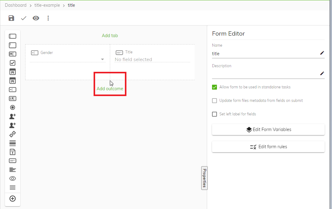
Select the form again by clicking the area above the word outcome, see screen shot.
-
In the Form Editor pane click Edit Form Variables.
-
Click the + icon and create a new variable with the name title.
-
From the Type dropdown list select Primitives and then string, and then click Update.
-
Select the Display value widget, and from the Field Editor pane select the title variable from the Variables dropdown list.
You have created a form where you can create form rules.
Create form rules within the form
To create form rules within the form:
-
Select the form again by clicking the area above the word outcome and then click Edit form rules.
-
Click the green + icon to create a new rule.
-
From the Event source dropdown list click Form events and select Form loaded.
-
Click the + icon next to Actions to create a new action.
-
From the Action type dropdown list click Update variable and select Title.
You are selecting the display value widget you created earlier.
-
Click the Edit button next to the Event output dropdown list that is under the Event output/Value heading.
-
Select Value from the right hand side and enter a value in the Value field, for example Select your gender, and then click Update.
This message will appear in the blank field of the display value widget before a user has selected their gender from the Gender dropdown list.
-
Click the green + icon again to create a new rule.
-
From the Event source dropdown list click Field events and then Click Gender and select Gender - field value changes.
-
Click the + icon next to Condition to create a new condition.
-
Select Gender from underneath the title (Form fields) heading.
-
Select Equals and then Value from the top right.
-
Enter Female into the Value field and then click Save.
-
Click the green + icon next to Actions to create a new action.
-
From the Action type dropdown list click Update variable and select Title.
-
Click the Edit button next to the Event output dropdown list which is under the Event output/Value heading.
-
Select Value from the right hand side and enter a value, for example Ms and then click Update.
You are configuring the form to display Ms in the Title display value field widget when a user selects Female from the Gender dropdown list.
-
Create a Gender - fieldValueChanged form rule for each of the options within your dropdown list. In this example you would create another one for Male, and another one for Other.
Note: You must create a Gender - fieldValueChanged form rule for each of the elements in your dropdown list.
-
When you have created the relevant form rules click Save.
-
Select Preview from the Eye icon dropdown list and test the responses in the form are correct.
Change preview size
You can change the size of the form you want to preview. This is useful because the form size can simulate the different sizes of the devices that will be using the form. You can customize the size of the form or select which device you want to emulate.
To change the size of the preview select Preview from the Eye icon dropdown list and select how you want to preview your form.
