The user interfaces (UI) section sets an end user interface for users to interact with content, tasks, and processes for the project using Alfresco Digital Workspace.
Properties
The basic properties of a UI are:
| Property | Description |
|---|---|
| UI name | Required. The name of the interface. Must be in lowercase and between 1 and 26 characters in length. Alphanumeric characters and hyphens are allowed, however the name must begin with a letter and end alphanumerically, for example order-template. |
| Content and Process | Required. Select Content to force all the widgets in the Digital Workspace that refer to content, processes, and tasks to be displayed. Select Process when you want only the widgets that refer to processes, and tasks to be displayed. Additionally if Process is selected then the landing page can be configured that allows the user who runs the application to be redirected to the list of running processes, or to their list of My Tasks. |
| UI description | Optional. A description of what the interface should be used for, for example A template for orders to follow. |
| Default System Logo | Optional. The default system logo image. The recommended size for the logo is 28x28 px. Note: To set a new logo the file must be uploaded in advance with the visibility flag set to public, for more see Files. |
| Application title | Optional. The name of the application. This is the name that will appear in the header and on the tab of your browser. |
| Header text color HEX code | Optional. The color of the header text on the user interface using hexadecimal numbers. For example #b39eba. |
| Header color HEX code | Optional. The color of the header background on the user interface using hexadecimal numbers. For example #b39oba. |
| Default Background Header Image | Optional. The default background header image. Note: To set a new background image the file must be uploaded in advance with the visibility flag set to public, for more see Files. |
Create default UI
To create a default UI:
-
Sign in to the Modeling Application and open a project.
-
Click the three dots next to UI and then select Create Default UI.
-
Enter a name and optional description.
-
Click Create UI.
Upload default UI
The UI definition is normally created using the create default UI tool and downloaded as a JSON file by clicking Download UI. You can follow the steps in this section to reuse a default UI definition in another project or UI.
Note: To upload a custom UI, follow the steps in Create custom UI instead.
To upload a default UI definition:
-
Sign in to the Modeling Application and open a project.
-
Click the three dots next to UI and then select Upload.
-
Select the JSON file that contains the UI definition.
Create custom UI
You can create a custom UI outside of the Modeling Application. The custom UI can be an Application Development Framework (ADF) application. It can also be any single page application, such as React or Vanilla HTML, CSS, or JavaScript, that conforms to the UI schema. To verify this, upload your JSON definition and click the Validate UI button.
Important: Before uploading your custom UI, ensure that it has a valid application entry point in either an
index.htmlorindex.htmfile. The custom UI must be contained in a zip archive with theindex.htmlorindex.htmfile at its root. The archive size cannot exceed 50 mb.
Note: ADF comes with a JavaScript library for managing bearer token authentication handling and renewal, which solution builders using other Custom UI implementations will have to manage.
To create a custom UI:
-
Sign in to the Modeling Application and open a project.
-
Click the three dots next to UI and then select Create custom UI.
-
Enter a name and optional description.
-
If you do not have a customized zip file yet, select Generate from Template to generate a custom UI from a UI template, which contains the source code from the Workspace application. The template zip file can be then downloaded and customized in a different application.
-
Once you have a zip file with custom UI, click the Upload button and select the zip file that contains your Custom UI.
Theme
You can add a theme to the Digital Workspace.
Use the Modeling Application to change the theme
To change the theme using the UI properties in the Modeling Application.
-
Sign in to the Modeling Application.
-
Select the UI you want to change and enter the new configuration properties under the Theme heading.
Note: You can only change the Theme of the Default UI.
-
Save the UI.
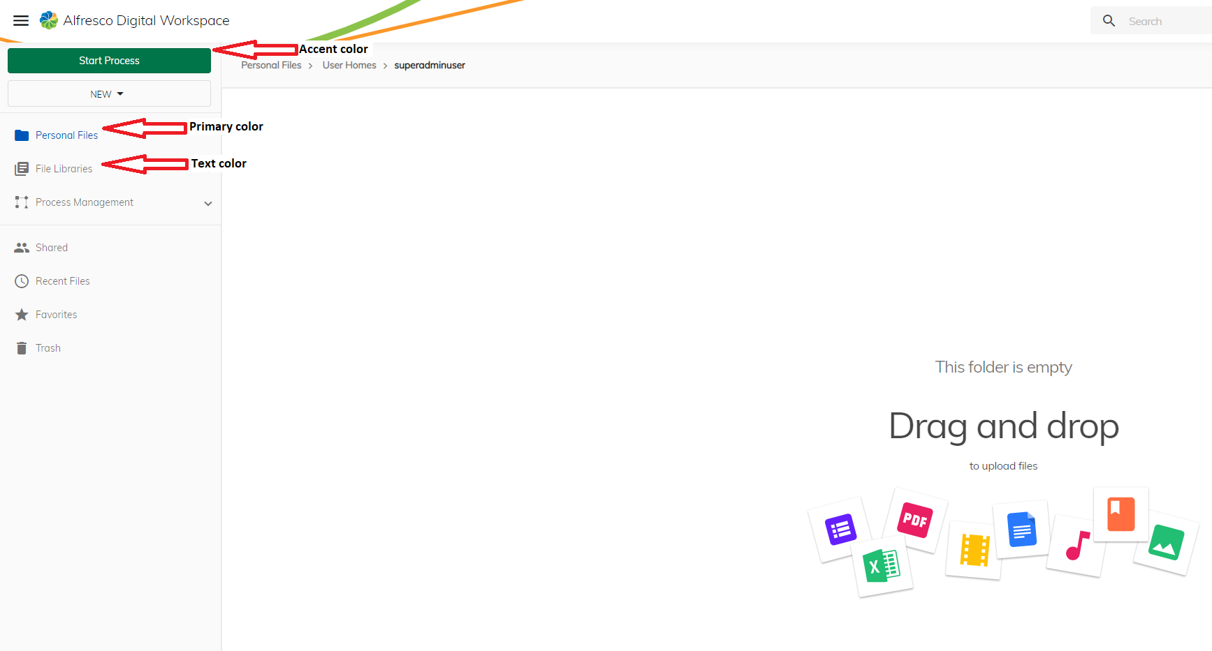
The properties of the UI theme are:
Note: See example image below.
| Property | Description |
|---|---|
| Primary color | The color is used to highlight important parts of your application, for example the text for the selected link in the left pane. |
| Accent color | The color is used to accent highlight areas of your UI and make parts of it stand out more, for example it can be used for floating action buttons, selection controls such as sliders and switches, highlighting selected text or Progress bars, and some links. |
| Text color | The default text color used for the application. |
| Background color | The color of the background, for example the color of the background of the left pane. |
| Font size | The base font size in pixels. Other font sizes are calculated depending on the base size |
| Font family | The family the font belongs to, for example Cursive. |
| Web font URL | Where the specific information about the font used is gathered from, for example. |
Deploy the theme
If you are deploying using the Modeling Application or Docker compose you must provide the correct configuration and the theme will be generated at startup.
After updating the properties for the custom theme in the Modeling Application, new entries for the UI are added to this file: "customCssPath": "./assets/theme/custom.css" (i.e. /[app-name]/ui/[ui-name]/assets/theme/custom.css)
For example:
"theme": {
   "primaryColor": "#d92ea8",
   "accentColor": "#2eb7d9",
   "textColor": "#672ed9",
Once you have deployed your application using the admin app, the values from the the theme javascript are used for generating the custom.css file. If using Docker compose the custom.css file is generated during the Docker startup process. The custom.css file is used for altering the application theme and the new theme can be found under the customCssPath value.
User interface modeling
Once a user interface has been created, set the type to content to deploy the Digital Workspace with the application. This can be accessed by users once a project has been deployed using the format ui/<name>, for example https://alfresco.com/finance-project/ui/content-app.
Note: An instance of Digital Workspace will be deployed with each application that can only start processes created within that same application. Only users assigned user access to the application will be able to access the interface.
Custom end user actions can be created for the Digital Workspace. This enables custom options to be added to various menus displayed to users. Rules can be set for the actions to only display on files or folders with specific names, or when an aspect is applied to a node. There are three parts to defining custom actions:
- The action itself that will executed when the option is clicked.
- A list of one or more rules to describe which nodes the action will be displayed on.
- The feature the action will be displayed on, for example the header or a context menu.
Actions
There are four types of end user actions that can be configured:
- Events that are used in conjunction with a trigger to start a trigger action when clicked by a user.
- Forms that display a form to the user to fill in, independent of a user task or process.
- Navigation to set a URL to redirect to when clicked by the user.
- Start process to start a named process when clicked by the user, and optionally include the file the action was launched from when clicked.
Event
Event actions are directly referenced by triggers when they are clicked. This means that an action can post a predefined message to a Slack channel or send an email notifying an email group about the document.
Note: If a user interface trigger action is not created that references the event action then nothing will happen when the action is clicked by an end user.
The properties of an event action are:
| Property | Description |
|---|---|
| Name | Required. The name of the action. Note: This is not the text that will appear to the end user in a menu. |
| Type | Required. The type of action will be Event. |
| Use selected nodes in action | Optional. Sets whether the nodes selected when the action is clicked can be used in the event or not, for example true. |
Form
Form actions open a form in Digital Workspace that users can fill in when the action is clicked. The form in question can be completely independent of a process and user task. Forms allow users to enter some information and use the output, for example to use a trigger on the form submission event.
The properties of a form action are:
| Property | Description |
|---|---|
| Name | Required. The name of the action. Note: This is not the text that will appear to the end user in a menu. |
| Type | Required. The type of action will be Form. |
| Form | Required. The name of the form to display when the action is clicked. |
| Use selected nodes in action | Optional. Sets whether the nodes selected when the action is clicked can be used in the form or not, for example true. |
Navigation
Navigation actions open a link when they are clicked by an end user. The link can be relative, for example opening another document from the repository, or the link can be absolute, such as to open another application.
The properties of a navigation action are:
| Property | Description |
|---|---|
| Name | Required. The name of the action. Note: This is not the text that will appear to the end user in a menu. |
| Type | Required. The type of action will be Navigation. |
| Target | Required. The absolute or relative link the action will direct to, for example https://wikipedia.org. |
| Open in new tab | Optional. Sets whether the link opens in a new tab or not, for example false. |
| Use selected nodes in action | Optional. Sets whether the nodes selected when the action is clicked can be used in the navigation URL or not, for example true. |
Note: The
Targetcan use the variable${nodes}ifUse selected nodes in actionis set totrueto pass the node ID to the link, for examplepersonal-files/(viewer:view/${nodes})?location=%2Fpersonal-files.
Start process
A start process action will start a process when the action is clicked. If the selected process contains a form on the start event with an attach file field and Use selected nodes in action is set to true, then the file that was selected when the action was clicked will be attached to it automatically.
The properties of a start process action are:
| Property | Description |
|---|---|
| Name | Required. The name of the action. Note: This is not the text that will appear to the end user in a menu. |
| Type | Required. The type of action will be Start process. |
| Process | Required. The name of the process to start when the action is clicked. |
| Use selected nodes in action | Optional. Sets whether the nodes selected when the action is clicked can be used in the process or not, for example true. |
Rules
Rules are used to define when an action is displayed to the end user. This is achieved using a series of evaluators, operators and optional nested groups.
Rule groups must:
- All be met for the action to display using Every.
- At least one met for the action to display using Some.
- Must not be met for the action to display using Not.
Note: Individual evaluators in a rule can be set to evaluate negatively using the
!against them. For example, if the evaluatorapp.navigation.isTrashCanis set to evaluate negatively then the user must not be in the trashcan for the action to appear.
Some evaluators take additional operators such as contains, equals or matches. For example, the evaluator selection.currentFolder.name can use a fully qualified folder name such as Invoices or use a regular expression such as ^(I|i)nvoices.
Application evaluators
Application evaluators check a user’s permissions on files and folders to set whether action will be displayed.
The application evaluators are:
| Evaluator | Description |
|---|---|
| app.selection.canDelete | User has permission to delete selected node(s). |
| app.selection.canDownload | User can download selected node(s). |
| app.selection.notEmpty | At least one node is selected. |
| app.selection.canUnshare | User is able to remove selected node(s) from public sharing. |
| app.selection.canAddFavorite | User can add selected node(s) to favorites. |
| app.selection.canRemoveFavorite | User can remove selected node(s) from favorites. |
| app.selection.first.canUpdate | User has permission to update selected node(s). |
| app.selection.file | A single File node is selected. |
| app.selection.file.canShare | User is able to share the selected file. |
| app.selection.file.isShared | A shared node is selected. |
| app.selection.file.isLocked | File is locked for editing. |
| app.selection.file.isLockOwner | File is locked and current user is the lock owner. |
| app.selection.file.canUploadVersion | User can update file version. |
| app.selection.library | A single Library node is selected. |
| app.selection.isPrivateLibrary | A private Library node is selected. |
| app.selection.hasLibraryRole | The selected Library node has a role property. |
| app.selection.hasNoLibraryRole | The selected Library node has no role property. |
| app.selection.folder | A single Folder node is selected. |
| app.selection.folder.canUpdate | User has permissions to update the selected folder. |
| app.selection.file.canLock | User has permissions to lock file. |
| app.selection.file.canUnlock | User has permissions to unlock file. |
| repository.isQuickShareEnabled | Whether the quick share repository option is enabled or not. |
| canCopyNode | Checks if user can copy selected node. |
| canToggleJoinLibrary | Checks if user can perform ‘Join’ or ‘Cancel Join Request’ on a library. |
| canEditFolder | Checks if user can edit the selected folder. |
| isTrashcanItemSelected | Checks if user has trashcan item selected. |
| canViewFile | Checks if user can view the file. |
| canLeaveLibrary | Checks if user can Leave selected library. |
| canToggleSharedLink | Checks if user can toggle shared link mode. |
| canShowInfoDrawer | Checks if user can show Info Drawer for the selected node. |
| canManageFileVersions | Checks if user can manage file versions for the selected node. |
| canManagePermissions | Checks if user can manage permissions for the selected node. |
| canToggleEditOffline | Checks if user can toggle Edit Offline mode for selected node. |
| user.isAdmin | Checks if user is admin. |
| app.canShowLogout | Whether logout action should be present or not. |
| app.isLibraryManager | Checks if user is library manager. |
Navigation evaluators
Navigation evaluators use the location within the repository structure to set whether an action will be displayed.
The navigation evaluators are:
| Evaluator | Description |
|---|---|
| app.navigation.folder.canCreate | User can create content in the currently opened folder. |
| app.navigation.folder.canUpload | User can upload content to the currently opened folder. |
| app.navigation.isTrashcan | User is using the Trashcan page. |
| app.navigation.isNotTrashcan | Current page is not a Trashcan. |
| app.navigation.isLibraries | User is using a Libraries or Library Search Result page. |
| app.navigation.isNotLibraries | Current page is not a Libraries page. |
| app.navigation.isSharedFiles | User is using the Shared Files page. |
| app.navigation.isNotSharedFiles | Current page is not Shared Files. |
| app.navigation.isFavorites | User is using the Favorites page. |
| app.navigation.isNotFavorites | Current page is not Favorites. |
| app.navigation.isRecentFiles | User is using the Recent Files page. |
| app.navigation.isNotRecentFiles | Current page is not Recent Files. |
| app.navigation.isSearchResults | User is using the Search Results page. |
| app.navigation.isNotSearchResults | Current page is not the Search Results. |
| app.navigation.isSharedPreview | Current page is preview Shared Files. |
| app.navigation.isFavoritesPreview | Current page is preview Favorites. |
| app.navigation.isSharedFileViewer | Current page is shared file preview page. |
| app.navigation.isPreview | Current page is Preview. |
| app.navigation.isPersonalFiles | Current page is Personal Files. |
| app.navigation.isLibraryFiles | Current page is Library Files. |
Node property evaluators
Node property evaluators use the types, aspects and properties of folders and files to set whether an action will be displayed.
The node property evaluators are:
| Evaluator | Description |
|---|---|
| selection.files.type | All the selected files are of the input type. |
| selection.files.aspect | All the selected files have the input aspect. |
| selection.files.property | All the selected files have the indicated property and their values satisfy the condition. |
| selection.files.name | All the selected files match the condition in their name. |
| selection.folders.type | All the selected folders are of the input type. |
| selection.folders.aspect | All the selected folders have the input aspect. |
| selection.folders.property | All the selected folders have the indicated property and their values satisfy the condition. |
| selection.folders.name | All the selected folders match the condition in their name. |
| selection.currentFolder.type | The current folder is of the input type. |
| selection.currentFolder.aspect | The current folder has the input aspect. |
| selection.currentFolder.property | The current folder has the indicated property and their values satisfy the condition. |
| selection.currentFolder.name | The current folder matches the condition in their name. |
Features
A user action can be associated to a feature once it has been defined and the rules for when to display it have been configured. This determines in which menu or view the action is displayed.
The properties to configure the action feature are:
| Property | Description |
|---|---|
| Title | Required. The text displayed to the end user in the menu, for example Start invoice process. |
| Description | Optional. The tooltip for the action in the menu, for example Start the invoice process with the intial invoice attached.. |
| Icon | Required. The icon that will be displayed to the end user in the menu next to the Title. |
| Order | Optional. The order the action will appear in the menu list. The higher the number the lower down the list, or further right in a list it is displayed. |
| Action | Required. The selected action to execute. |
| Visibility | Optional. The rule to use for evaluating whether a user can see the action. |
| Enabled | Optional. The rule to use for evaluating whether the action is enabled or not. |
Actions can be displayed in different parts of the Digital Workspace by associating them with different features.
Application header feature
The application header will display an action next to the search bar and user information:
Application header menu feature
The application header menu will display an action in the application header menu next to items such as Settings and About:
Application toolbar feature
The application toolbar will display an action underneath the header where items such as a breadcrumb are normall placed:
Dropdown button feature
The dropdown button will display an action in the left-hand menu as a new item:

Context menu feature
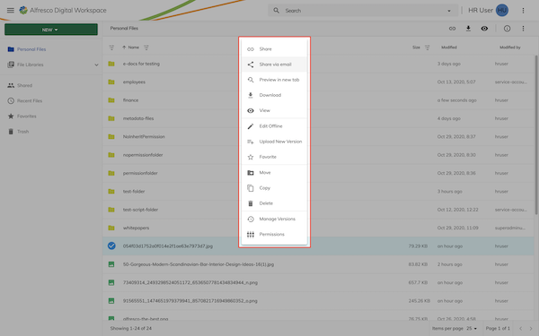
The context menu will display an action in the menu displayed when right-clicking a node:
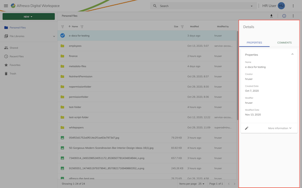
Sidebar feature
The sidebar will display an action in the properties sidebar:
Sidebar toolbar feature
The sidebar toolbar will display an action on the toolbar within the properties sidebar:
Viewer feature
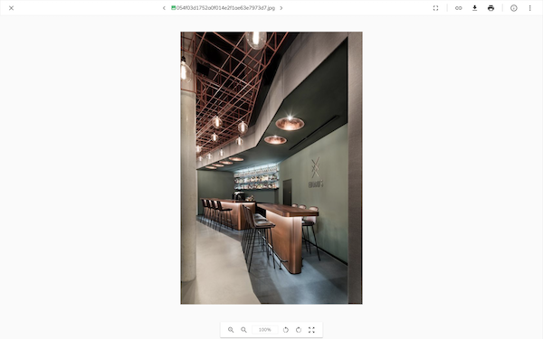
The viewer will display an action on the file viewer page:
Viewer toolbar feature
The viewer toolbar will display an action on the toolbar located on the file viewer page:
Viewer toolbar menu feature
The viewer toolbar menu will display an action in the dropdown menu in the toolbar located on the file viewer page:
Viewer shared feature
The shared viewer will display an action on the file viewer page of a shared file:
Viewer shared toolbar feature
The shared viewer toolbar will display an action on the toolbar located on the file viewer page of a shared file:

Custom user interfaces
Custom user interfaces can be developed with the Application Development Framework and deployed as part of the project.
User interface actions
The actions that can be run against an interface are:
| Action | Description |
|---|---|
| Download UI | Download the JSON for the interface. |
| Validate | Run validation against the interface. Any errors can be seen in the log history at the bottom of the Modeling Application and are flagged in a pop-up box. |
| Save | Save any changes made to the interface. |
| Save As | Save As allows you to save a another copy of a model. This new saved copy will not affect the orirginal model. |
| Delete | Delete the interface. |
Auditing
When an event action is performed you will find an entry in the Audit service, the information visible depends on the Action type.
| Action type | Event type | Description |
|---|---|---|
| Event | USER_ACTION_NAMED_EVENT | This event is sent from the Form runtime and provides information about the user action, such as the name of the interface in which the action was performed, the name of the event and the nodes selected when the action was performed. |
| Form | USER_ACTION_FORM_SUBMITTED | This event is sent from the Form runtime and provides information about the form submitted from the user action, such as the name of the interface in which the action was performed, id of the submitted form, the values submitted, or the outcome pressed. |
| Start process | PROCESS_STARTED | This event is sent from the Process runtime and provides information about the process definition and the process instance created. |